 Image: Bright Bazaar
While we're still wrapping our head around how to use Pantone's Colour of the Year, Greenery, they've already moved on to thinking about the big colour trend for 2018. And looking at the mix they're considering, we're taking a further step away from the pastels that ruled 2016 and that are still all over interiors Instagram.
At the International Home + Housewares show last week, the executive director of the Pantone Colour Institute, Leatrice Eiseman revealed the big colour trend we can expect to take over in the next year, and it's quite a varied palette. One thing's for sure, more intense colours are on the way - bright colour lovers can rejoice!
"Intense colours seem to be a natural application of our intense lifestyles and thought processes these days," she said at the International Home + Housewares Show. "Metallics we know are classic, but they have really moved over into neutrals."
Anyone who has been obsessed with the recent iridescent trend in homeware buys can relax however, as those are going nowhere. "The human eye can absolutely not avoid" anything pearlised or translucent, she says.
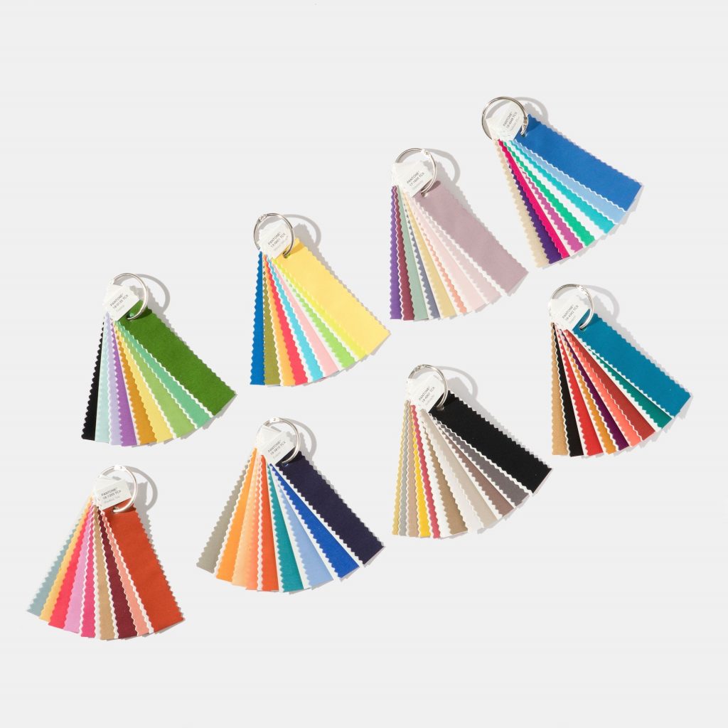
While it'll be much later in the year before we hear the 2018 Colour of the Year from Pantone, there are eight colour palettes they've determined that you can expect to see everywhere next year.
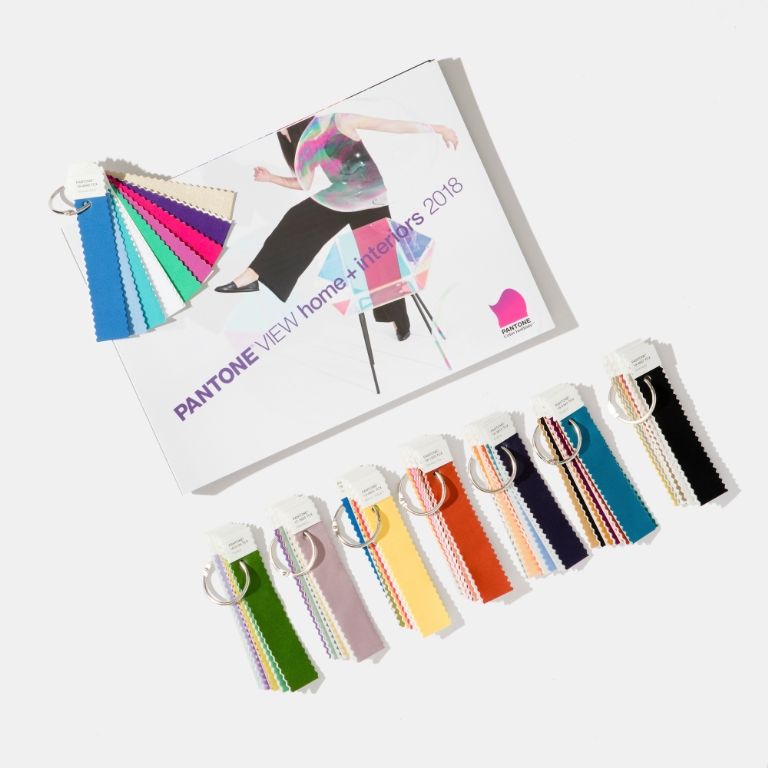
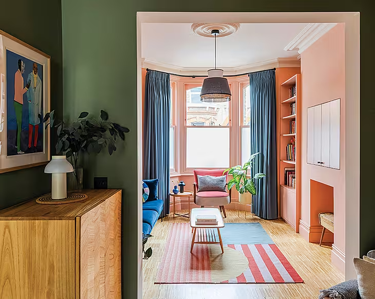
1. Resourceful: Complementary blue and orange colours, combining warm and cool tones.
2. Verdure: Vegetable-inspired, these are celery, berry and eggshell tones.
3. Playful: Bright yellow, lime, and other super brights, sunny hues.
4. Discretion: Almost the opposite of Playful colours, these are subtle elderberry and rose pink hues.
5. Far-fetched: Warm, earthy hues.
6. Intricacy: Neutral metallics (the "new neutrals") with berry red and yellow.
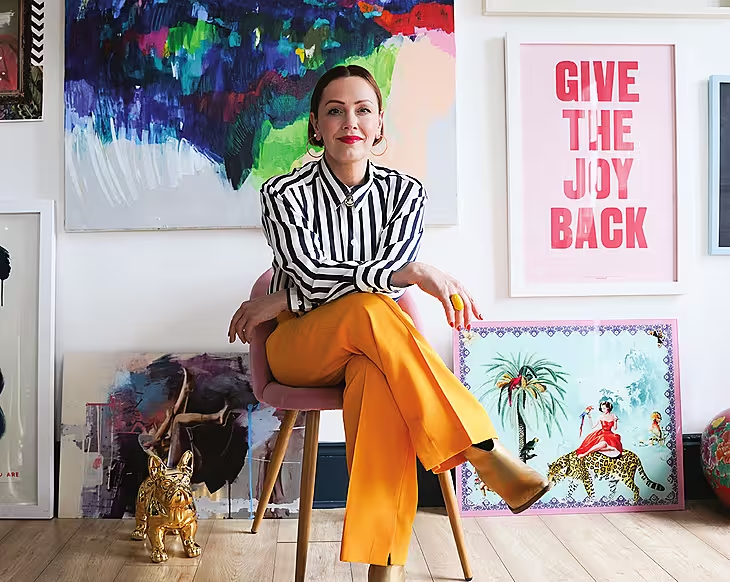
7. Intensity: An eclectic mix of saturated colours, balanced with black and gold.
8. TECH-nique: Bright turquoise, pink and purple, anchored with brilliant white and frosted almond.
Now you've plenty of time to get thinking about which Pantone palette would suit your home best!


