The aspect of this 1950’s three bedroom semi in Terenure was what first drew interior designer, Serena, of Kitt Interiors, to this house. ‘The house is north east facing, the sun comes around to the front of the house around midday and sets to the right of the house, so during the summer the back garden is sunny all day. I was living in a townhouse in the same area but slightly closer to the city, but it seriously lacked light and I was always looking for a brighter sunnier house,’ explains Serena, who hadn’t initially considered moving further out of the city. ‘We have been educated to think location, location, location, I was surprised to see there are lots of houses on the fringes of the “right area’’ for half the price, that are well constructed and had plenty of space and light,’ explains Serena.
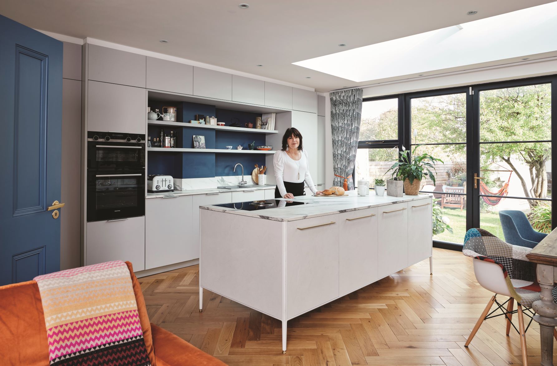
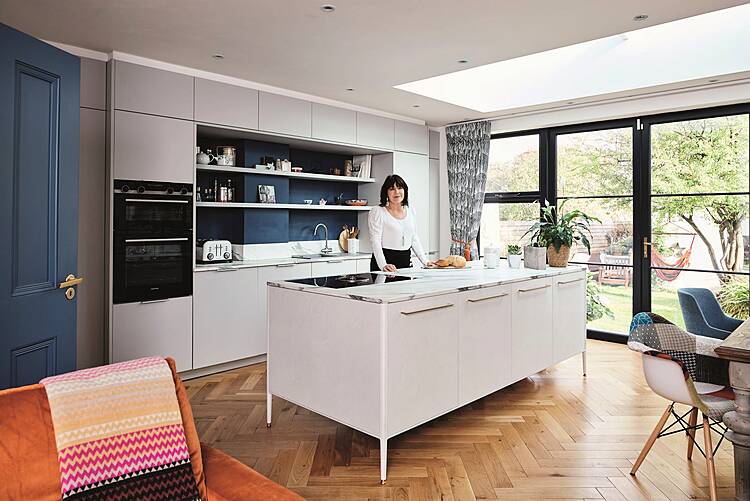
Serena wanted the kitchen to be really practical, clean and simple, with plenty of storage and workspace, she opted for a large freestanding central island and a bank of floor to ceiling fitted cabinets with flush mounted appliances. The kitchen was supplied by lomi.ie The door and back wall are painted in Priory Wall by colourtrend.ie
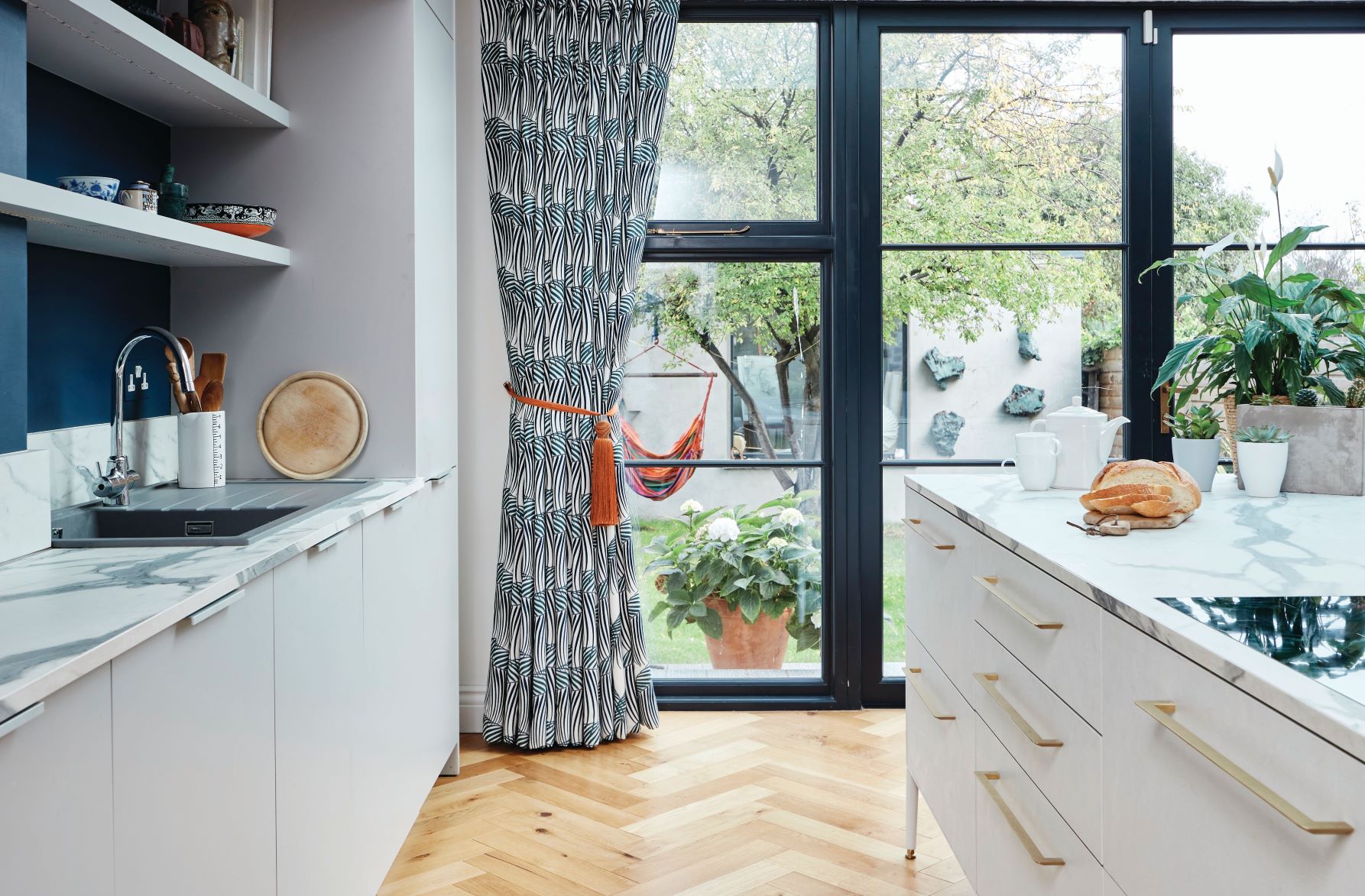
The newly built open plan kitchen dining live area features a large roof light, supplied by foldingdoors.ie, and floor to ceiling glass doors, supplied by kellswindows.com, ensuring this space is flooded with has much natural light as possible, The introduction of striking herringbone flooring, supplied by keenm.ie, keeps the look on trend and introduces texture and warmth to the scheme.
Serena bought the property three years ago, it originally had a small dark galley kitchen and a separate dining room to the back of the house which she decided to knock down, with the key objective of adding an extension and utilizing as much glazing as possible in order to create a comfortable, spacious, light filled living, kitchen space, which opened up onto the garden. ‘I have always hankered after a big family functionable kitchen, with plenty of space to entertain family and friends,’ says Serena, who literally camped out in the front room while all the construction work was going on. ‘I decided, taking my budget into account and the fact I wasn’t doing any major work to the bedrooms or the front room that I could live in the house. I had a little camping gas stove and a kettle which I survived on for six months. I created a temporary office in one of the bedrooms and ran three large scale projects at the same time. I now know the meaning of “if you want something done ask a busy person” laughs Serena. The money she saved, from not renting, was put towards fitting a really good quality kitchen with high end appliances as well as the finishing touches in terms of soft furnishings.
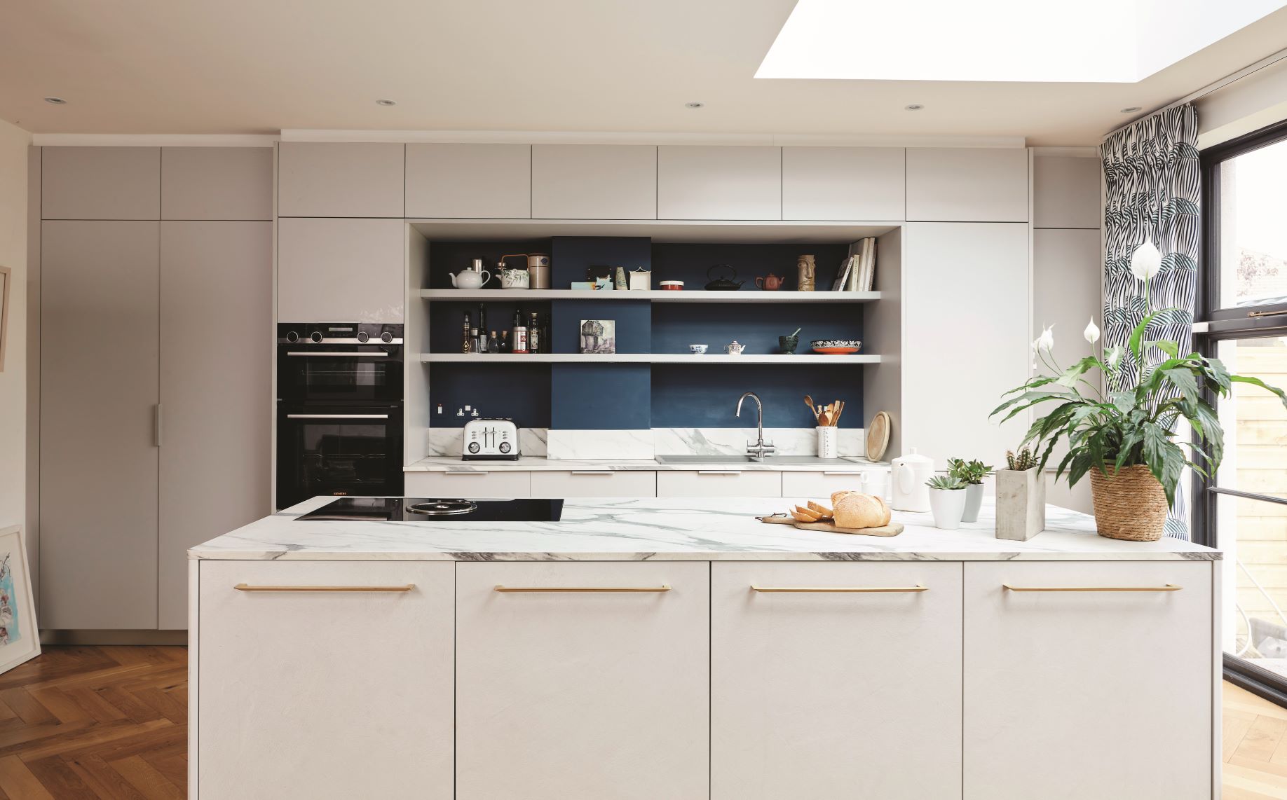
The work took approximately two years to be completed, which included selecting all the soft furnishings, to the art on the walls. ‘The design for the interiors happened almost unconsciously, I focused, as I do with my projects, on the character of the client, their lifestyle and the character of the building, so this really determined the style it should be,’ explains Serena.
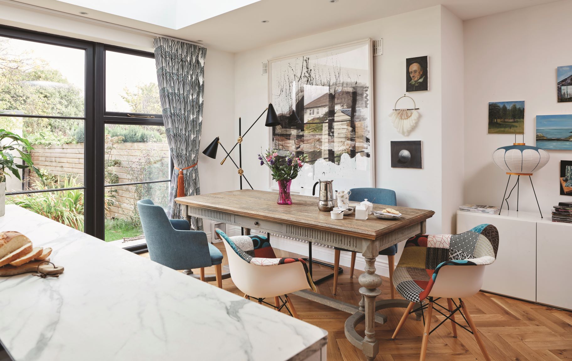
Pops of colour are introduced into this neutral palette with Serena’s artwork and selection of mismatched upholstered chairs, that she has gathered over the years, the patchwork chairs came from Amazon, for similar try zinzan.ie, and the dining table is stocked and sold by kittinteriors.com. The curtains are made up in a Sanderson fabric, Manila Embroidery Indigo 236778. sandersondesigngroup.com
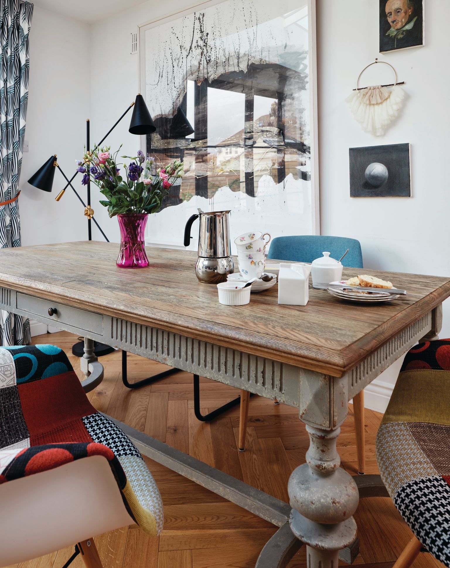
The majority of the house is painted white, with a subtle use of blue, cleverly introduced on the doors and on the back wall behind the shelving in the kitchen. The front room is painted in a deep blue, ‘my sitting room is my one dark room, it’s a sunny room so you get the light during the day and at night it’s wonderfully moody and really cosy, especially when the fire is lit. I was careful to keep the open fireplace and restore it using handmade tiles in keeping with the period of the property.’ Serena wanted the perfect canvas for all her wall art, so was careful in considering her choice of paint colours. ‘I have a great interest in art and run an art practice alongside my interior design practice, so most of the pieces are painted by me in my garden studio. I specially designed it to maximise the northern light, it’s a haven from the outside world, particularly at this moment in time, a space I also use to create schemes for my clients,’ she explains.
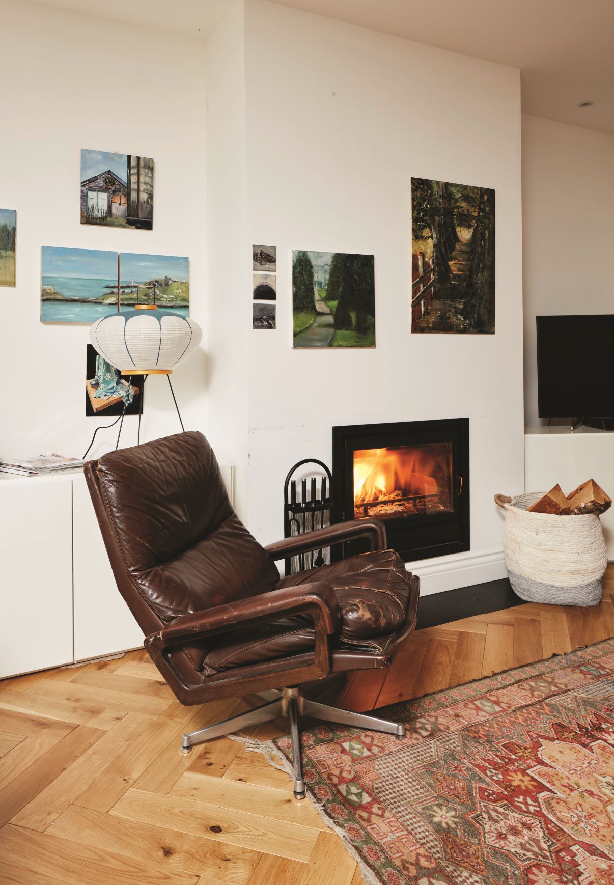
A vintage leather chair sits comfortably by the newly fitted stove, supplied by lamartine.ie, ‘I put a stove in this space as the room is a big space to heat and I wanted to make sure it was nice and warm in the winter,’ explains Serena.
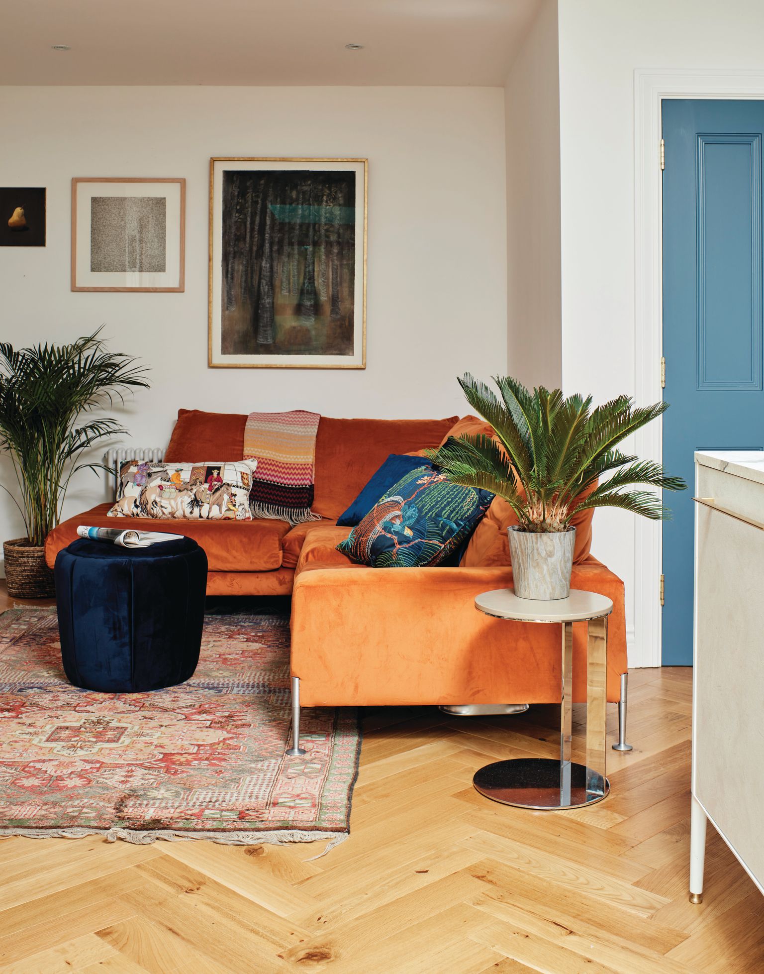
A comfy sofa, that Serena has had for years provides the perfect spot to relax and unwind. The plants, rug, cushions and throw complete the cosy vibe.
Serena definitely achieved her ambition of creating a light filled home. ‘I wake up every morning in this house, open the curtains, to be greeted by ambient light, winter and summer, I think everyone whether consciously or not is always chasing the light, it makes us feel good and improves our mood. Every space in this house is lovely and bright, even my landing has natural light pouring into it, the house is now a real joy to be in,’ concludes Serena.
To contact Serena about a one-one consultation, which she can do online @kittinteriors.com
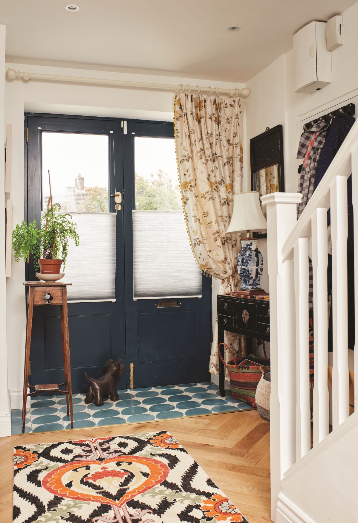
The entrance hall with the double half glazed doors is lovely and bright and allows natural light to flow from the front of the house through to the new extension. The console table, lamp and rug are supplied by kittinteriors.com. The tiles are supplied by marrakechdesign.se.
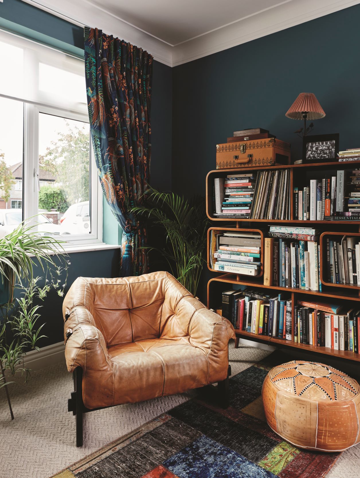
‘There is a wonderful company pieces.ie that have a great selection of mid century furniture, this bookcase was so unique I just had to have it, I knew I had the perfect spot for it,’ explains Serena.
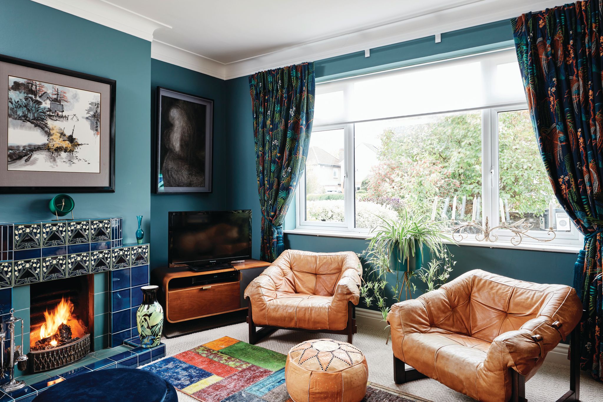
One of Serena’s proudest achievements was converting the little uninteresting 1960’d fireplace into a real focal point, ‘I sourced a wonderful German company, golemtile-baukeramik.de, who hand make mid century tiles for fireplaces like this, it adds that extra bit of visual interest to the room,’ says Serena. The room is painted in Prussian, by Zoffany. Serena has had the leather chairs for years they were a chance online find. The curtains are made up in Rainforest Embroidery, Tropical Night, 236778, by Sanderson.
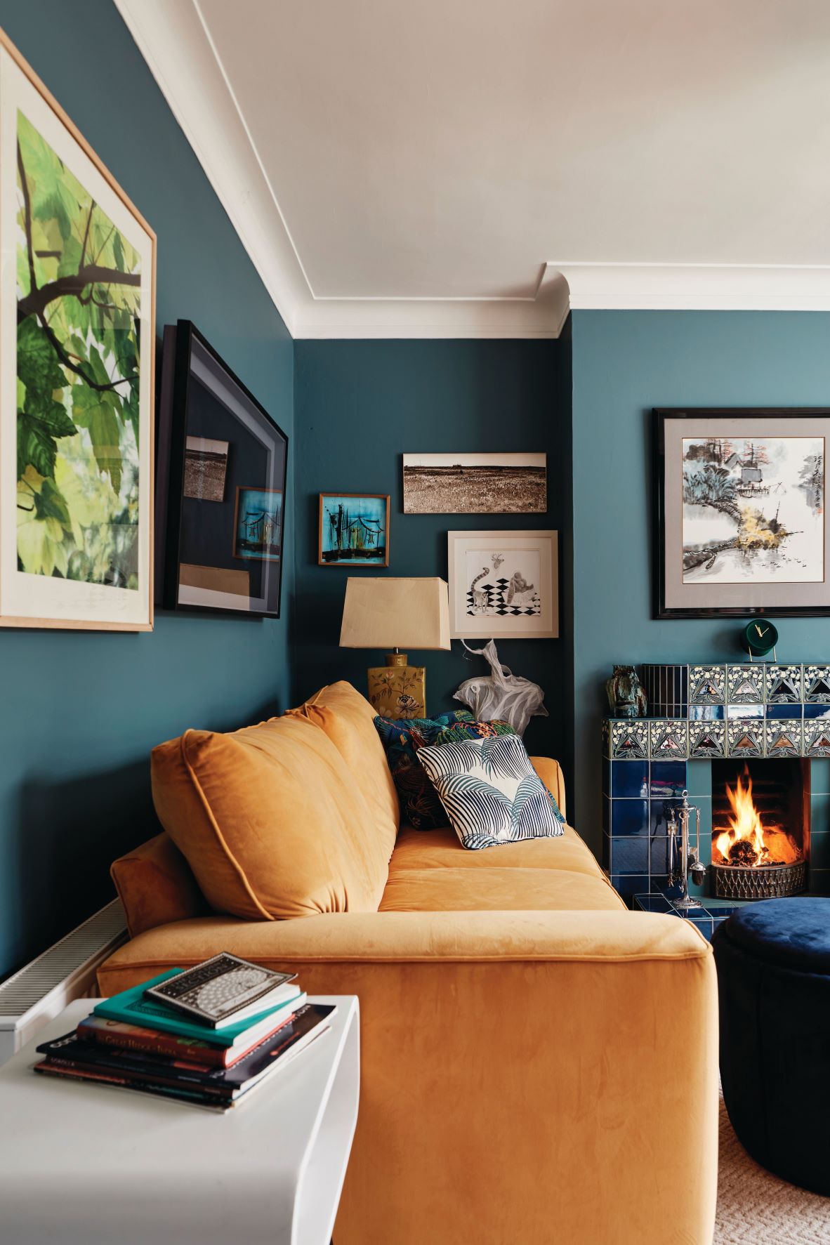
Serena had her existing old sofa upholstered through her own company in a rich velvet fabric from GP & J Baker. ‘I wanted something that would contrast beautifully with the paint colour and this ticked all the boxes,’ says Serena.
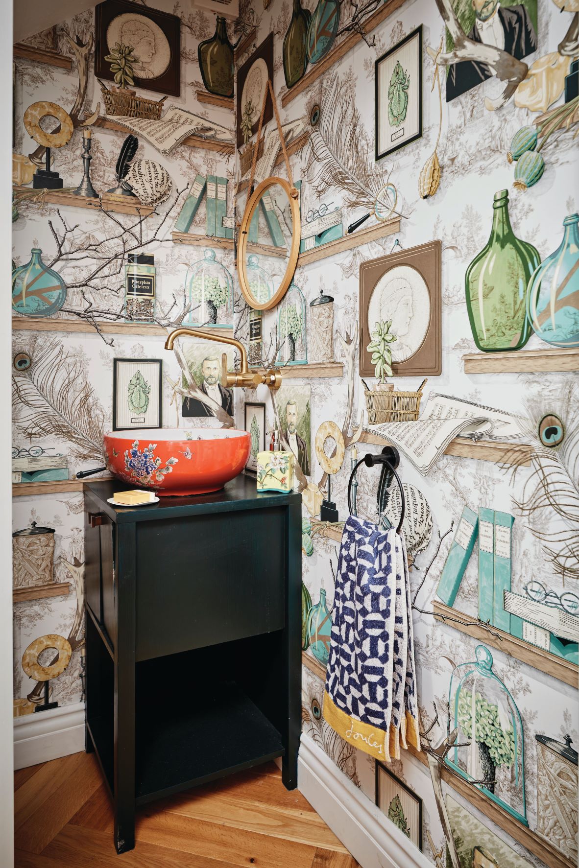
‘The downstairs cloakroom originally opened up into the old kitchen which wasn’t very practical, one of the carpenters suggested closing this off and making a new entrance in the hall, which worked a dream,’ says Serena. The room is wallpapered in a Jane Churchill paper and the sink was found on Amazon.
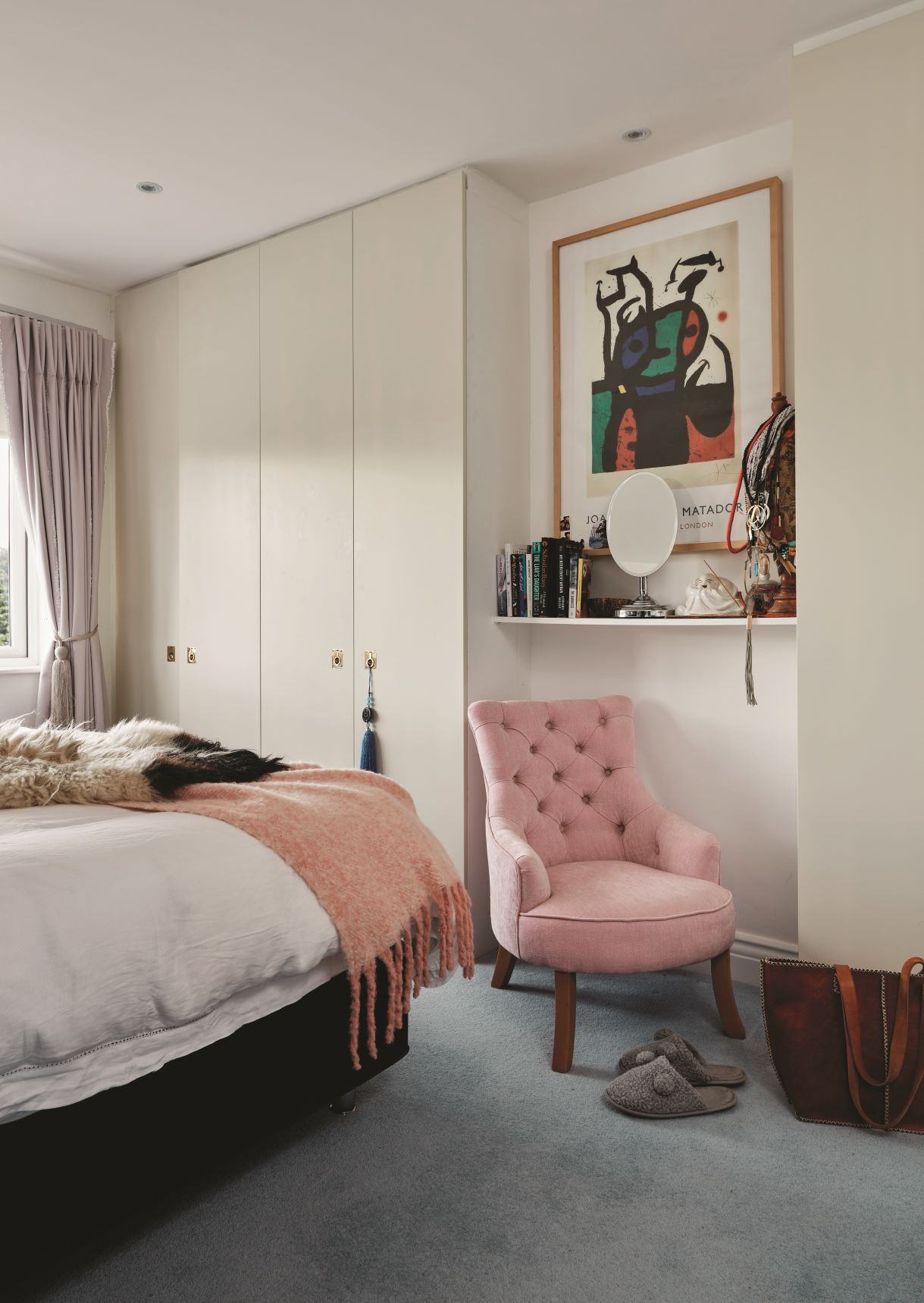
Serena kept the look pared back in the master bedroom and by layering throws, from tkmaxx.com, she has introduced texture and pattern with her choice of cushions made up in a fabric from stylelibrary.com The headboard was designed and made up by kittinteriors.com.
Touches of pink introduce a calming feminine look, the pink chair was designed by Serena it is based on the design of an original slipper chair.
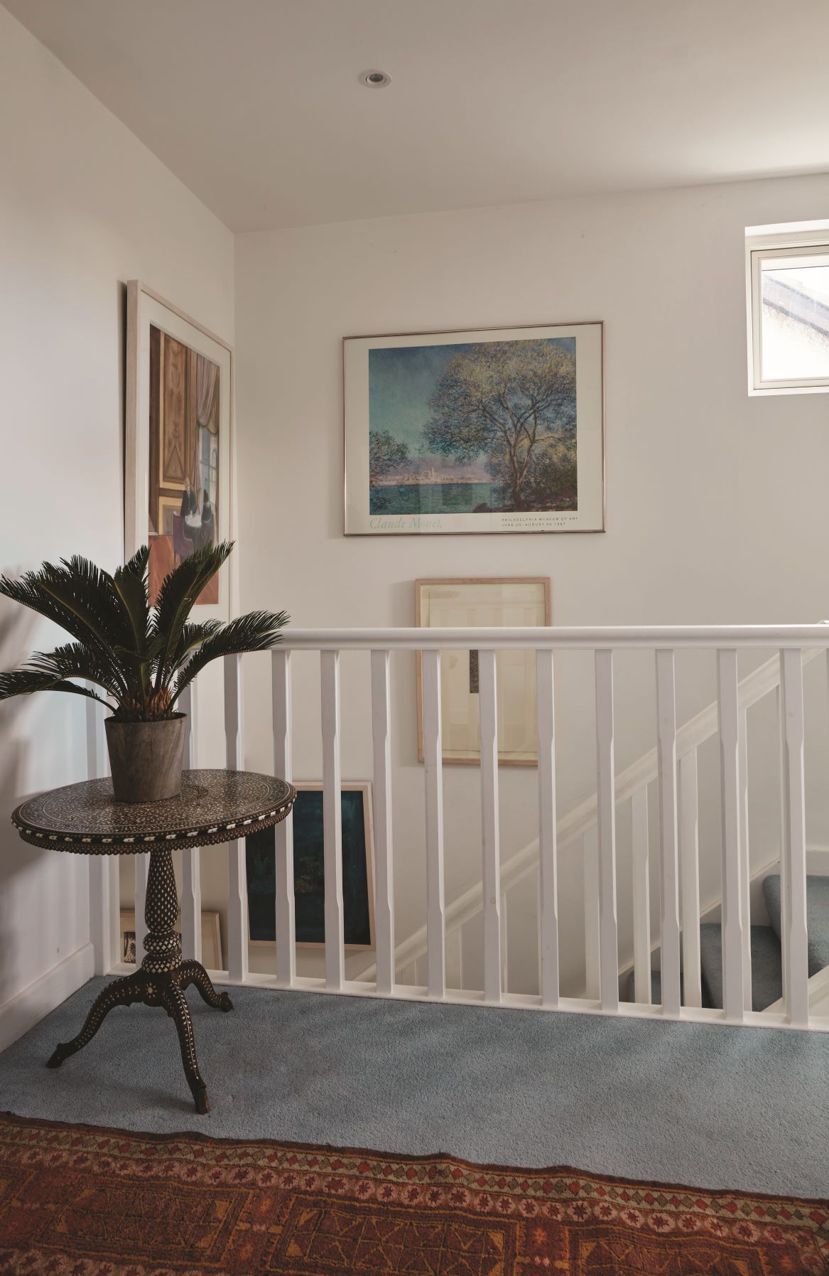
Serena loves her spacious bright landing, ‘if you think a large landing is a waste of space I have to disagree, it makes the whole upstairs feel bright and uncluttered, it gives me great pleasure standing in this light filled space particularly first thing in the morning,’ says Serena. The carpet was supplied by mattbritton.ie and Serena picked up the runner on one of her trips to Egypt. The table was an auction find.
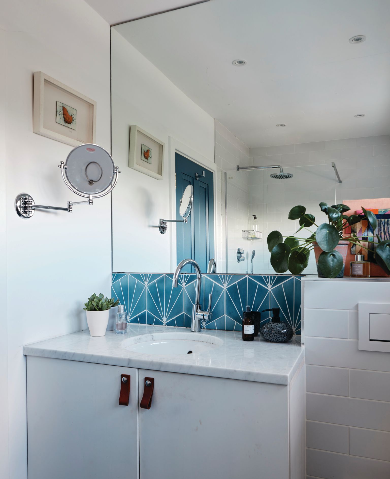
The large mirror in the bathroom makes the space feel spacious fresh and bright, Serena designed the vanity unit and had it made up by franeywoodconcepts.ie
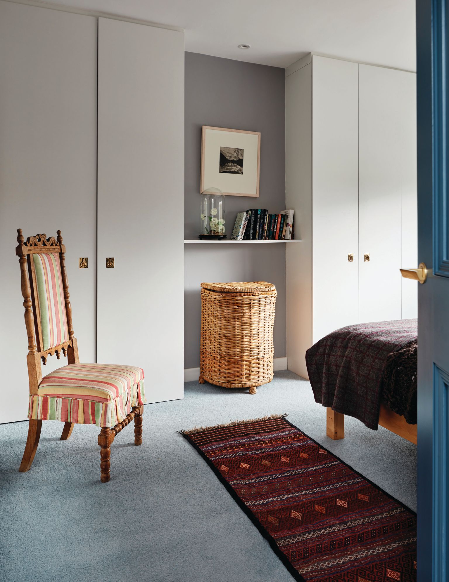
Wanting to keep the bedrooms clutter free and practical Serena designed fitted wardrobes that she had bespoke made by franeywoodconcepts.ie The antique chair, an auction find, was re-upholstered by Serena and the runner was picked on her travels.
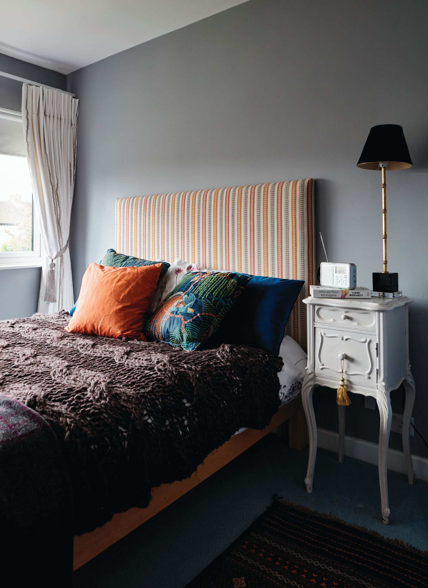
Serena has introduced accents of orange with a striped headboard from kittinteriors.com and a silk orange cushion a chance find in tkmaxx.com. The cosy chunky knit throw from avoca.com give this room a welcoming and comfy vibe.
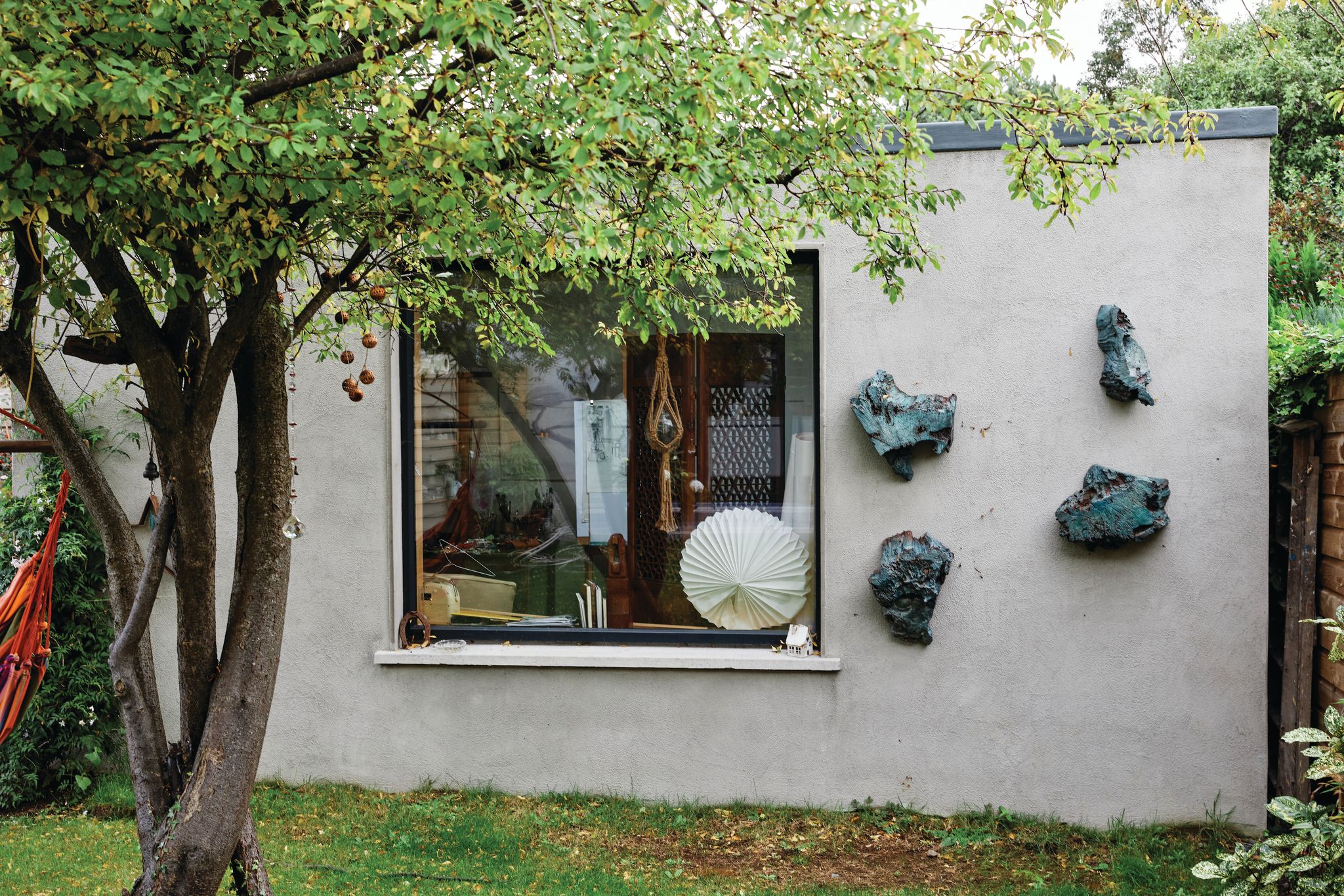
‘My self contained studio is a godsend particularly during lockdowns, it has given me an extra space I can retreat to and indulge my creative juices. I’m a mixed media artist. my practice is investigative and I try to create tension between the viewer and the artist,’ explains Serena.
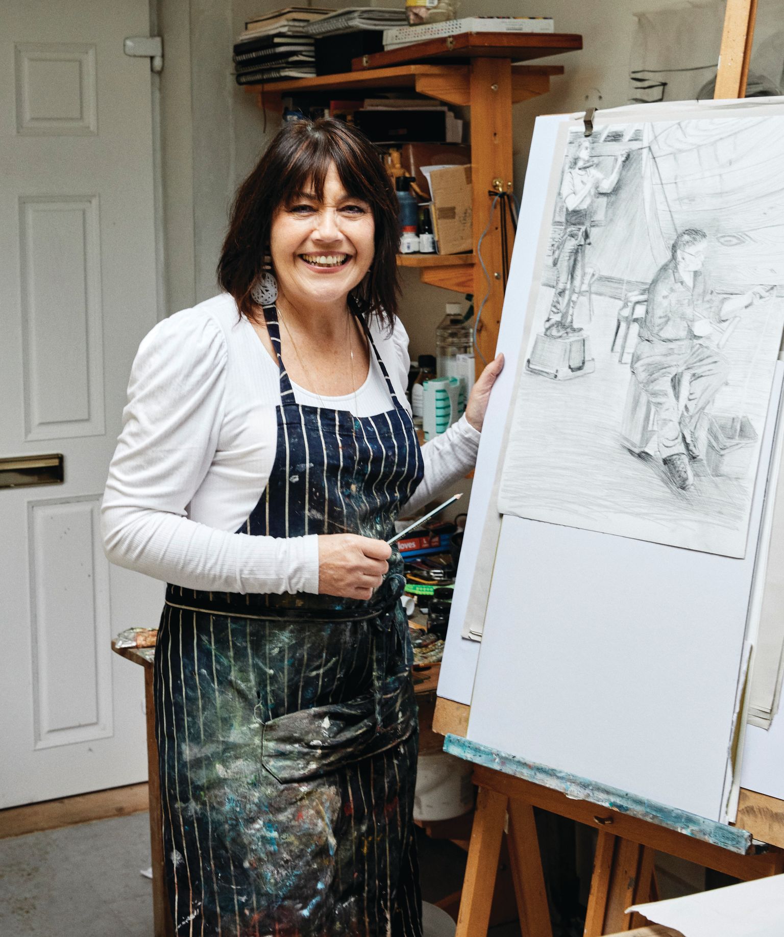
DESIGN ADVICE FROM SERENA
- Designing interiors is like putting together an outfit. Choose one big ticket item and accessorize around this. So if you are going to invest in a large rug or piece of art work out your colours and style from that.
- A good designer always listens to the remit and desires of the client and their lifestyle, ie. if they have children, a pet etc.. and will develop a scheme around their aspirations and budget.
- Try not to latch on a particular style too much, be it modern, classic, traditional etc., as the building and your lifestyle will have a big impact on the final look. Above all it must have a stamp of the owner’s personality to make it an individual space.
- Don’t be afraid to mix the old with the new, vintage pieces with modern artwork in a minimalistic or period setting always work a treat.
- The use of accessories, such as cushions, prints and lamps are not too expensive and they can be interchanged throughout the house at different times of the year to give each area an uplift.
- There is loads of inspiration out there. Look to Pinterest and Instagram and interior magazines for inspiration, create boards with your favourite ideas or to go to stores, this will make the job easier particularly when you are sourcing products for your ideal end result.
Photography Philip Lauterbach
Words and styling Penny Crawford-Collins


