From painting out everything magnolia in order to achieve the perfect neutral backdrop to buying a job lot of tiles on sale - and then finding that the local chipper have picked the same ones - there are so many easy to avoid pitfalls that any of us can fall into. We’ve picked some of the most common design mistakes we've seen in lockdown, and asked the interior design community on ways to avoid them.
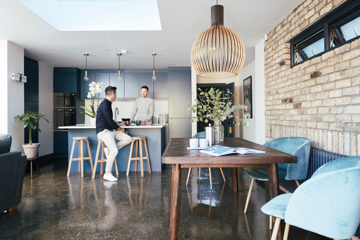 Blogger Darren Heaney at home making plans for his next project
PUTTING A RANDOM FEATURE WALL IN 'TO ADD CHARACTER'
Whether it's a supersized mural, wood panelling or a punchy paint colour with a gallery of pictures, all houses deserve some fun feature walls. But the problem lies when your loudly patterned 1970s wallpaper or bright mustard wall looks stark and bare against plain floors or other neutral furnishings.
“In my last house, I thought I was completely on trend by painting a single wall in my kitchen in an aubergine colour,” says interiors blogger Darran Heaney” It was a horrendous colour and it was all anyone could see when they walked into the kitchen. I also did a floral wallpaper feature chimney breast at the time. It just didn’t tie in with anything else in the house and was an eyesore to anyone who came into the room.”
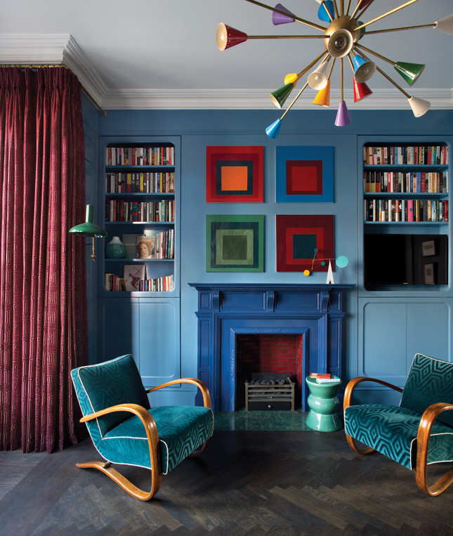 Think of a feature wall as a canvas to make other details stand out, such as a collection of prints, mirrors or floating shelves or even as a backdrop again its a fireplace. This is a Roisin Lafferty design showing how an art and books wall over a fireplace can create a beautiful focal point
NOT SIZING CORRECTLY AND BUYING ON IMPULSE
From a rug that is too small to zone a dining space to a ofa that simply overwhelms your living room, furniture that is bought without sizing first is a definite no-no.
“Like with all good design you need a plan in place about everything you buy or you will simply end up with a whole lot of bits and bobs for a room without any particular style in mind,” says Galway based Dee Noonan of Yellow Gate Design, “It is all such a waste of time and money. Better to just be patient and get it right from the outset.”
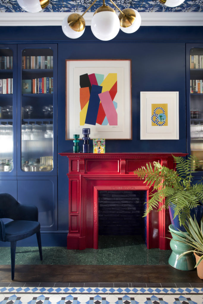 Built-in bookcases and wardrobes are worth investigating from the outset as they are often mistakenly added as an afterthought. With a really small or really large space it can be worth getting a few pieces made-to-measure so that you can really get the proportions right. Design by Kingston Lafferty. Image: Barbara Corsico
PLAYING IT TOO SAFE
We all know the feeling. You’ve just moved into a new place or need to re-decorate where you currently live and you’re thinking that if you paint everything out in a neutral colour and pick furnishings that will stand the test of time, you’ll avoid making wasting any money on something you will hate in a few years time. Sound familiar? Well apparently one of the most common mistakes that interior designers see is when people play it too safe and layer neutral upon neutral.
“I hear people say a lot “I’ll get sick of it after a few years,” says interior architect Ruth McGahey at House of Goose Studio in Meath, “But honestly, you’ll get sick of it much faster if you don’t choose the piece you absolutely adore. People’s personalities need to be layered through their home, that is what makes a space most interesting.”
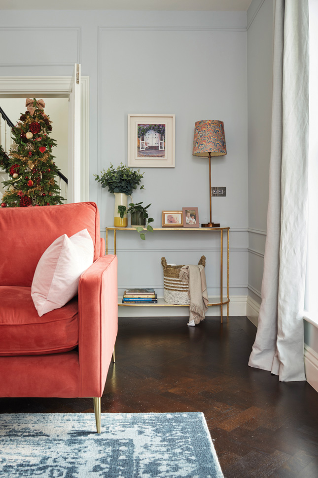 Think about mixing up a scheme by introducing colours and textures that work together to feel warm and characterful. This is a shot of Ruth McGahey's own Meath house renovation which was previously featured in the magazine and on the website. To see more of her house click here
ONLY FOOLS RUSH IN
Another common problem is doing things in such a rush that you end up making mistakes. Often homeowners can feel under enormous urgency from their builders to make quick decisions and which can result in all sorts of things going wrong.
“Everyone wants everything now and there is definitely an impatience in getting things done," says Roisin Lafferty, creative director of Kingston Lafferty Design. “However, rushing things and cutting corners is only ever for a short term gain. Most people investing in improving their homes have worked long and hard to save for this. It is so important to remain focussed but be patient.”
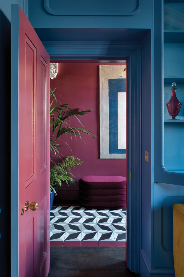 "Take your time, follow a process and allow contingency for both time and budget. It is worth finding good tradesmen and builders to do the work and waiting for their availability to get the job done," says designer Roisin Lafferty. Image: Barbara Corsico
Any of those sound familiar? Here are a few other first hand experiences from the instagram community...
“I suppose my biggest design crime was painting my whole house magnolia and when I first moved in. I thought it was a good idea to “freshen the space” but I then spent the next five years eradicating the magnolia.” - Blogger Catherine Dainty Dress Diaries
“So many mistakes. But the worst was some really ugly, dark brown, rectangular bathroom tiles that were on special offer and the salesperson was pushing us to take them (wonder why?!). I was pregnant and hungry and really wanted to sit down so I just said, “great we’ll take them. Let’s have lunch!”. That was a lunch I regretted for a long time, particularly as I realised they were the same tiles as the local chipper. I bet brown features in a lot of people’s interiors regrets.”- Jennifer O’ Connell Irish Times journalist
“Ohhhh not realising about the extractor fan ducting so ruining a nice sleek kitchen because we could have studded out a wall to hide it but didn’t.” Interiors instagrammer Sam Minshaw, justafewchanges
"Definitely putting sliding doors into our loft extension rather than wooden sash windows and wooden framed French doors that would have been more in keeping with the house. I hate those plasticky sliding doors every day! We also have a patio that is too small because I wanted to save a pear tree from being cut down but the patio is now just a bit too small to sit out on! The pear tree is doing well though!" - Stylist emilywheeler.interiors
"I absolutely regret painting all the woodwork including a bay sash window in a dark colour and then hating it and having to repaint. " - Lifestyle blogger Emma Harris at aquietstyle
"Flooring for me was my biggest mistake. Wish I had gone with pale wooden boards instead of dark and also spent out on expensive carpets! Cheap ones are just no good! " - Instagram homemaker Rosemary Bickers at home_with_rose
“Big mistakes are what I call the ‘vanilla’ overmatching, style of decorating!! I call it the ‘lifted out the catalogue’ look. Tasteful curtains matching the cushions, with a co-ordinating throw and the odd bland accessory, thrown in, is all very high street and not reflecting the owners personality at all.”- Interiors blogger Sarah from Retwigged
“My pet interior hates? Upside down ‘nipple’ lampshades and bathrooms tiled everywhere so that they look like the interior of a chipper - oh and tile borders, I cant cope with!’- Barbara Taylor from Living and Beauty


