Fashion designer Laura Chambers’ hallway makeover very definitely is an entrance to impress
Photography: Philip Lauterbach
Project: Part of a larger home extension and renovation project, Laura Chambers’ hallway went from mini to maxi. Hating the beige shades it was decorated in, she hired interior designer Elaine Verdon to bring it to life so that it’d finally be the entryway into her home that reflected her – and her family’s personalities.
Homeowners: Laura Chambers, husband Viv, children Emma and Evan and dog Bailey.
Hallway makeover budget: €3,500
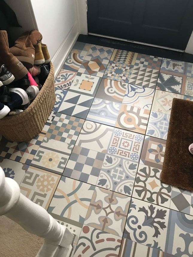
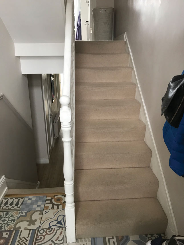
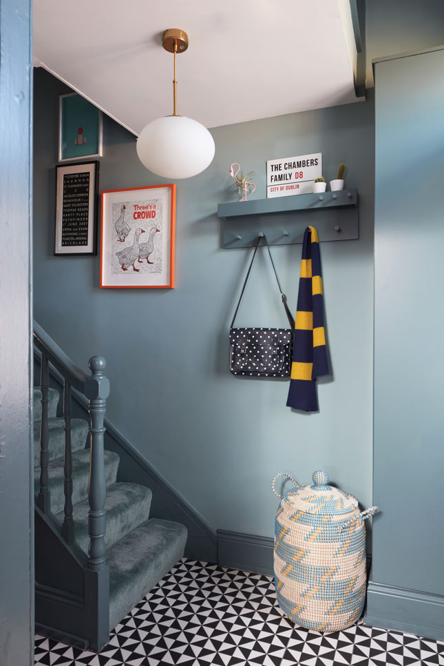
What they did: Existing mosaic tiles were ripped up, stair carpet removed and the beige was banished in favour of fresh coats of dark blue paintwork. All-in-all, it took around three weeks to transform the space.
Before
After
Dark foundations and acid-bright colour contrasts: that’s the basis of Laura Chambers’ eponymous, luxury Irish cashmere brand (Laura-chambers.com). It’s no surprise her interior décor style follows suit – NCAD graduate Laura studied fashion; colour and contrast are hardwired for her.
“Each collection features bold, bright, distinctive colours,” she says. “At its core, it’s about feminine, solid pieces which flirt gently with street and retro vibes. I design what I would want to wear myself.”
Laura’s husband Viv has often commented that her pieces match their home – “I think this season he would be right,” she muses. “My love of fashion totally fuels my interior style.”
The family – Laura, husband Viv, children Emma (11), Evan (8), and Bailey, the Cavachon – bought their classic Dublin 8 Victorian villa in 2014. “It needed a lot of work. It was a one-bed, and while it was livable it was grim and really too small for all of us,” she recalls. The couple hired Melted Snow Architects (Meltedsnow.net) who came up with a plan that took the house to a three-bed with a converted loft-style attic, which Laura uses as an office.
In total, the renovation took four months and involved demolishing an existing extension, adding a new courtyard with a large extended kitchen and chill-out area and re-configuring the layout.
The work also opened up what had been previously a small entrance hall into a long entryway with sightlines through the entire home. “It became a really big feature of the house,” she acknowledges.
“However, having spent months making decisions I couldn't decide what paints to choose so I just told the painters to paint the walls in Farrow & Ball’s Skimming Stone and we put down a nice-but-bland beige carpet, and God-awful mosaic tiles – which I hated from day one, but we just didn't have the budget to change them,” Laura says. “I really disliked the hall. It was literally a means to an end – it just never reflected my style. It was so safe; boring.”
After deciding she couldn’t “spend another winter in the house in a haze of beige,” Laura took to Instagram and discovered interior designer Elaine Verdon of Leo + Cici (Leoandcici.ie). “Elaine has such a distinct style and I felt a style affinity there so sent her a DM,” she says. An initial consultation involved a walking tour of the house where Elaine asked Laura questions about what she did and didn’t like in each space – “What I felt was missing and what I hoped to achieve from each room.”
Elaine’s influence can be seen throughout this house, “but I told her while much of the house needed a blast of colour I really strongly disliked the hall,” Laura states. “I felt it was the first thing people see when I opened the door, but it just felt so bland and boring.”
Elaine’s influence can be seen throughout this house, “but I told her while much of the house needed a blast of colour I really strongly disliked the hall,” Laura states. “I felt it was the first thing people see when I opened the door, but it just felt so bland and boring.”
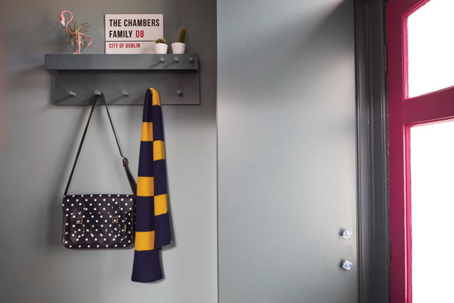
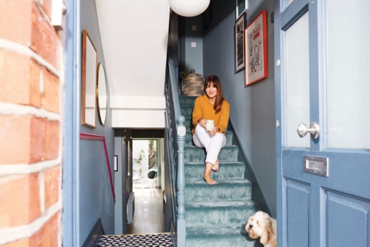
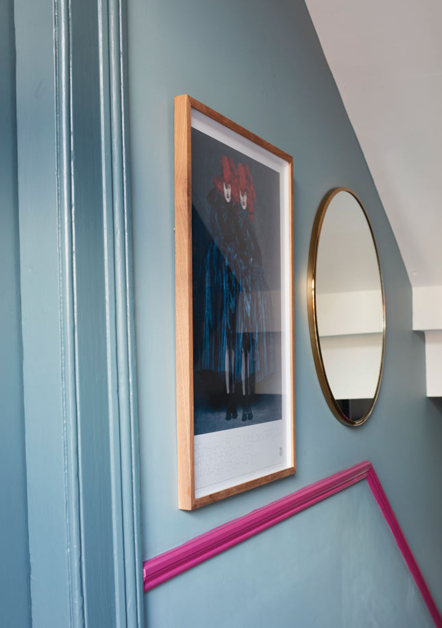
It took Laura a little while to come around to Elaine’s presentation of ‘Joyful Maximalism’ for the interior scheme. “I was really surprised by all the dark paints she wanted to use, and this would take time for me to adjust,” she recalls. Adjust she did: the hallway is now painted the striking Oval Room Blue by Farrow & Ball with a hot pink accent – Laura’s favourite shade – on the dado, courtesy of Fleetwood’s Exuberant Pink.
“I kept thinking that I love bright colours, not dark, but now I see that the beauty of the dark colours is that all the bright colours you team with them pop so much,” she enthuses.
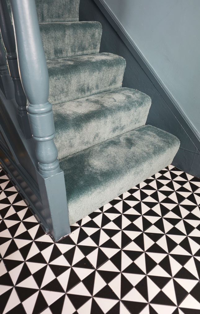
“I just love the hall now. It’s gone from being my least favourite part of the house to my favourite,” Laura says. “I’m delighted when I open the door now, as it's a reflection of our family. When I look down the hall and see the check tiles, hot pink front door, dark green walls, luscious green carpet, neon light and all the books and artwork it feels like a warm, fun place to be –¬ and not just a functional space.”
Sourcebook
- Wall Paint: Oval Room Blue by Farrow & Ball; Farrow-ball.com
- Woodwork: Inchyra Blue by Farrow & Ball; Farrow-ball.com
- Dado Rail: Exuberant Pink by Fleetwood, Fleetwood.ie
- Stair Carpet: Lano Celadon 661; Dublincarpetsdirect.ie
- Floor Tiles: Oxford Black Base from Tile Merchant, Tilemerchant.ie
- Ceiling Light: House Doctor Opal White Pendant at Hicken Lighting; Hickenlighting.com
- Chambers family sign: Notonthehighstreet.com
If you liked this you might also like: Hallway revamp: 4 ways to design an entrance that makes a statement


