There’s a particular wizardry that happens when you get a home renovation just right. For Aoife Delaney, the alchemy was simple. She loved the south Dublin locale she and her husband and kids Addison (4), and Maximilian (2), bought their home in, for starters. The house was also just the right size for their growing family. While it needed significant work, which included the roof and bay windows, they knew they wouldn't have to undertake additional building works for an extension.
The one bum note? “It was very much run down, really just a shell of a house,” recalls Aoife. “It took a special eye to see its potential, so we knew if we could get the right team together, we’d be able to create a really special space.”
Call in the decorators!
The solution came in the form of an expert design team who were the secret sauce in this particular potion. “Eclectic style and use of colour was definitely something that attracted us to Kingston Lafferty Design ” Aoife says, of the couple’s decision to appoint the award-winning Irish interior architecture and design agency.
“A lot of our friends were embarking on similar home renovation projects and going for safer colour and design choices. While gorgeous, we felt it didn’t reflect our own ideas – we were ready to do something a little unusual.”
Unusual is Róisín Lafferty’s raison d'être, and Aoife is here for it. “We’d seen some of the beautiful house renovations she’s done in House and Home over the years and we started following her on Instagram. Her use of colour is particularly inspiring – she has a real gift,” Aoife says.
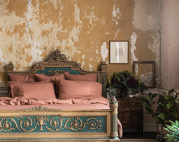
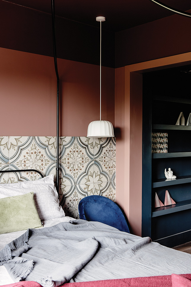 The dusky pink paint work from Fleetwood Paints anchors the look and feel of the master bedroom. The colours are Mahogany Rose and Marron. The ceiling lights are by New Works Copenhagen from Viaduct
Planning the Budget
When it comes to interior design services, you tend to think of that dollar sign emoji with the wings – so cost has to have been a factor, surely?
“Budget was definitely important,” Aoife agrees. “The wonderful thing about Roisin and her team was that while they do very high-spend projects, they were able to come up with, and execute amazing concepts that came in within our budget. Her creativity was particularly fantastic in that sense.”
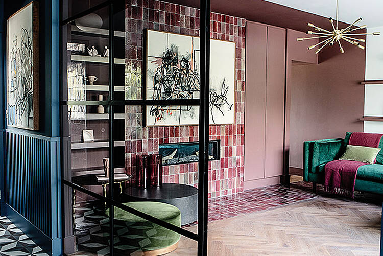
In the finished project, Róisín and team have used relatively inexpensive finishes creatively: liberal use of colour-blocked paint, tiles, mirrors and statement lighting plus furniture from affordable, trend-led retailers such as Made.com, Habitat, DFS and Cult Furniture. The result is a cocooning finish that looks high-end.
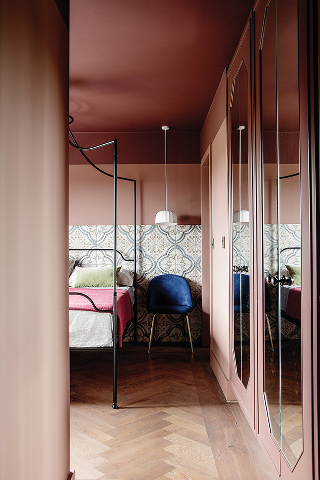 The four poster bed is the Beaumont from The White Company. The tiles which act are like a visual headboard are the Nijar Glazed range from Best Tile . Custom wardrobes are painted in the same colour as the walls, and inside are painted in Dark Slate from Fleetwood's Pantone range.
Complete transformation
But to get to that point, there was quite a lot to do: “The house had to be completely redone: insulation, windows, plumbing and electrics, the indoor and outdoor spaces, the layout of the interior – walls were knocked down, and rooms moved around,” Aoife recalls.
The couple had previously lived in a fully-furnished rented house, only bringing with them their art collection and one piece of furniture: “A 12-foot Mara wood table bought on our honeymoon in Sri Lanka,” Aoife says. “It’s not a small or discreet piece of furniture, but Róisín brought it into the kitchen design perfectly.”
Now in the house just over a year – “we moved in the week before Christmas 2018” - Aoife has the benefit of hindsight when she considers the project and looks at what they’ve achieved. “We could see the transformation happening during our on-site meetings, but nothing prepares you for the final move and walking from room to room, seeing everything flow so well,” she recalls. “We had no idea we would ever have such a well styled and colourful home. We are delighted with it!”
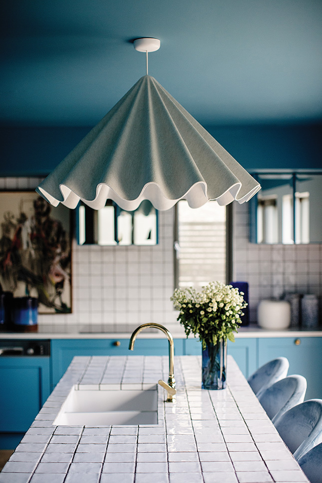 With that eye-popping tiled island centre stage, the kitchen-diner is a knock out. Tiles used are the Zelliges from Rocca Tiles . The units are from Blackrock Kitchens painted in Manitou Blue by Fleetwood. The bar stools are from Cult Furniture.
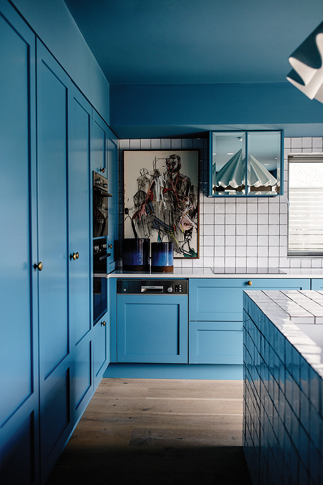 The soft statement light is the Menu Dancing Pendant Light from Nest.co.uk. On the floor are the Oudja glazed ceramic tiles from Best Tile
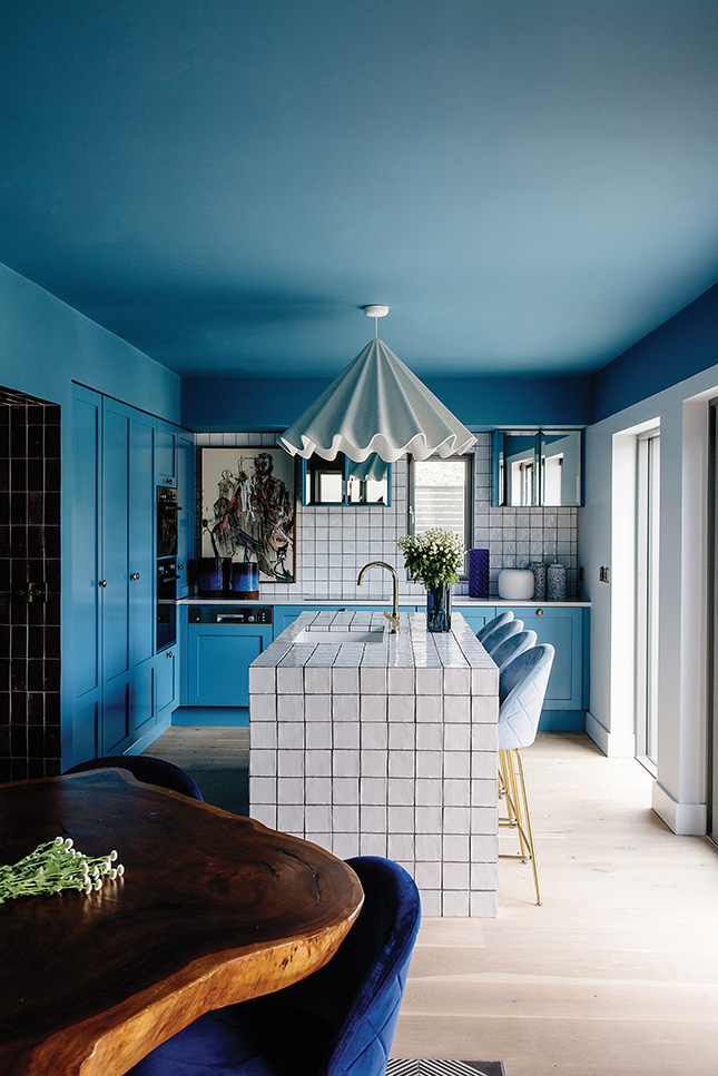 The couple's 12 foot Mara table was bought on their honeymoon in Sri Lanka and has been factored into the design beautifully


