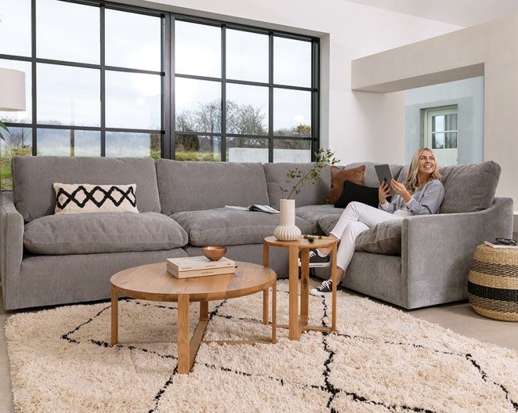
Ireland's top interiors experts talk their favourite lounging looks, and how to put these trends to work.
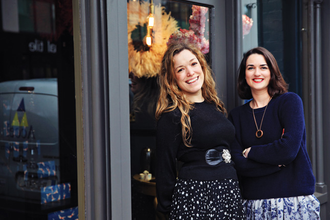
Sarah Drumm and Lisa Marconi of Dust.ie are a huge fan of brass and marble, and reckon it's here to stay.
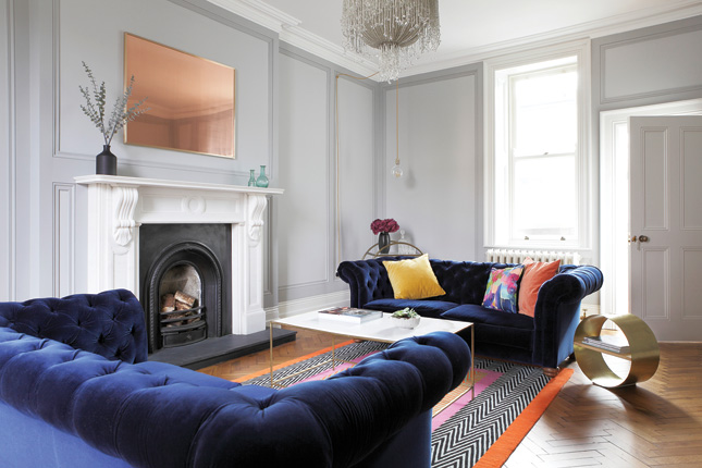
“Of all the spaces we've designed, this is one of our favourites. It was such a beautiful room to start with and it was lovely to be able to embrace the history of the room, while injecting some fun, modern elements into it. We embraced the theme of mixing old and new in every aspect of the room design. The Chesterfield sofas are a nod to the old, while the vibrant, blue velvet fabric and the bright, abstract scatter of cushions keeps them fresh and young. The chandelier is, itself, a nod to this theme, with its traditional shape but contemporary material of cascading beads. We wanted to steer away from the traditional ornate brass mirror over the fireplace, so instead, we designed a bespoke modern brass frame and replaced the more conventional mirrored glass, with highly polished copper sheeting. The rug anchors the whole room; the pattern, within it, mirrors the gorgeous parquet flooring and the vibrant colours tie in with the cushions.”
Dust's tips for styling your living room:
- Greenery or flowers are always essential; they bring a space to life
- Well-chosen coffee-table books are important, too. They reveal something about the person who lives there, and personalise the room
- Think about how your accessories tie together. The colours of these cushions were chosen to complement the rug in the room. It’s nice to mix patterns, as well, but you have to be careful with how you go about it
- A living room is one of the most important spaces in the house. It’s the room that, virtually every visitor sees, so make sure you add that ‘wow’ factor. Don’t be afraid to experiment – bring your personality into it, so people know it’s your space, when they visit
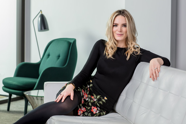
Interior Designer Suzie McAdam shies away from pastels and encourages us to embrace dark, bold tones that add character and charm.
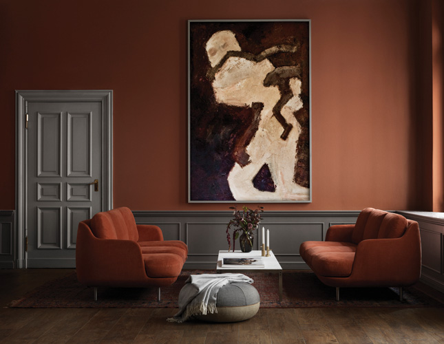
“I’m drawn to interiors that beautifully boast a striking and balanced sense of dynamism, proportion and colour. It takes confidence and practice to hone these attributes within an interior, and this living room has mastered all three. I particularly love the soulful and rich palette; it works so well in this room. It’s illuminated and brought to life, thanks to the classic detailing, large windows, and high ceilings. The colours here: terracotta, dark grey and maroon, are really on trend. Terracotta and peach tones, in particular. A lot of people will shy away from dark, bold tones, but my most impressive projects are full of character and style. They exude dark tones that are balanced and accented with lighter shades. It's easier to achieve a dynamic result with warm and darker tones, like terracotta, because you need a restricted palette and colour blocking. You don’t need more than one or two accent colours. White and brushed gold create a refined, yet edgy look. If I were to add to this decor, I'd add a white marble or glass side table with well-proportioned decorative pieces and accessories. I'd add a little more to the furniture with peach, cream and sage throws and cushions. As I always say ‘less is more’!”
Suzie's advice for creating the perfect lounging look:
- Take risks. A lot of people tend to play it safe, but I think going for that richer colour or stronger texture, makes your home much more interesting.
- Make sure your home reflects you. Your living room is so important, and you really want it to make an impression on your guests, so make sure its personal.
- My top three favourite places to shop for interiors are: RESIDE for furniture. I also really like Dust.ie, I think they have some really nice, interesting pieces, and for accessories, Article in the Powerscourt Shopping Centre is really good.
Related Cool and collected: Expert advice on starting and building your art collection

Diana Valentine, owner of Home-Lust.com reckons that creating a style for any room has a lot to do with phycology, and should be full of your own personality.
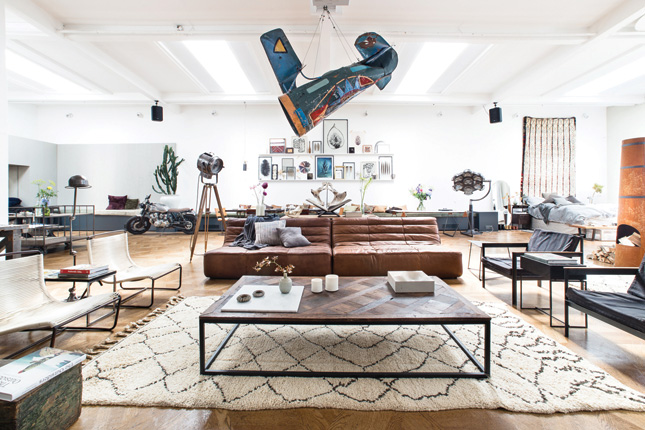
“Some of the best-styled interiors I’ve come across lately, outside decor magazines are created by a Dutch design agency called The Loft. They run a recurring conceptual pop-up store, devising seductive spaces that are both refined and highly functional. One of my favourite projects by The Loft is this penthouse studio that centres around a large living area decorated in a classic yet idiosyncratic style, which might be hard to classify, but I call it preppy minimalism. The focus here is on communal spatial arrangement, beautiful striking shapes and the use of natural materials like wood, leather, textiles and ceramics. I love the combination of classic mid-century style armchairs, and the playful, über-modern sofa. The vibe is relaxed, yet highly elegant. The industrial pieces work wonderfully well with the ethnic and eclectic touches, such as the Beni Ourain rug, the vintage travel trunk and handmade ceramics. It’s a dreamy, wanderlust-inducing room that invites you to relax, but also encourages you to plan your next trip; the suspended aeroplane is like a reminder to never stop exploring.”
Diana's top tip for designing your space is:
Don’t let the larger furniture pieces dictate the style of the room. Choose your sofas and armchairs in neutral colours and simple shapes, and go as big as the room allows. This space is for lounging, a playroom for adults, really, so bring in the element of comfort but steer clear of bold patterns or faddy designs for your seating.


