The latest project from Kingston Lafferty Design is a jewel-toned masterpiece, and we can all stand to learn a colour lesson or two from this period terraced redbrick home...
Photography: Barbara Corsico
Creating a new colour palette is no mean feat in an interiors landscape that often seems to skew between dark décor and Scandi minimalism, with not a lot in between. But the ever-inventive Roisin Lafferty, Founder and Creative Director of Dublin’s Kingston Lafferty Design, can always be relied on to come up with a fresh approach.
In this boxfresh residential project, she’s cultivated a colourful concept that has its roots in the homeowner’s art and objet collection, as well as her interest in travel. “We took influences from Italy and Marrakesh,” Roisin reveals about this period terraced redbrick project.
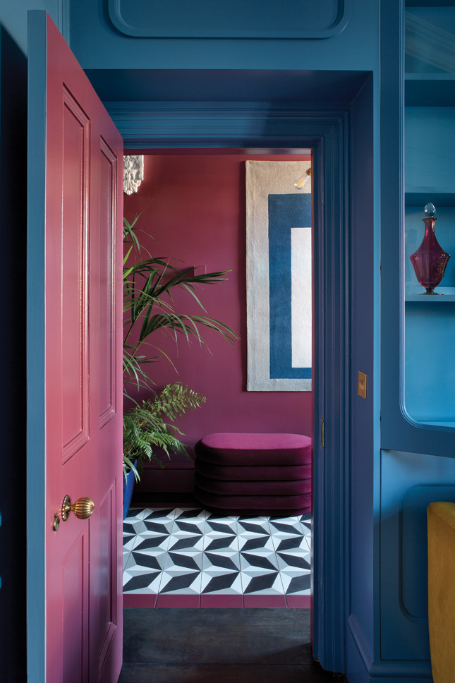
“It looks like a lot,” she says, “but it feels calm, it’s not shouty.” For those who are shy of using stronger shades, Roisin says paint is your first port of call.
“The thing is, when it’s paint, apart from hall, stairs and landing, it’s easy to paint a room yourself. Get samples, work out what atmosphere and you want to create – that’s really important,” she advises. “People feel more comfortable with fashion than interiors, so paint is the starting point.”
In this period terraced redbrick home, colour is used as both the clothes and the accessories – “It’s a jewellery box,” Roisin laughs. “The colours are all quite timeless, they’re not garish or sugary.” For interior inspiration and six tonal tricks to try, read on.
The house
House type: Victorian 3-storey period terraced redbrick with 4 bedrooms (one used as a study)
Location: Dublin 4
Size: 202 sq m
Owner: A professional woman who loves art, architecture and travel
Lesson #1: Create contrast
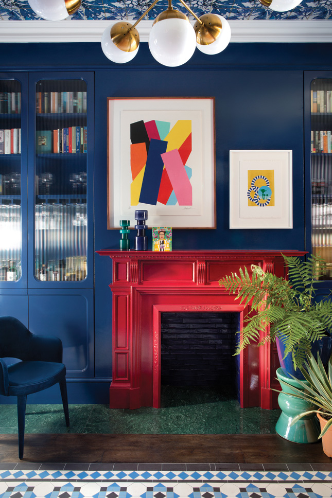
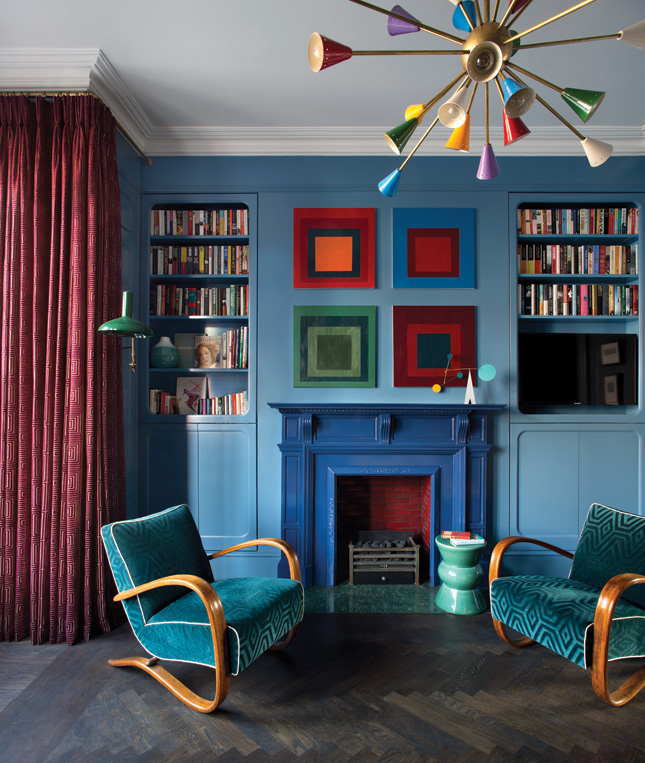
The easiest way to add impact is with colours that are opposing on the colour wheel – so think purple and yellow, green and pink, and red and blue – a particularly effective combination, used here to great effect.
Walls, woodwork and joinery are painted in Wynwood from Fleetwood’s Vogue Collection. Floor tiles from Original Style from Richardson Ceramics are inset into the parquet floor from Floor Design.
An extended hearth runs lengthwise from the fireplace and is created using green marble from Rocca Stone. Vintage-inspired ripple glass cabinets hide bespoke cocktail cabinets on either side of the hearth and above it hangs a print by Maser, a source of inspiration for the entire scheme.
Lesson #2: Blue and green should be seen
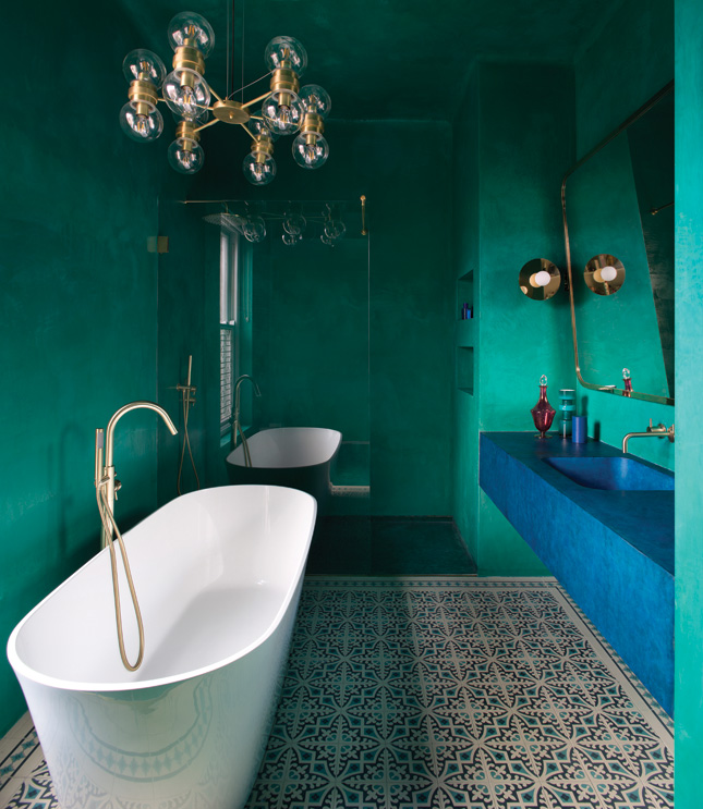
Forget the old maxim that blue and green should never be seen – that’s just for those who are afraid to rock the bold boat. In truth, this is a shade match that performs, and where better to try it than in a bathroom?
In the Moroccan-inspired en suite, polished plaster walls and ceilings from Stucco juxtapose with a monolithic concrete sink and vanity unit, custom-made by Concrete Design Studio, finished in a punchy blue hue.
Finishing touches are the wall lights are from Atelier Areti which flank a custom-designed brass mirror. Sanitaryware fittings are from Versatile Bathrooms. The chandelier is from Mullan Lighting.
Lesson #3: Keep it in the family
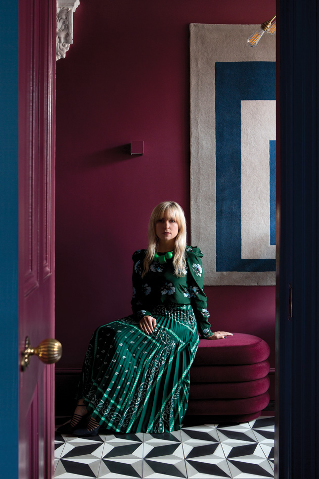
Learning to create harmonious schemes is tricky, but one tactic to try is to limit your palette within a colour family to create a result that works well from room-to-room.
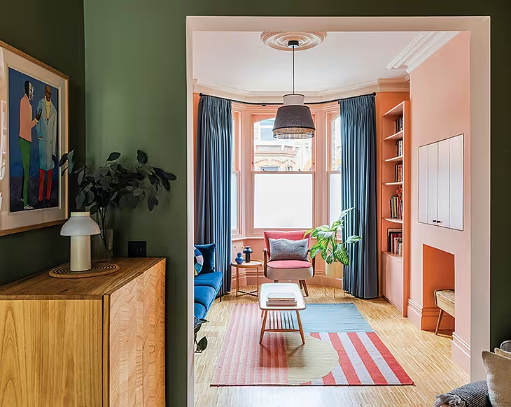
In this house, one of the key design challenges was for the colours to work when seen from the vantage point of other rooms. “The idea was to frame each space, so when you look in, they complement and flow. It’s almost like colour-blocking in different tones,” Roisin explains.
The combination of Fleetwood’s Copenhagen Blue in the sitting room and Aged Wine in the hall works visually because they’re right beside each other on the colour wheel, therefore tonally they’re analogous.
Lesson #4: Try it in tonal
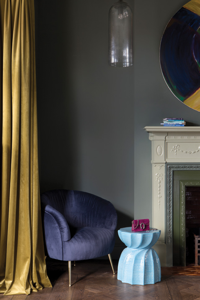
A bedroom has different requirements than social spaces and needs a more restful palette. Instead of the normal-formal, Roisin has gone for aged sage and blackened greens in the master suite, in a variety of shades across the same hue.
Walls are painted in Fleetwood’s Retreat. The green velvet curtains are by Designers Guild. Lighting is from Out There Interiors and the blue velvet chair is from Artemest. A trick to try is the paint treatment the team has given the fireplace: picked out in bands of complementary greens, it’s a standout.
Lesson #5: Bling it with brass
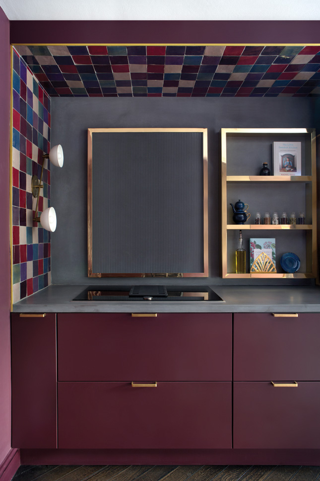
Not your average kitch sitch, one of the standout elements of this cooking space is the use of materials. Zellige tiles aside – which cocoon the units and cleverly mimic colours used throughout the house – the brass detailing adds a level of sophistication.
Both satin-finished and polished brass is used and we love the bespoke backsplash for the hob: designed by the Kingston Lafferty team, it’s made from ripple glass in a polished frame and offers both form and function.
Walls and cabinetry are painted in Fleetwood’s Plum Brown. Zellige tiles were sourced from Mosaic del Sur. The wall light is from Apparatus. Units were custom-made by Moore O’Gorman Joinery.
Lesson #6: Inside out
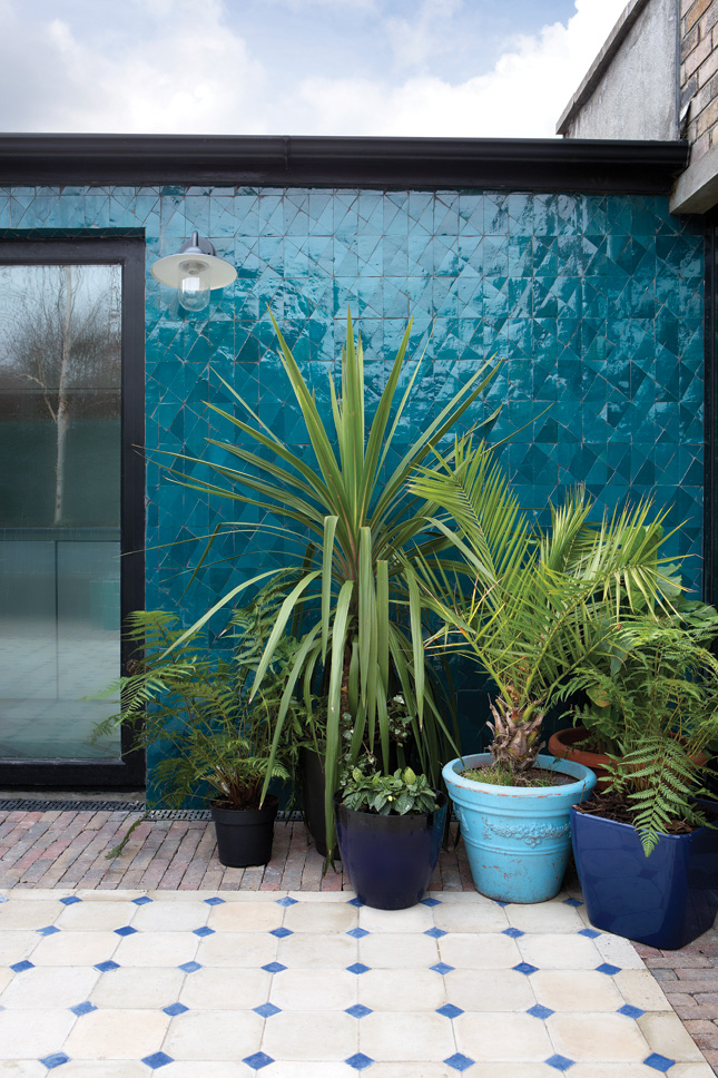
Take a leaf out of our Portuguese pals’ playbook: tiles are not just for indoors. In this scheme, Morocco was again the inspiration for the garden, which is a paved haven.
Blue zellige tiles were used on an exterior wall and are complemented by reclaimed floor tiles from Bert & May, used on the patio area.
Roisin Lafferty has founded CREATE by kld, a tailored design service starting at €650, providing you with the Kingston Lafferty Design tools and expertise to implement your own beautiful scheme; Createbykld.com.


