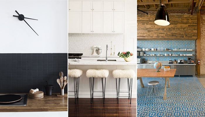
We are all about kitchens with character and one of the easiest ways to make a statement in a kitchen is with a bold backsplash. You can bring in beautiful textures, eye-popping patterns and easy pops of colour and dimension to your culinery space. We've rounded up 11 totally pin-worthy kitchen backsplashes to inspire your next kitchen makeover.
White-on-white
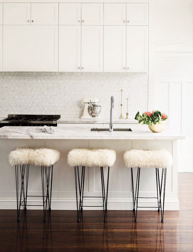
Image: Samuel Hartnett
The interlocking hexagonal tile pattern is a slightly more modern pairing with the marble island. It adds some textural interest in what is otherwise a primarily neutral space.
Stainless steel
Image: Remodelista
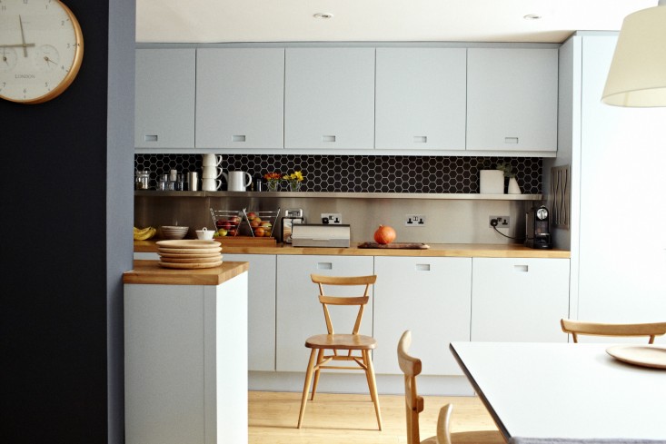
Stainless steel backsplashes might have you thinking of canteens or industrial kitchens, but it can be a very sleek addition when paired with other design features, like the beehive tiles and the butcher block counter space, here.
Patterned tiles against a dark kitchen
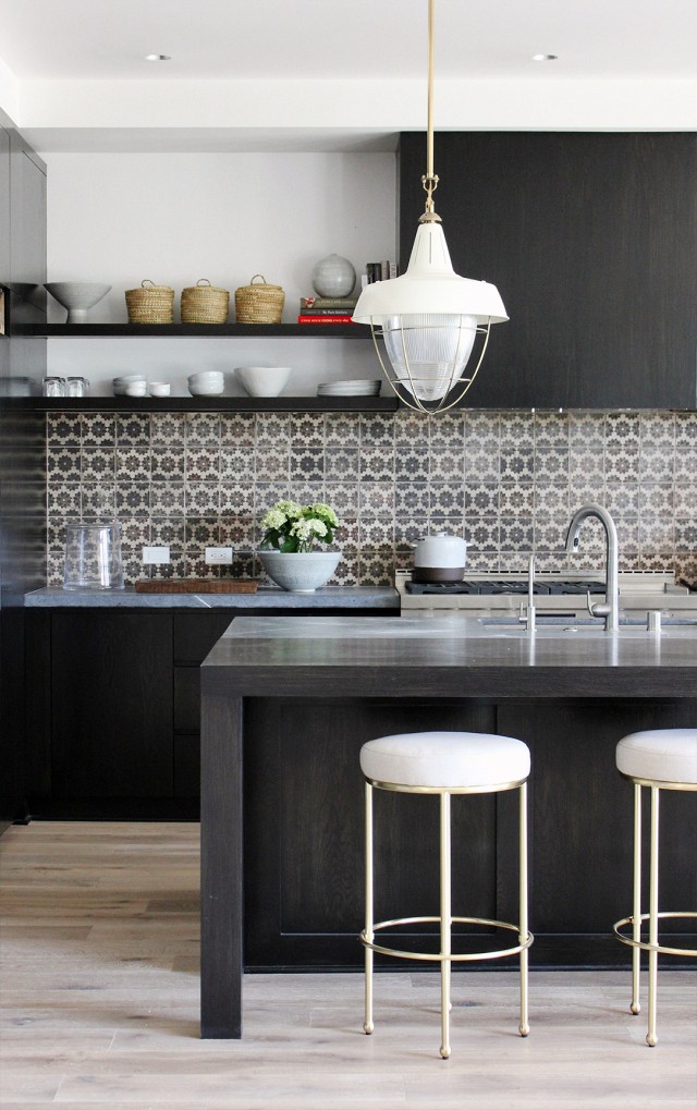
Image: Disc Interiors
These simple patterned tiles add a huge amount of interest and depth to this dark kitchen and we love it.
Cool white
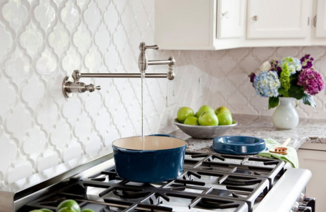
Image: Houzz
How cool are these white tiles? You have to bring a little something extra to white tiles to stop them looking dated, or worse, boring, and these ones have it all.
Dramatic floor-to-ceiling backsplash
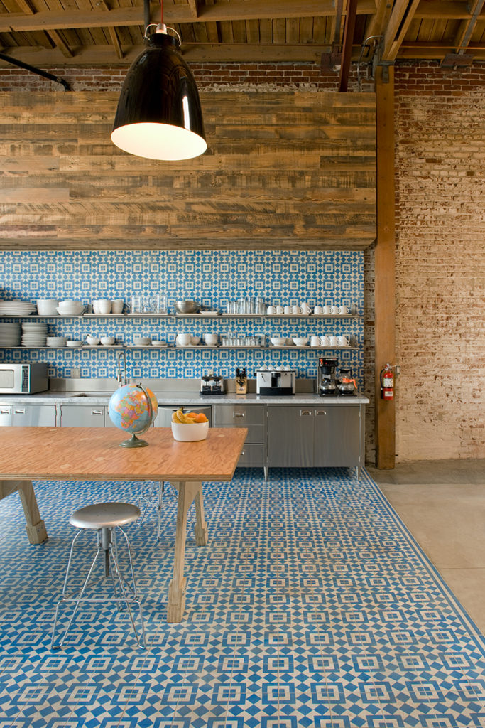
Image: Shubin and Donaldson
Feeling brave? This dramatic backsplash continues all the way from floor to ceiling and just doesn't stop. Granted, it's a statement, but it creates a flow that beautifully leads your eye from the kitchen counter to the dining area.
Pop of colour
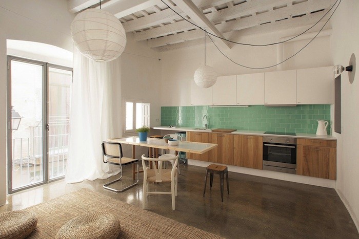
Image: Remodelista
Pops of colour through kitchen backsplashes can be a good way to bring colour in. It's a statement, but confined to just the tiled area, it's not overwhelming. We're in love with these very on-trend subway tiles, too.
Go big or go home
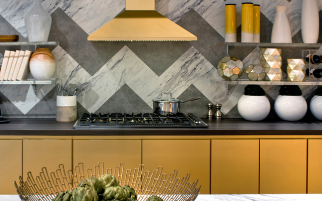
This mega chevron can't be missed. If you're going for a statement backsplash, a small chevron border tile just don't do. This is actually two laminates laid in a chevron pattern, meaning not only do they have a very cool backsplash, but they've got the marble look without the hefty price-tag.
Small kitchens that can
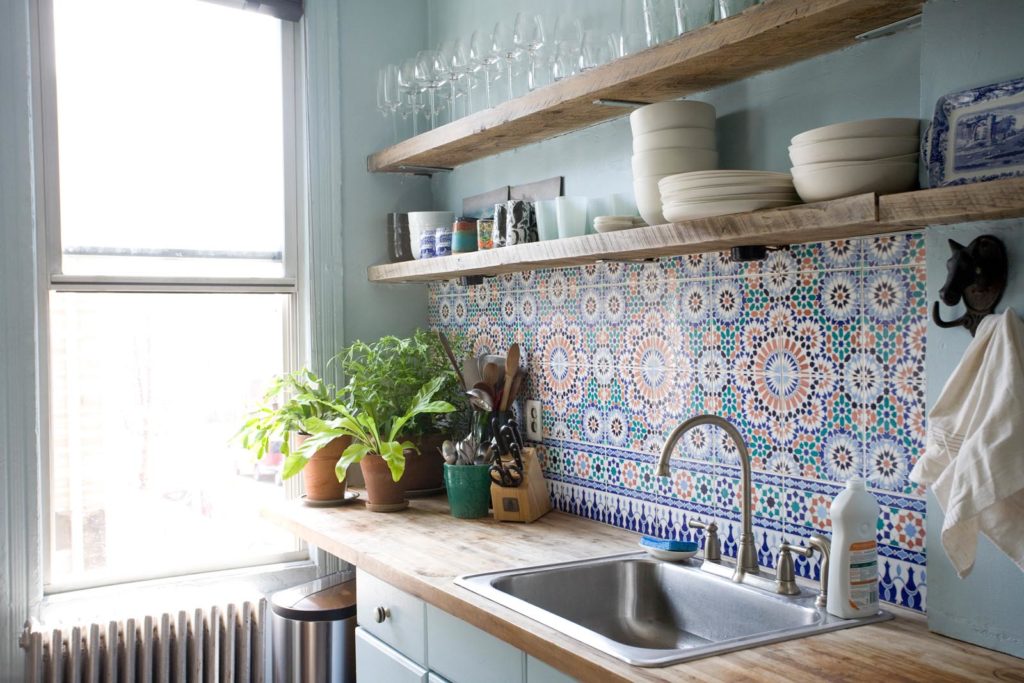
Image: Chad McPhail Design
This relatively small apartment went for it with a really busy patterned tile but it totally gets away with it because the open shelving keeps things airy and from feeling too cluttered. It's all about that balance.
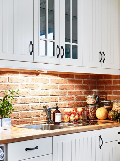
Image: Planete Deco
We're all about exposed brick in plenty of places in the home, but this is a fairly unusual choice. But we're on board, especially paired with these white presses.
Keep things clean
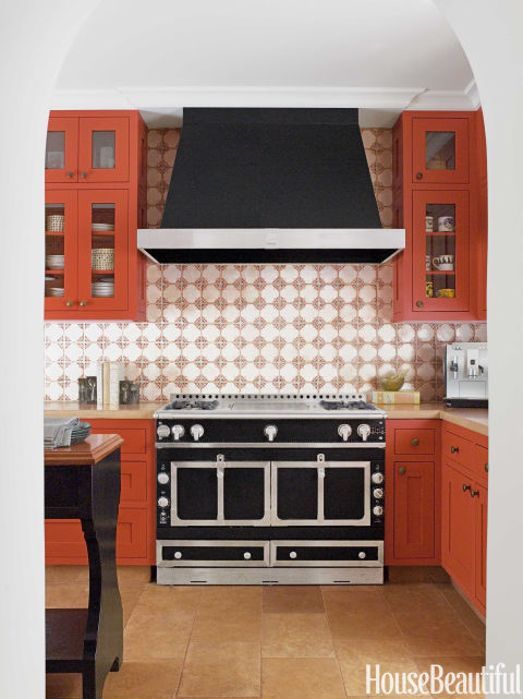
Image: David Duncan Livingstone
These presses and that cooker are fairly big statements in and of themselves, without adding a dramatic backsplash to the mix. A patterned tile in this kind of room would be the wrong choice in so many cases, but keeping a relatively simple pattern that picks up the colour, but with a white base, means this backsplash isn't overpowering.
Back to Black
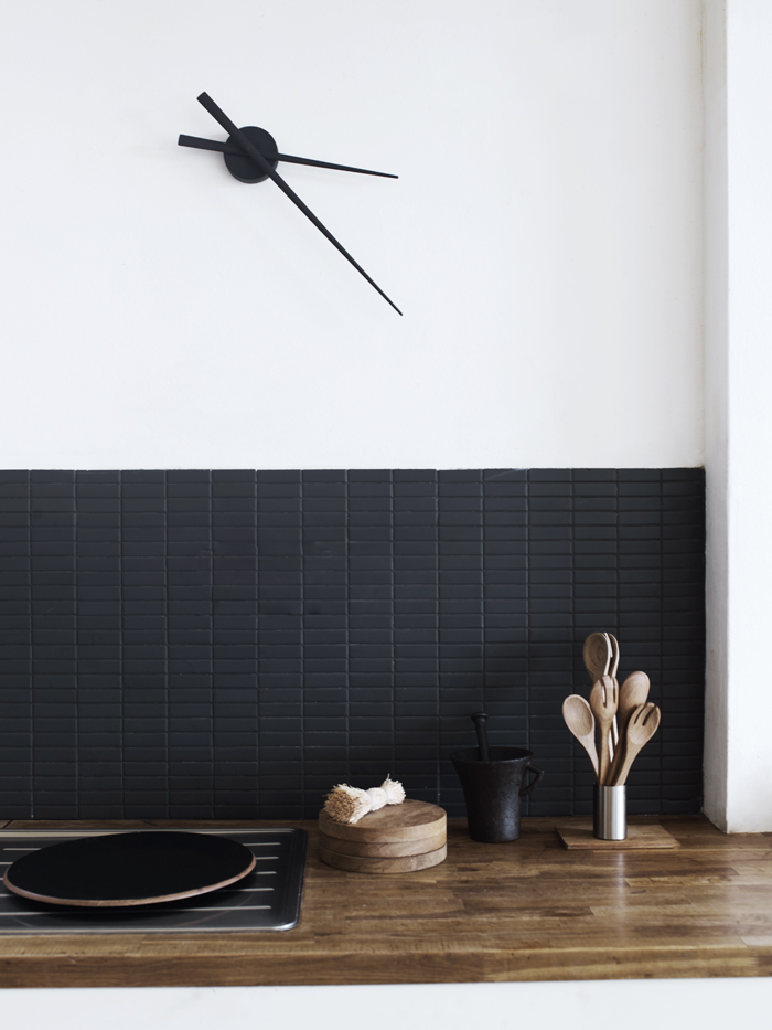
Image: Elle Blogg
Black tiles are a fairly bold choice but here, they work so well. Choosing a matter black stacking tile as opposed to something big and glossy, keeps the look understated, which is complimented by the minimalist clock and kitchen accessories.

