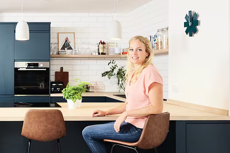
Mathilde Murray has transformed her old and impractical kitchen into a spacious homely haven for all the family to enjoy
KITCHEN MAKEOVER DETAILS
Project: This project involved the creation of a practical and spacious kitchen-diner out of an existing multi-functional room. The family wanted a really usable kitchen that was modern and cosy. In addition to building works, they added brand new kitchen units, installed wall and floor tiles, lighting and appliances.
Homeowners: Mathilde Murray, husband Robin and three children and pets
Kitchen spend: Approximately €18,000
What they did: A 20 sq m extension was added to create enough space in the house to make this large area function properly as a kitchen come diner. The additional space also allowed them to add a separate living area plus utility.
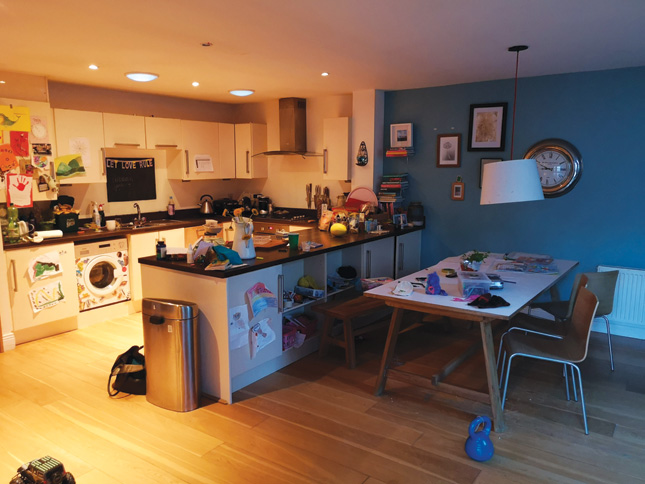
BEFORE
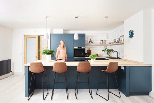
AFTER
Mathilde Murray and her husband, Robin, have been living in their Wicklow bungalow with their three children Sebastian (9), Florence (7), Elliot (5), Cookie the dog, Oscar the cat and Rolo the hamster, for nine years. Their kitchen is the hub and heart of their home but it was in dire need of some TLC. “We moved in with a baby on the way and then we grew to a family of five, but the kitchen didn’t grow with us,” Mathilde says.
Over time Mathilde and Robin realised that they needed their kitchen to be more practical, not to mention bigger. “We just had a small under-counter fridge and with a family of five, I don't know how we lasted,” Mathilde laughs.
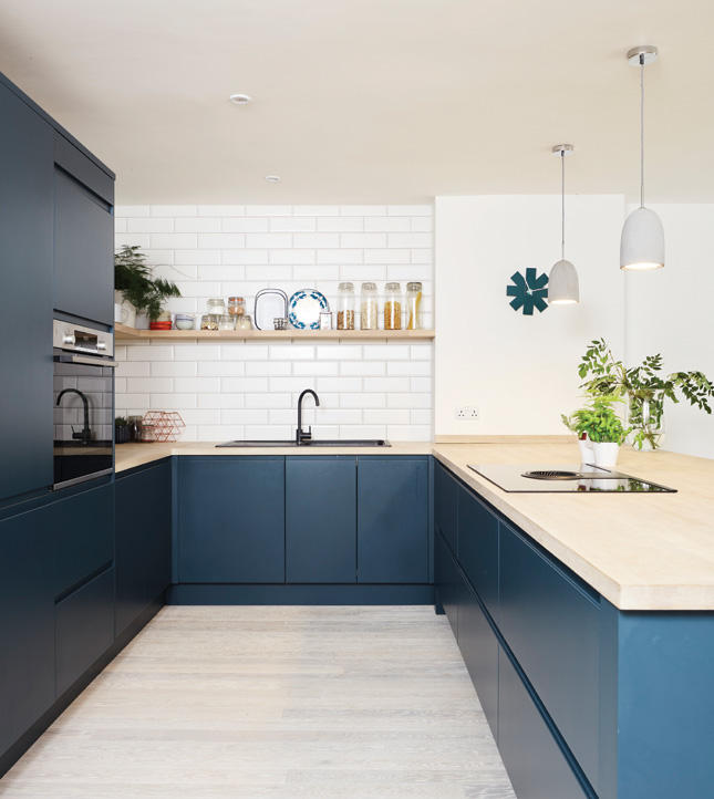 Shelf-care: Ditch the countertop clutter by arranging your kitchen accessories on a floating shelf above the workplace
Previously, the couple’s main living space was an open-plan kitchen, dining and sitting area all-in-one. With a noisy washing machine in the same area as their TV, it’s understandable that Mathilde wanted a more functional approach.
Along with planning a three-month kitchen renovation, the couple decided to extend too, adding an extra 20 sq m which has now become a separate living room plus a small utility room. “The work started from only changing the kitchen to actually having a whole extension built on. The beauty was that it gave us way more possibilities for a new kitchen,” Mathilde explains.
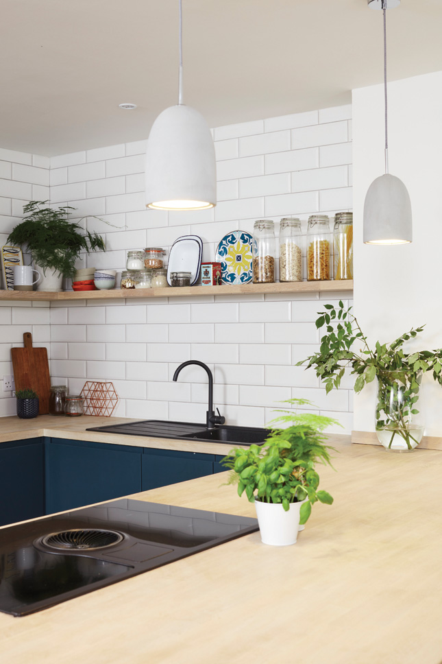 The addition of the induction hob in the peninsula means this kitchen's workflow is completely optimised
Taking design inspiration from Pinterest, Mathilde knew what colour units she wanted and enlisting the expertise of interior designer, Alannah Monks (Theabodestylist.com) helped hugely with the design of her dream kitchen.
“I’ve always had something for dark blue, navy and teal colours – I've wanted to use them, but I was a bit scared,” she says. “But when you have someone like an interior designer coming in they can work with you, and it really came together.” Alannah was ‘the best investment’ the couple made. “She has such a good eye for what we want and she’ll think of things that you haven’t thought of,” Mathilde says.
“We always jokingly say it probably saved our marriage, as doing a big extension and working a whole house can be really stressful,” Mathilde laughs. “I think it's handy to have even just as a liaison between the kitchen suppliers, builders, tilers and the painters,” she advises.
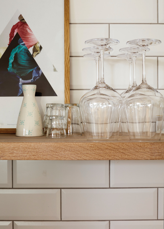
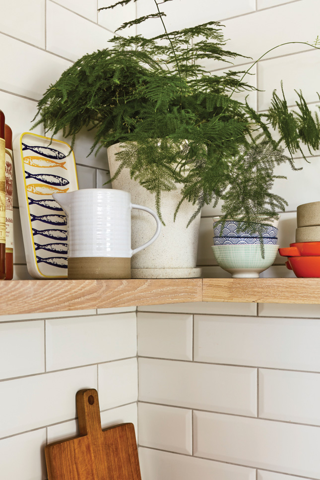 Show off: Open shelving offers a great opportunity to showcase pretty pieces and curated crockery, so don't hide it away
With the removal of the sitting area out of their kitchen space, the couple had more area to work with. “Our kitchen table looks so much better now because we have more space and it just works with the kitchen. I think the main thing was to get a really nice functioning kitchen that doesn’t look too much like a kitchen,” she says.
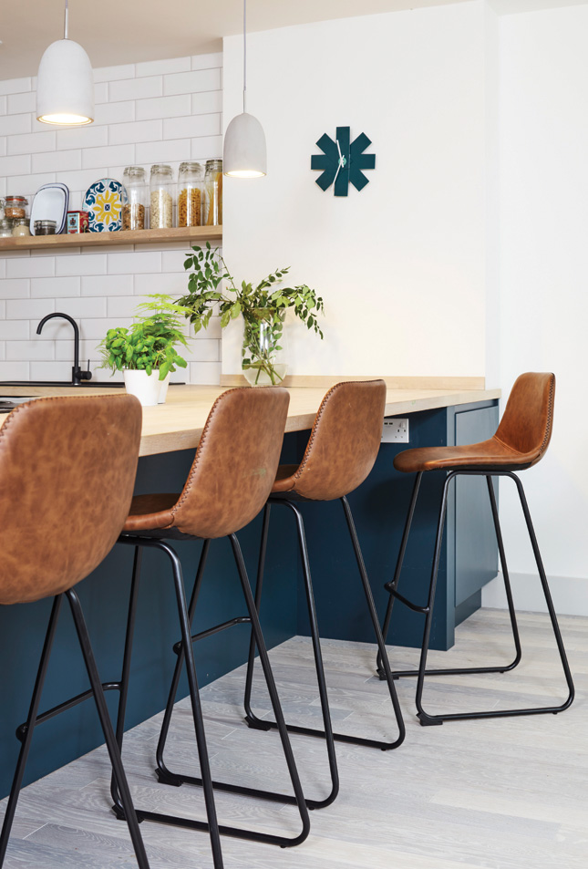
Leaving the configuration essentially as it was, the couple made a few tweaks. They did consider installing an island first, but opted to keep the original peninsula shape, as it’s large enough for the kids to eat at or do homework. “Because we have three kids we really wanted them to sit and eat on the countertop, and it worked much better to have four seats there.”
Widening the peninsula and adding an induction hob with downdraft extractor has made this area work really hard, too, as it does away with the need for an extra wall or ceiling-mounted appliance.
“When you have people over it's really nice that when you’re cooking you can still face them when they sit at the counter and chat together. Or even in the evening they [the kids] can sit with us and it creates a more engaging environment,” Mathilde says.
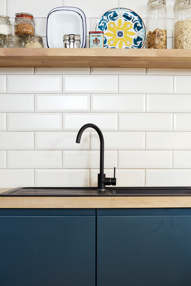 Black magic: Make a statement by swapping a bog-standard sink for a standout black basin. It's a sharp contemporary look
“We now have a big corner unit on the outside of the peninsula too, and if we’d had an island we would have missed out on that,” she points out. Additional storage was high of Mathilde’s kitchen wish list and she gained extra drawers, alongside a large fridge which is now beautifully integrated, as is the dishwasher. The floating shelves above the countertops also deliver a much-needed feeling of space as your eye isn’t drawn to a lot of fussy wall-mounted cabinetry.
It’s not just mum and dad who love the new design. Mathilde and Robin’s children are big fans of the remodel. “In the morning they have their breakfast at the counter while I just make the lunches and it just feels easier even for tidying it up,” she says. “It does seem to make my life easier.
SOURCEBOOK
Builder: Stephen Roe Construction
Flooring: Bearfoot Flooring; Bearfoot.ie
Kitchen and appliances: Supplied and fit by Tierneykitchens.ie
Wall tiles: Tilemerchant.ie
Paint: Slaked Lime by Littlegreene.ie on walls and units matched to Deep Teal in the Fleetwood Pantone Collection; Fleetwood.ie
Lighting: Hickenlighting.com
PHOTOGRAPHY: Philip Lauterback


