The canvas is great but it’s what Céline has added to this Haussmann-style apartment that makes it stand out
Words Amandine Berthon | Photography Julien Fernandez | Production Amandinejules.com
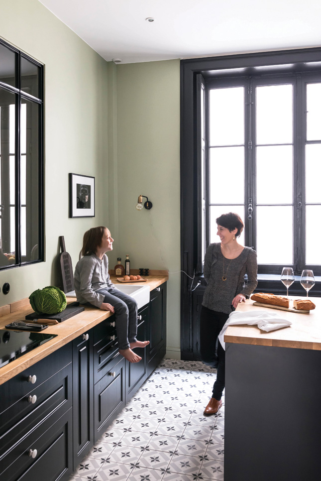
Having a home that’s too big is a wishlist item most of us can only dream of, but for interior designer Céline, who owns this four-bedroom, 230 sq m, typically French, Haussmann-style apartment along with husband Nicholas in Lyon, that was a legitimate concern. Despite having three kids (Loris (17), Charline (15), and Numa (8), they were worried they wouldn’t use all the space properly.
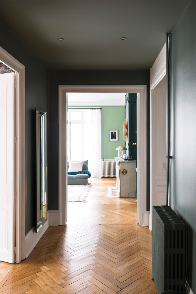
An unusual layout helped with that, however. “The interior was in good condition and didn’t require any major work,” Céline says. “The U-shaped layout is perfect,” she continues.
“The childrens’ rooms are on one side, our space is on the other, and the living areas are in the middle. This is a late Haussmann building, dating from 1894, which is why the layout is unusual. The kitchen is in the centre, instead of being relegated to the end of a corridor as was customary in the 19th century.”
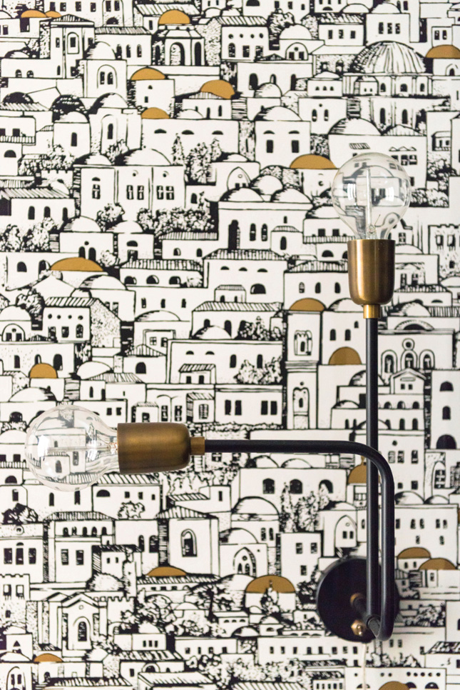
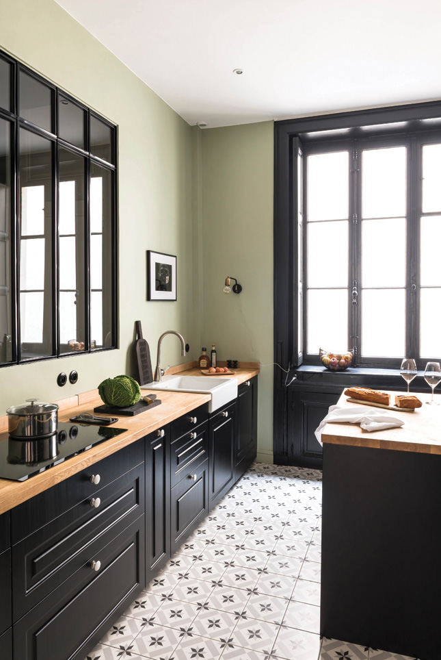 A stylish and retro atmosphere in the kitchen, with flooring inspired by old-fashioned cement tiles (find similar at Tilestyle.ie). Wall lamps from House Doctor (livingandcompany.com). Appliances by Miele (Miele.ie). Wallpaper is Mediterranea by Cole & Son (Designerwallpapers.co.uk) brightens one wall.
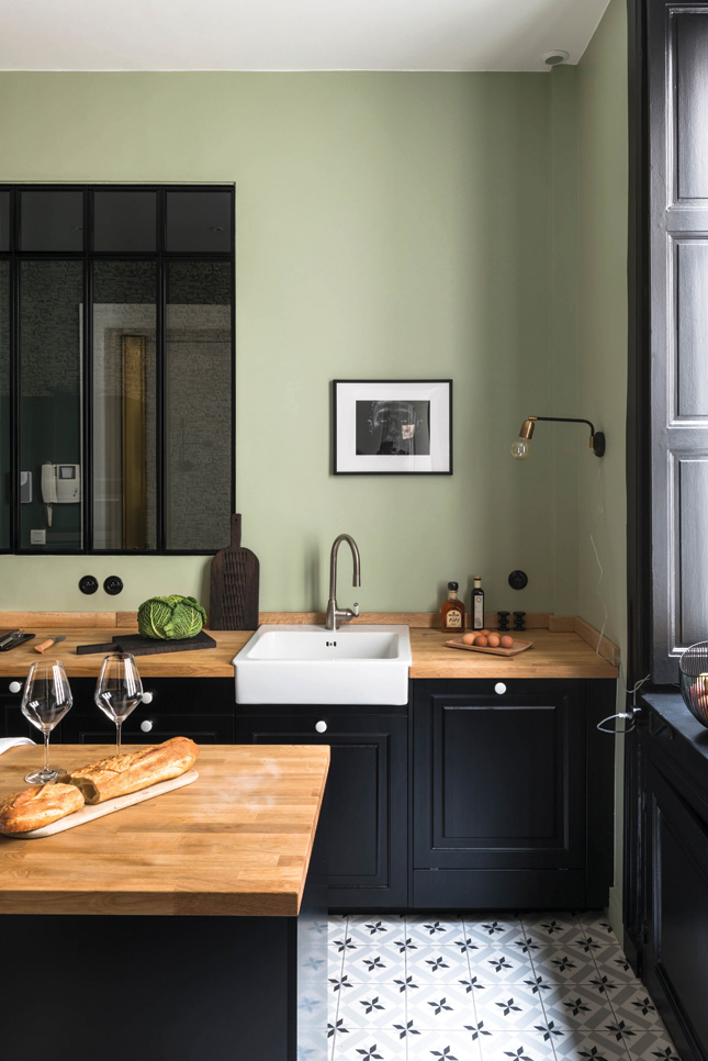
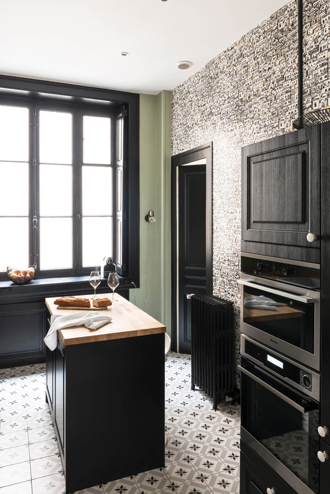
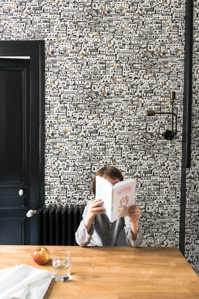
One of the things Céline did to ensure they used all the space well was take the dining table out of the kitchen. “I love the idea of an open-plan kitchen, but in practice it doesn’t suit us,” she says.
“We cook a lot and cooking smells spread. On top of that, Nicolas gets up very early.” Instead, they installed a glass panel on the front wall of the kitchen to open it into the hall, and put the table in the dining room. “This has become the centrepiece,” Céline says. “It’s my favourite room.”
It took years for the couple to find the apartment, but their search was rewarded. “This type of property is rare. We visited four in two years of active searching,” she reveals.
“This place exceeded our expectations. It was more than we were looking for. Everything appealed to us; the magnificent facade, the fully-preserved original features such as fireplaces in every room, and the parquet flooring – my absolute dream,” Celine says.
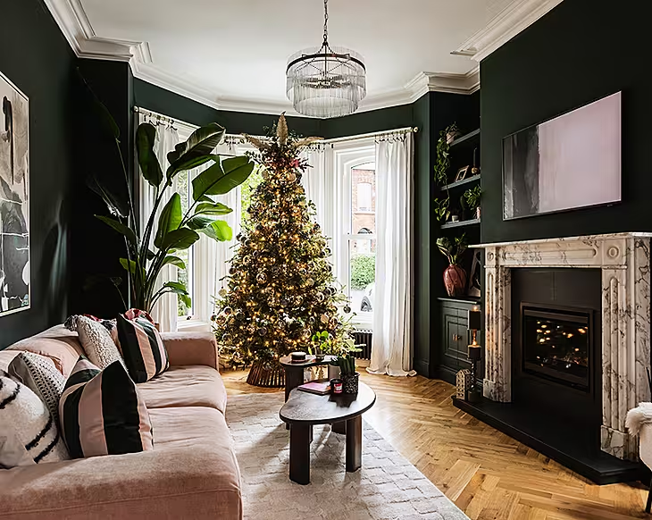
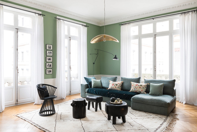 Cosy decor with ethnic touches brings a twist to the classic architecture of the living room. The hanging Brass 95 from Gervasoni (Ambientedirect.com) mirrors the gold plating of the fireplace. Paint is Breakfast Room Green by Farrow & Ball and Thé de Chine from the Sarah Lavoine collection from Ressource Paint (Ressource-peintures.com). Sofa from Flexform (Minimahome.com). Beni Ouarain rug (Trouva.com). Coffee table from Maison Hand (Lyon). Armchair by Tom Dixon (Tomdixon.net). Wall lamp from DCW Editions (Houseology.com). Cushions from Caravane. Mirrors from Pols Potten (Polspotten.nl). Gold Lamp from Bloomingville (Woodesign.ie)
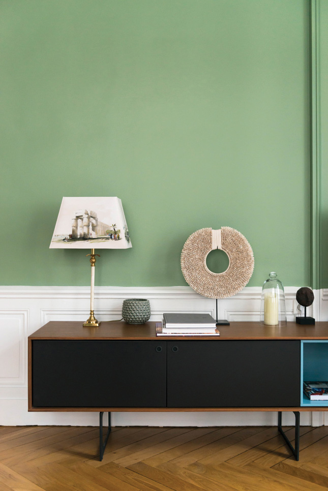
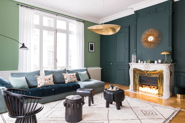
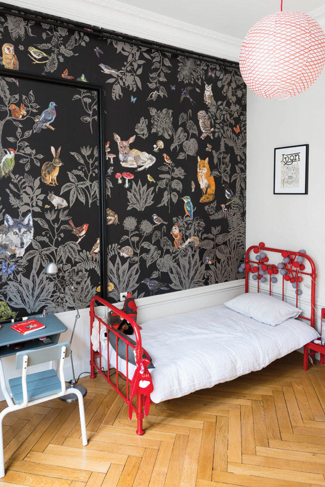
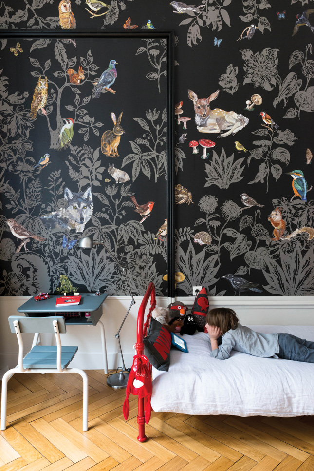
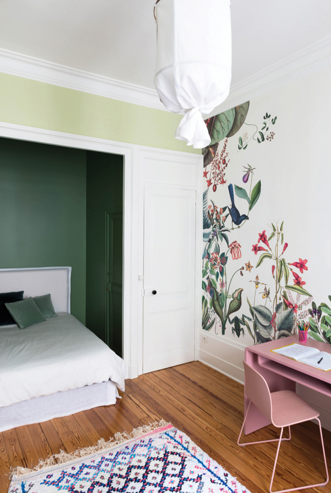
The bones of this beautiful building are the perfect canvas for Céline’s paint and paper picks. “I wanted to put colour everywhere, to be daring and, above all, have fun! I composed the palette from all the wallpapers I’ve fallen in love with over the years,” she says.
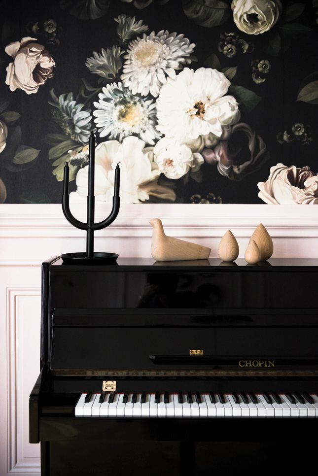
And so, the wall above the piano uses Céline’s favourite wallpaper, Ellie Cashman’s enchanting Dark Floral. This is the starting point which inspired the entire palette.
“Green is the central theme. There are six shades of green throughout the apartment. Pink, which is used in the dining room and my daughter’s bedroom, is a tone that I’m fond of and which goes well with green,” she explains.
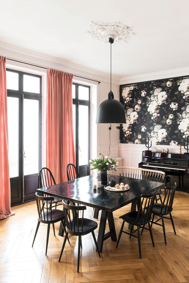 Céline drew on the shades of her favourite wallpaper Dark Floral by Ellie Cashman (Elliecashmandesign.com) to create the colour palette for the apartment, using green as her central colour, accented with black and pink. The dining table was custom made by cabinetmaker Thomas Montarnal. The Love seat bench is from Ercol (Arnotts.ie). The Ercol vintage chairs were found at a flea market. Bell lamp pendant light from Normann Copenhagen (Nordicnest.com). Curtains and mirrors from Caravane (Caravane.co.uk). Middleton Pink paint by Farrow & Ball (Farrow-ball.eu). Marianne Swing Wall lamp from Wo and Wé (Woandwe.com). Grossman Grasshopper floor lamp from Gubi (Gubi.com). Candlestick from Ikea (Ikea.ie). Vases from Kaolin (Kaonline.fr). House Bird by C. Eames (Cadesign.ie)
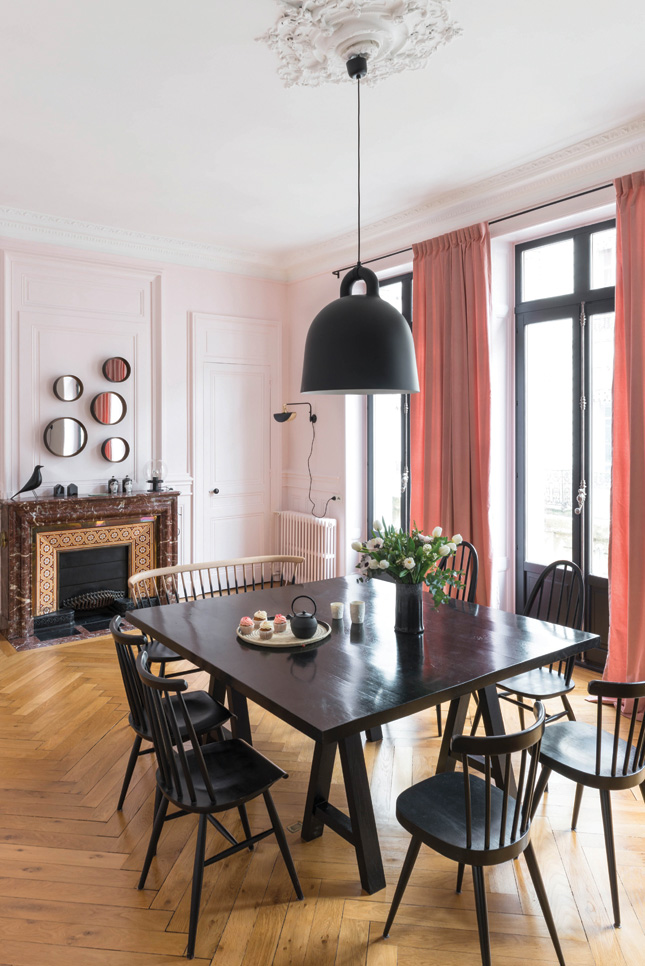
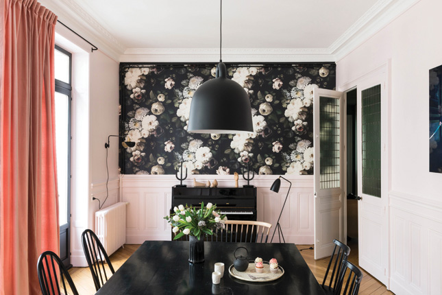
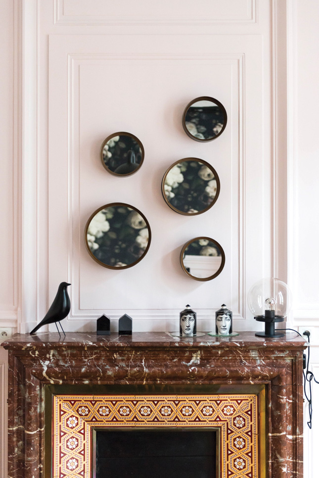
“Black is used in several places. I was aiming for coherence so as not to get distracted.” Farrow & Ball is a favourite for its unique depth of tone, and Ressource Paint was also used.
As for the furniture, the couple mostly re-used pieces they already owned. “It's really satisfying to see the furniture take on a new aspect here,” Céline remarks.
The dining table looks as if it were designed for the room, but it is a blackened oak that was made several years ago. “It represents the moments when all five of us are together – rare with teenagers who are always in their rooms,” she laughs.
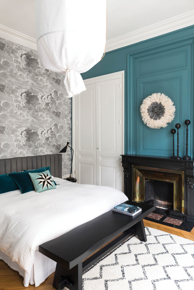
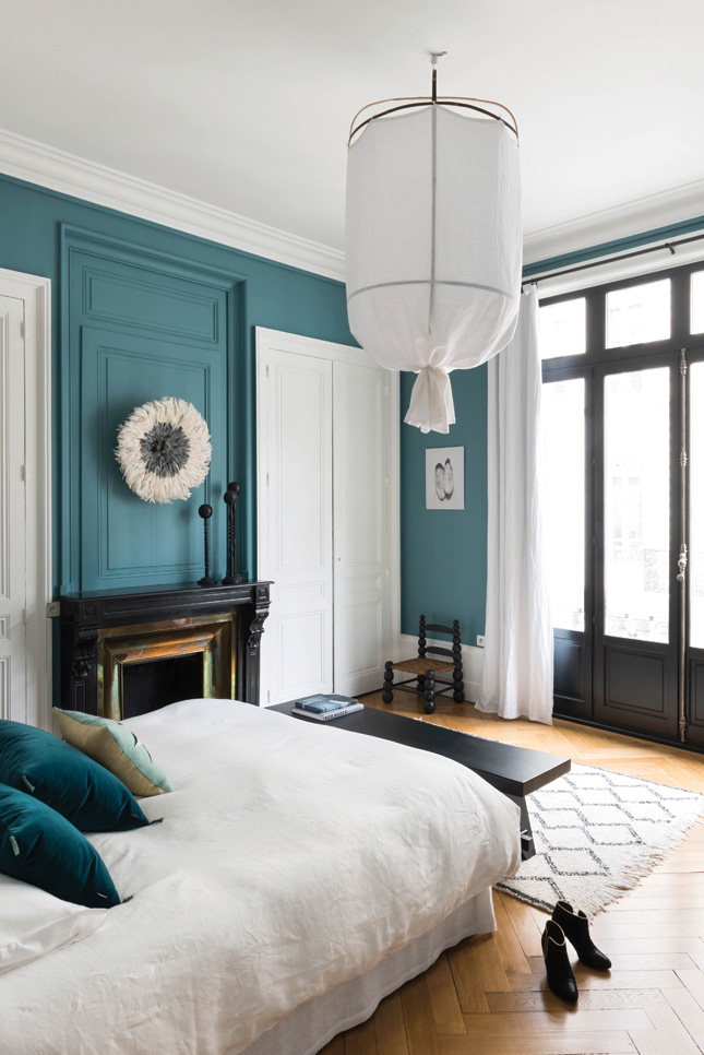 “I love the morning light in my bedroom. We feel very comfortable here,” Celine says. The blue on the walls is Orage from Ressource paint, which complements the dream-like wallpaper, Nuvolette by Cole & Son. Bohème lantern at Rue de la Déco. Beni Ouarain rug from Galerie Girard (Lyon). Bench from HK Living. Bedhead from Habitat. Bedlinen from Bar à linge. Cushions from Caravane and Lindell & Co. Bedside lamp from Sarah Lavoine. Floor lamp by Arne Jacobsen from Conran Shop. Bedside table and chair hunted at Emmeline Lescure antique shop in Lyon. Juju hat at Les petites chineries. On the fireplace, Napoleonic hat holders from Florence Bouvier (Lyon)
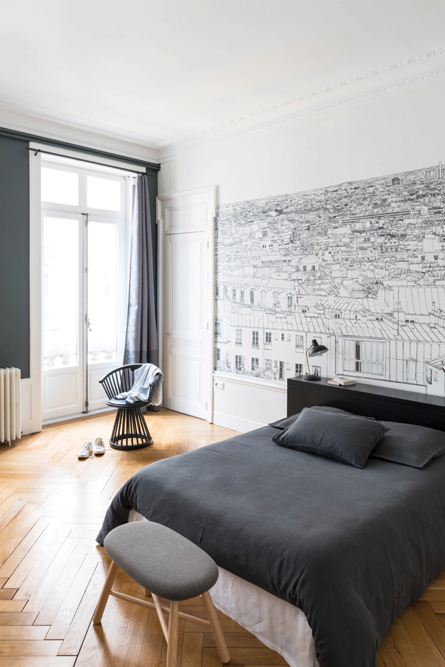
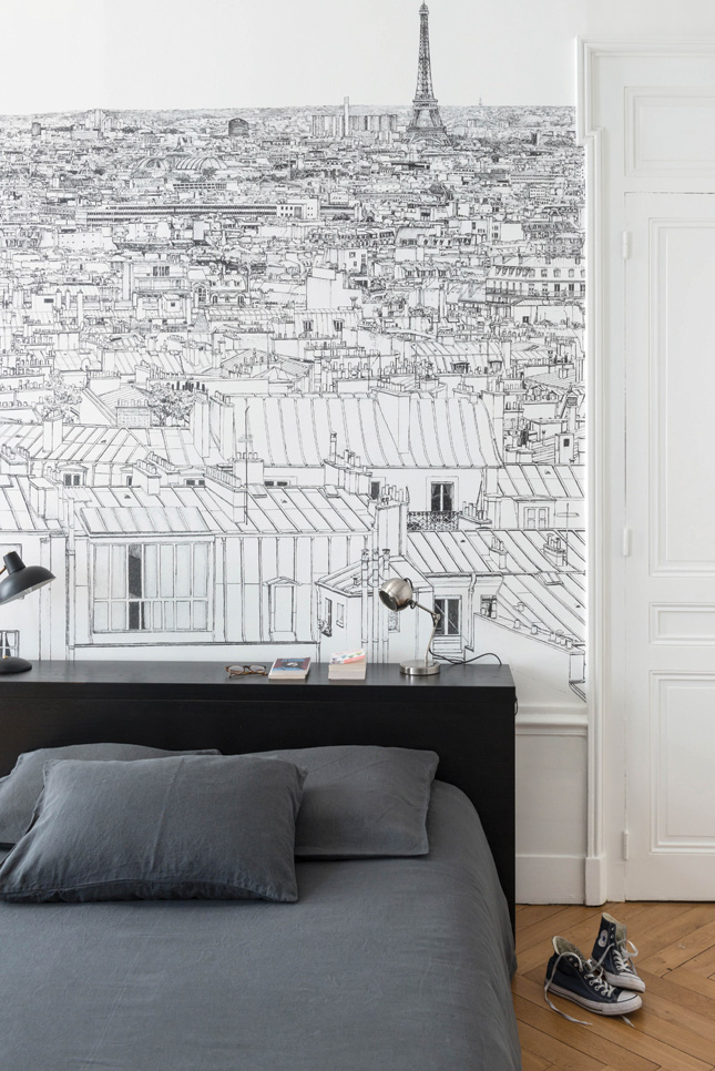
Now well settled, they’re enjoying their new space. “We can live with the windows open. The apartment is pleasant all day long. The light enters in the morning, and in the evening the sun is reflected off the facades across from us. We felt we’d be happy here – we weren’t wrong.”


