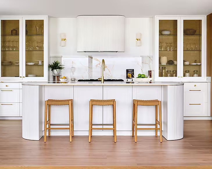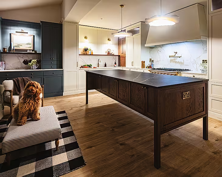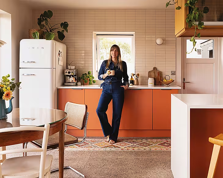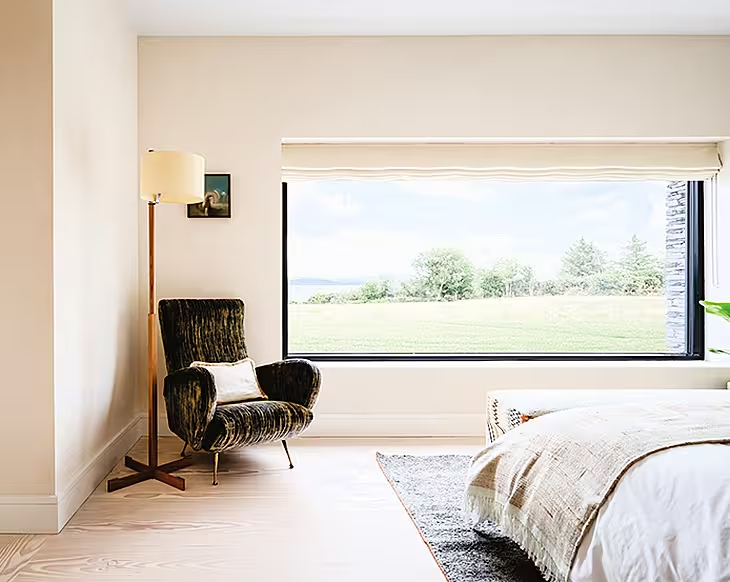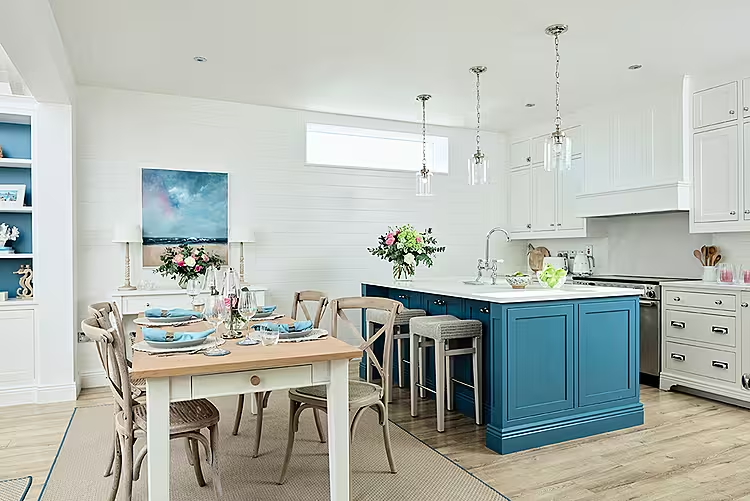
A new layout and redesign by Caroline Fernandes has transformed this open plan kitchen-living space into the ultimate family hub, befitting its Wexford setting. For six rules for renovating from Caroline, click here
Words: Róisín Carabine | Photography Philip Lauterbach
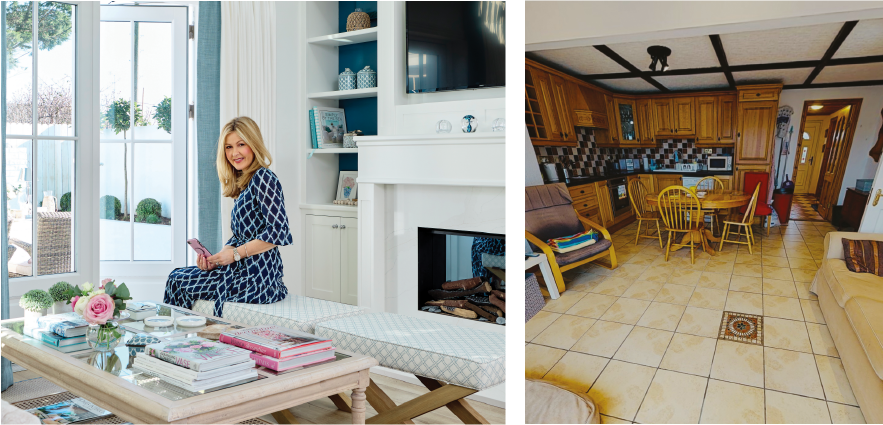
Interior designer Caroline Fernandes is known for her classic styling. Here, she’s tested her skills transforming a dated Wexford cottage into a chic retreat for her family. “The original layout was quite enclosed with lots of wasted space and no flow between the zones,” Caroline explains. “Also the L-shaped kitchen was awkward. These were just the initial problems when we set out on this renovation!” You can read the rest of the story in our interview with Caroline below.
What was the plan for the new space?
To reconfigure the home’s layout, increase the size of the living area (within the planning regulation guidelines), maximise the natural light and create a better connection between the different zones.
Where did you tackle first?
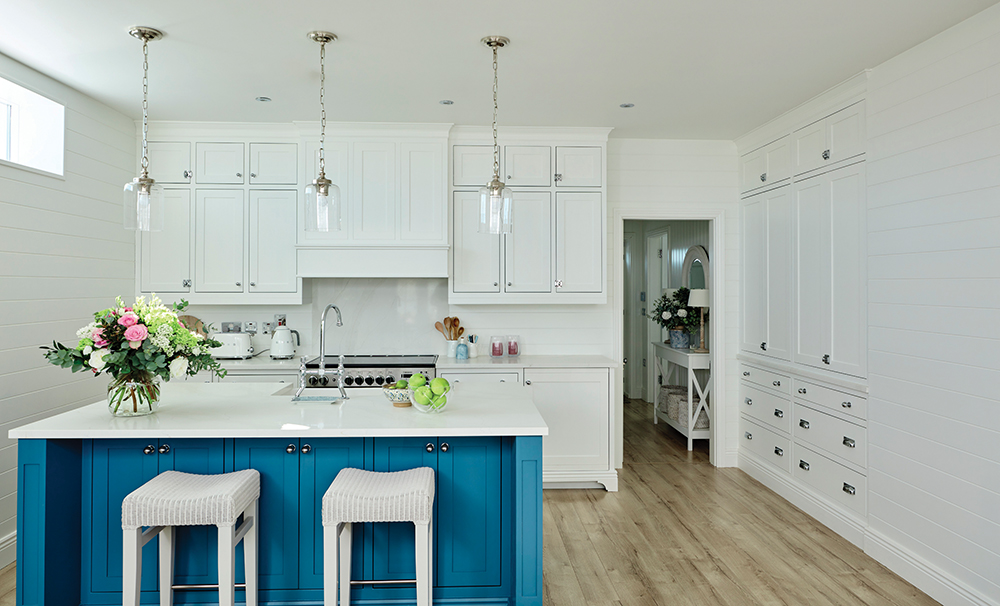
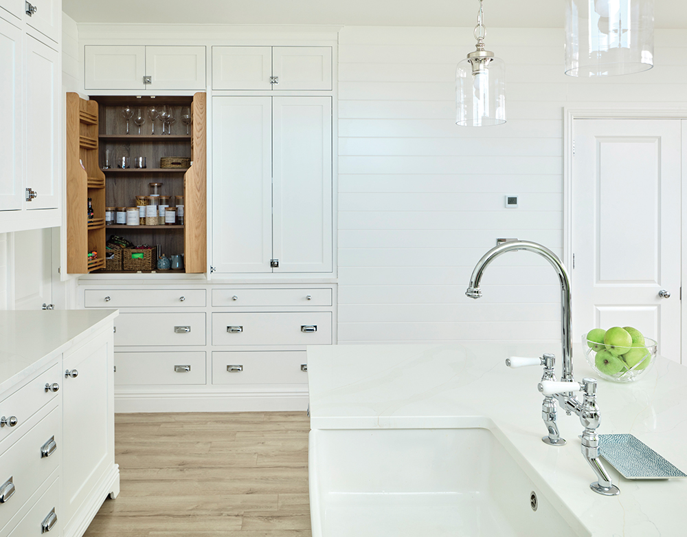
I wanted the kitchen to be the hub of the new space. I confined the units to the back wall and ran them floor to ceiling to enhance the feeling of openness, while also maximising available floor space. This allowed me to add a letter box window to let in more light. The original layout had a redundant area to the left-hand side of the doorway which wasn’t deep enough for storage so I borrowed space to create a full-height recessed pantry. I added an island and designed it with entertainment in mind so there is lots of counter space, storage on both sides and extra seating beside the dining area. The walls are clad in shiplap wood which help to frame the area beautifully while also providing texture.
How did you divide up the space?
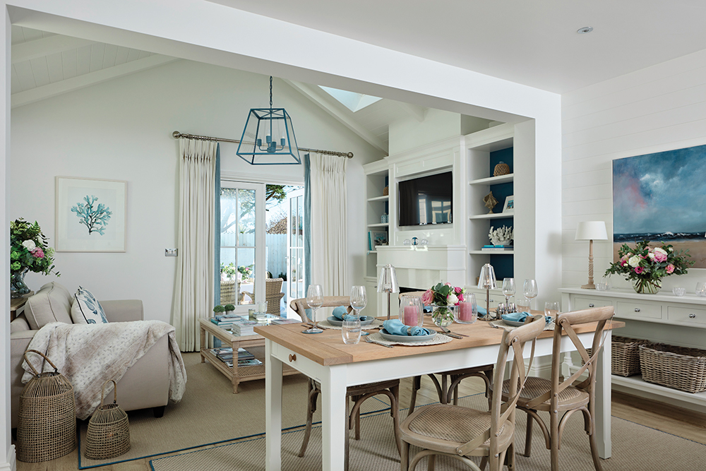
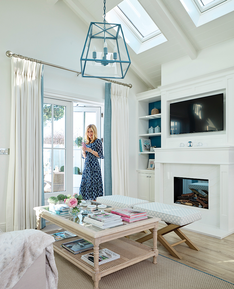
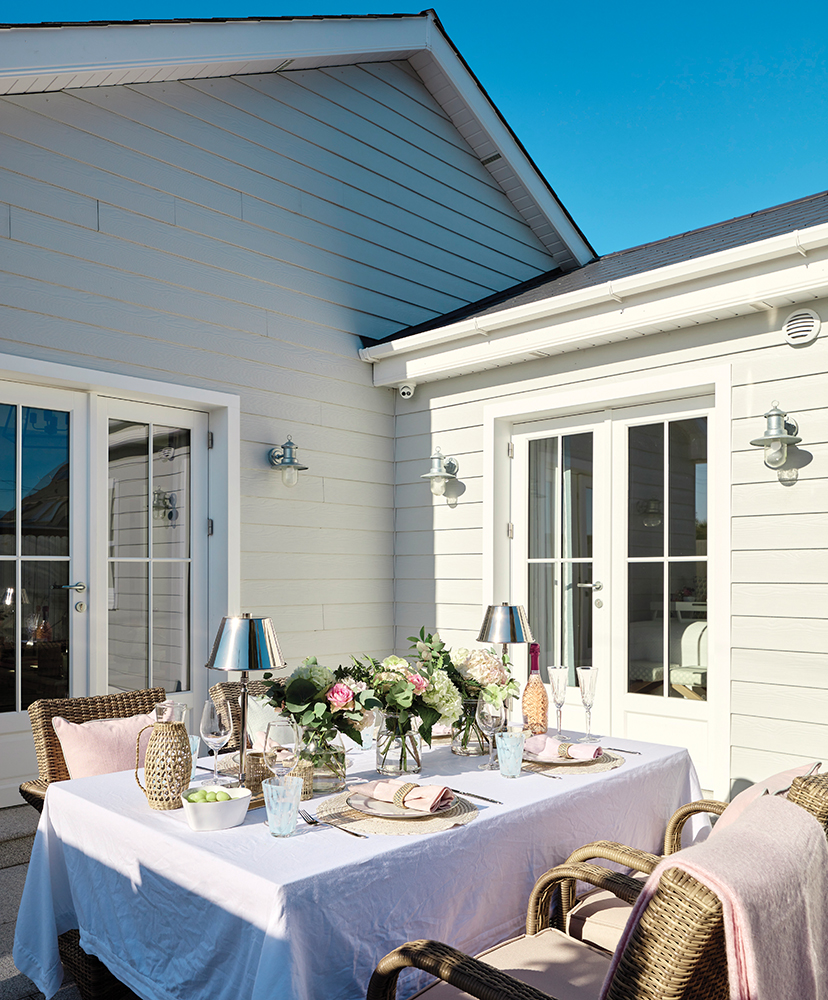
I had a nib wall built to zone off the new extended living area. It’s a great way to break up a space whilst still maintaining an open plan look. Plus, it adds visual interest and allowed me to switch up the woodwork detail from the walls onto the pitched ceiling. Velux windows now flood this area with natural light while glazed panelled double doors connect it to the outside.
What have you done to link the zones?
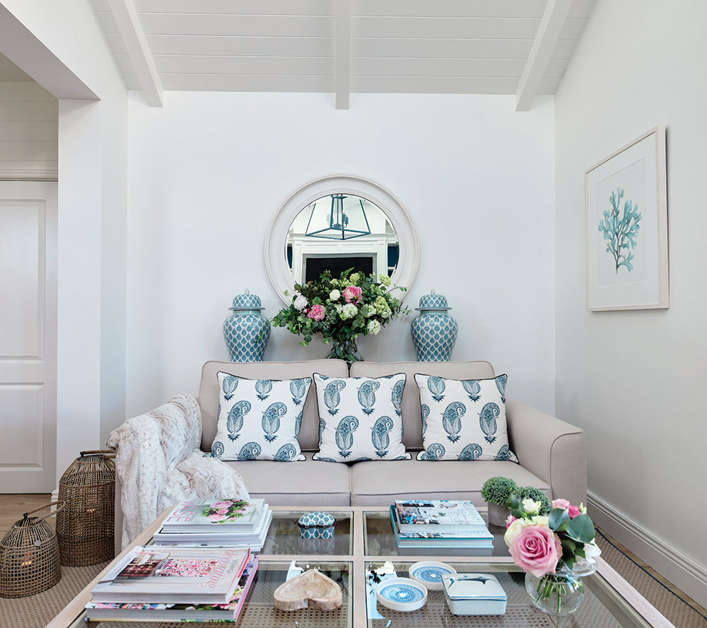
Open plan spaces need a focal point to work successfully. Here, I created a bespoke false chimney, incorporating an electric fire, in the living area. It takes its visual cue from the kitchen so there is a continuity to the design. I also used the same gorgeous blue tone that’s on the island on the inside of the open bookshelves and introduced small hits of blue throughout the space in the lighting and soft furnishings as another way of linking the spaces.
Tell us about the inspiration for the decor?
I wanted to create a bright, inviting, laid-back vibe with a year-round spring summer feel for my family. I have always loved East Coast American style and so given the cottage’s location on Rosslare Strand, just a minute’s walk from a gorgeous Blue Flag beach, it seemed like a natural fit. I’ve gone for a clean, fresh, white scheme, with hints of blue and sandy tones, and have added lots of visual interest and texture to ensure the space feels warm and inviting.
How did you maximise the light?
As well as adding in extra windows, I designed a well-layered lighting scheme; task lights over the island, LEDs under the hood and wall units, a feature pendant in the living area, spots inside the open bookshelves and table lamps everywhere. Light is everything in a space. Natural light affects all the decision making in a scheme, from layout to colour palette selection.
Your best design decision?
The pantry. The storage is fantastic, and not just as a pantry but also because it stores so much more. We’ve fitted in a wine rack, glass storage and a microwave. It is so practical and I love the internal configuration too with its mix of long and short presses and drawers.
Get the look
Design & styling: Caroline Fernandes
Dining table, bar stools, living room pendant light & mirror: Neptune at The Orchard
Console table: Designed by Caroline and made by Deanery Furniture
Island lights: Broughtons
Table lamps: Pooky
Cabinet hardware: Armac Martin
Worktops & fire surround: Continental Stone
If you've loved the story of Caroline's renovation, make sure you benefit from more of her expert advice by checking out her six rules for renovation.


