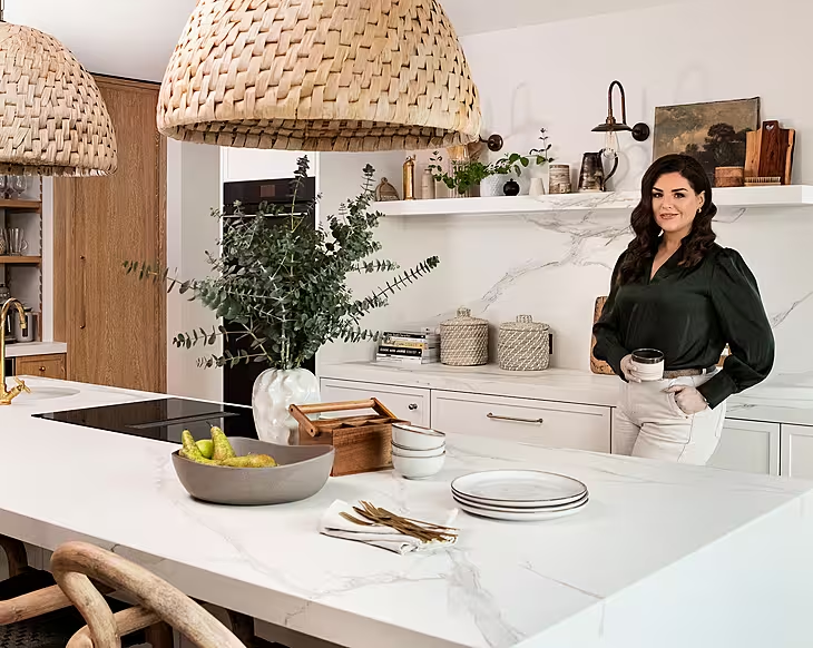
Expect the elegantly unexpected in interior designer Julianne Kelly’s Dublin home. On a quiet suburban street near a golf course – “the odd shout of ‘fore’ can disrupt a sleepy Sunday afternoon” – her 1950s four-bed house is also home to husband Joe and daughters Ruby (8), Freya (6) and Rebecca (1).
“My parents set up Kevin Kelly Interiors in 1976 and I took over in 2011,” Julianne says of her design pedigree. Recently rebranded, the company is now known Julianne Kelly Interiors and as a soapbox for her talent, her own home is the showpiece.
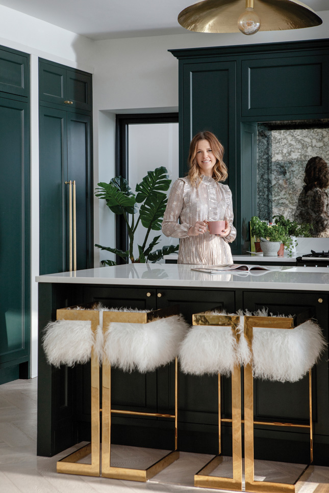
Walking down the hall from the front door, you enter the hub of this house, an especially large kitchen, dining and living area with huge windows to the garden – and the showstopper: a truly dramatic sunken seating area, affectionately named ‘the pit’.
“I have to admit we agonised over this for a week or so,” Julianne recalls. “In the end, we love it. It was exactly the right choice and is a real feature in the house. With such a large area we knew we needed something special: we had the space for a large counter in the kitchen, and with so much light coming in we knew we didn’t want to put up a wall to split the room in two.”
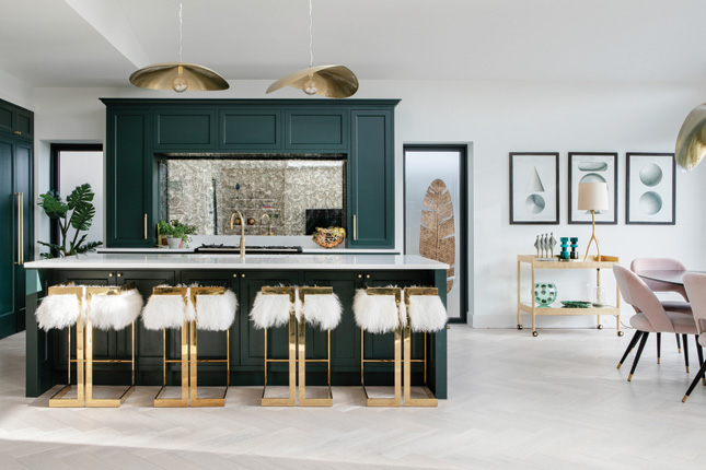 This entire space was designed to have a Floridian feel, and the 1970s-style sunken seating fits right in by complementing complements the kitchen units. These were made by Abington Design House (Abington.ie), painted in Zoffany Hunter’s Green (Mrcb.ie). Handles are Buster + Punch (Busterandpunch.com) with Calcutta gold worktops from Silestone (Silestone.com). Julianne sourced the fabulous foxed mirror through Abington too. “I knew I wanted a mirror to reflect light back, but a plain mirror would be impossible to keep clean above the range, whereas you don’t notice every tomato stain on the antique finish,” she says. At the island, four statement stools in brass draw the eye. These are from the Emmet from Worlds Away, available at Julianne Kelly Interiors.
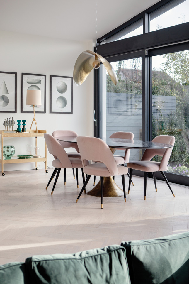 The dining table and chairs are from her shop; above hangs a statement light fitting from Gervasoni (Gervasoni1882.it). Find a similar bar cart at West Elm (Arnotts.ie).
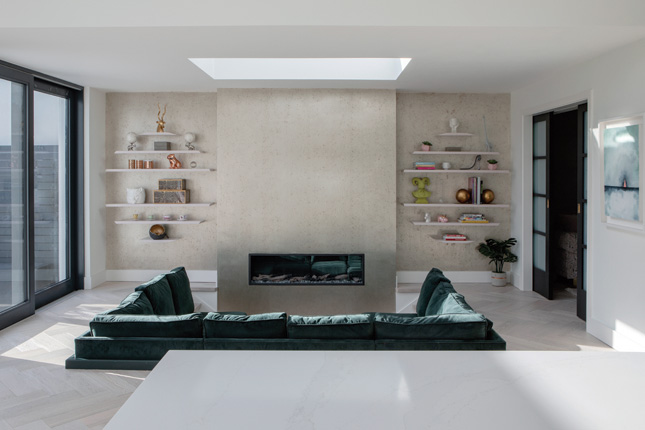 Over at the ‘party pit’, Julianne was inspired by an episode of Mad Men. “I shared the idea with the builders, and they loved it. Then it was a case of getting one of my furniture makers to make a bespoke sofa. It’s a great area for the kids – they especially love to dive onto it.” The wipeable, washable fabric is from Julianne Kelly Interiors and is by Warwick (Warwick.co.uk). It faces a feature wall papered in metallic paper by Arte (Arte-international.com). In the alcoves is pink-painted bespoke shelving designed by Julianne. “I designed them and got Abington to make them,” she says
This isn’t the only carefully considered design decision here. “Designing my own home was a labour of love,” Julianne says. At the time, she was pregnant with Rebecca, and the clock was ticking to get everything done before she gave birth – which she achieved with a comfortable fortnight to spare.
“Sometimes it felt as if there were too many options, I knew all the design houses and their collections so well. Eventually it was a question of trusting my own style and eye, avoiding trends and focusing on what I knew I wanted.”
The result is a home that is clear about its sensibilities. A mélange of tones and textures abound throughout the rooms, but all are complementary – green, pink and peach marry with warm metallics and cool woods – so while Julianne has used her take on design styles, she has created a scheme that is completely harmonious throughout the whole house. “I definitely wanted a really calm space with lots of light and colour,” she says.
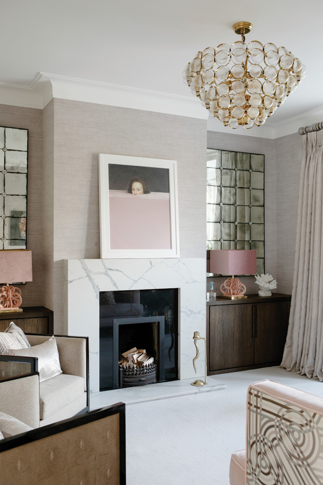
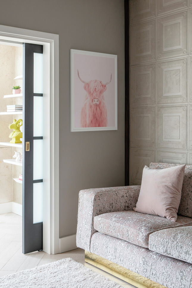 “This is our no-tech room, the plan here is to light a fire and just lounge,” Julianne says of this glamorous, grown up space. “We’ve found that it really comes into its own in the winter.” Two Eichholtz mirrors flank the chimney breast (Eichholtz.com); the central light fitting is also from the brand. Dark oak alcove units, made by Abington Design House ground the space and allow the elegant proportions of the fireplace to shine. “This was one of the first things I improved with a fireplace from Murphy Stone in Sandyford (Murphystone.com). When I was younger my childhood was filled with lazy Sunday afternoons in a similar room with my parents, the newspapers, and a crackling fire. For me, that is home,” Julianne says. On the mantlepiece sits a standout print from FY (Lamfy.co). “You either love or hate it,” Julianne smiles. Arte wallpaper lines the walls, and Julianne’s seating was made by her own furniture maker and covered in Zoffany velvet, backed with an Hermès fabric
The interior is the icing on the cake of an extensive seven-month renovation project. Julianne and Joe bought the house in 2016. “It was more or less untouched since construction, except for a small box room added to the rear, and the house still had a functioning outdoor toilet,” she recalls. Knowing how these things go, they decided to live in it for a year before they did the renovation.
“After 14 months we were ready to do the big job. I always think if you can, it’s great to live in a house first and see how the light falls in the rooms and how you use the space. My plans were clear with a third baby on the way; the vision was to create a family home for three children and two adults,” she says.
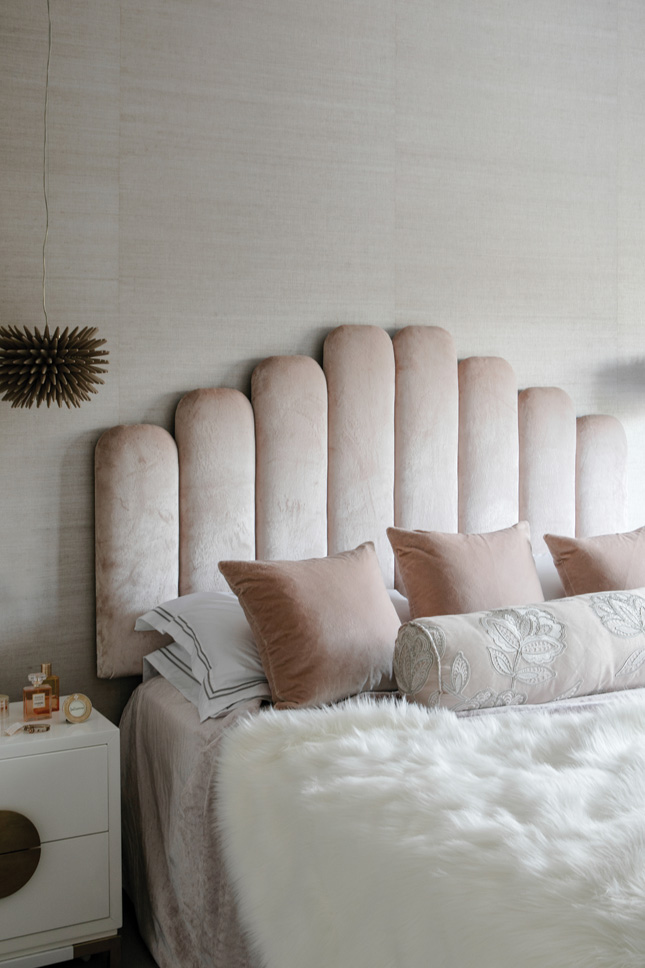 “I Just wanted calmness. I tend to fall in love with one piece, material or finish and then work from there,” Julianne says. Here, she started with the silk-textured paper from Zinc (Zinctextile.com). She designed the headboard and had t covered in Dedar’s Splendido – “my favourite velvet of all time.” The bedside tables are from Liang and Eimil (Liangandeimil.com), another company Julianne supplies. Above them hang statement lights from Neapolitan brand Riccio Caprese (Ricciocaprese.it), also available at Julianne Kelly Interiors. Curtains are made from fabric from Aldeco (Aldeco.pt).
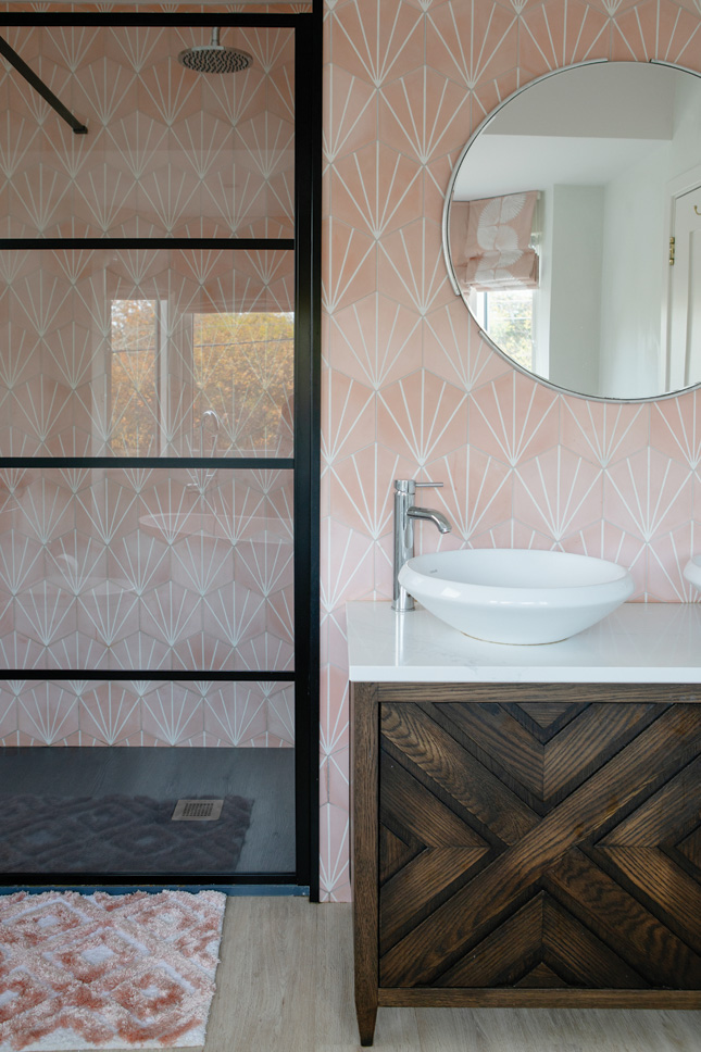 In the en suite, the lily pad encaustic tiles are from Best Tiles (Besttile.ie). “I saw them with a friend who strongly advised against them due to the bold design, but I knew I had to have them and love them,” Julianne says. The sink unit was designed with Abington and is topped with Silestone. “It is actually the same as my kitchen countertop – saving money in the process.” The Crittall-style showerscreen is from Waterloo Bathrooms (Waterloo.ie) and Julianne has used another Jane Churchill fabric for the complementary window blind
Those plans included a large kitchen, flexibility for an au pair while the kids are young, a utility room for washing and drying – “I spend a lot of time in here!” – and an en suite and walk-in wardrobe for the master bedroom. “I love not having clothes strewn all over my bedroom,” Julianne says.
That master suite is the piece de resistance upstairs. “I believe you need to be comfortable where you sleep and bathe. The master bedroom and en suite are like a little apartment for us,” she says. “They’re relatively separate from the rest of the first floor and are big enough to be comfortable without being too overbearing.”
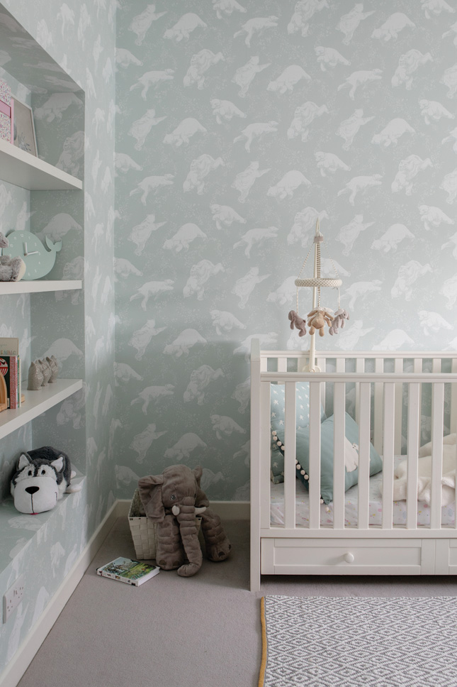 The wallpaper is "a very cute one from Boris Tapeter from our showroom," Julianne says.
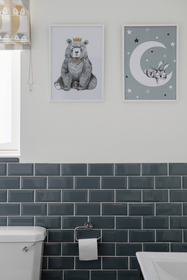 In the family bathroom, a warm vibe abounds. Wall tiles and sink cabinet were found at Tubs & Tiles (Tubstiles.ie) and the fun window blind is a Scion fabric by Harlequin, supplied and fitted by Julianne’s shop
Every space in this house has features and finishes to charm the eye. Surely there can’t be much left to do?
“Well,” she muses, “My husband wanted a hidden door to one of the upstairs rooms as a result of watching too much Batman in the ‘70s and ‘80s. It’s on his wishlist, and we may move the master bedroom to the top floor once the kids are old enough,” she adds.
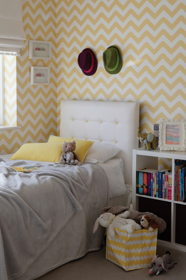 Julianne’s not convinced this sunny yellow paper from Thibaut meshes with the rest of her scheme. “My girls loved this wallpaper; I was heavily pregnant and finished making decisions. It’s a reflection of their personalities: sunny, bright and fun.” The bespoke headboards are covered in a Designers Guild fabric and Ruby and Frey share a handy Ikea storage unit for their toys
“Don’t get the wrong idea though,” Julianne laughs, “I’ll probably never stop working on this house. As a designer myself, there’s always the fact that my style is evolving – and when I see the new collections it’s hard to resist.”
PHOTOGRAPHY: Ruth Maria Murphy


