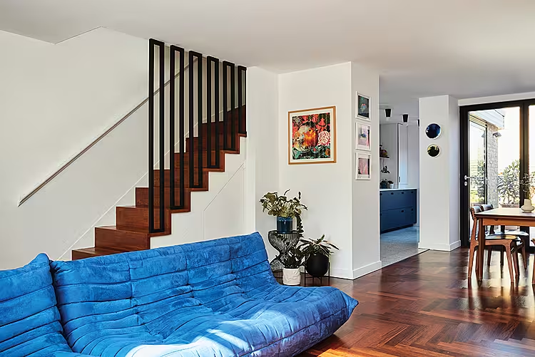
Interior designer Bo Fentum has worked wonders in this rework and revamp of a modest 1960s terraced house. To see more of Bo’s tips for renovating a mid-century house, click here.
Words: Ciara Elliott | Photography: Chris Snook
What was the brief for this project? “Simply to bring back its mid-century soul!,” says interior designer Bo Fentum who has transformed a modest London terrace house into a spacious and light-filled three-bedroom family home, with a home office, for her clients, Steve and Elesa and their two young children. “The couple has a real appreciation for 1960s design and the era of this house so they knew from the outset what they wanted to achieve,” says Bo. “They engaged with me very early on - before they had even completed on the purchase, which meant we had lots of time to create the perfect spatial layout and design for each room as well as source the right materials and vintage furniture for the project.”

The original house
Although this is not a very big house, getting the layout right meant that each space was used to full effect, without a metre wasted. From the outset there was a clear thought process to make the space work best for the whole family.
“The house was dark and damp and completely unloved. All of the original features had been taken out so it presented a real opportunity to start again from scratch,” says Bo. “Thankfully the clients were not scared of a project as we needed to completely strip back everything.”
A mid-terrace early Norman Starrett-designed house in South London, the property originally had two double bedrooms and a small box room, as well as a storage loft which had been boarded up. Downstairs, there was an open-plan lounge area as well as a separate galley kitchen, with a utility room at the end. “Once the builders started they tore down every internal wall and took out the floors between the levels”, says Bo. “It was one large shell, so the spatial design layout could be applied and after that the interior design element included.
The new layout
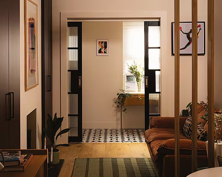
“Every room needed serious attention however, as did the exterior,” says Bo. “We went through the house room by room working on the layout, mood boards, lighting and electrics and final design to make sure the clients were happywith each individual space. It was also really important to make sure that each space spoke to the next so that the overall house felt harmonious and complete.”
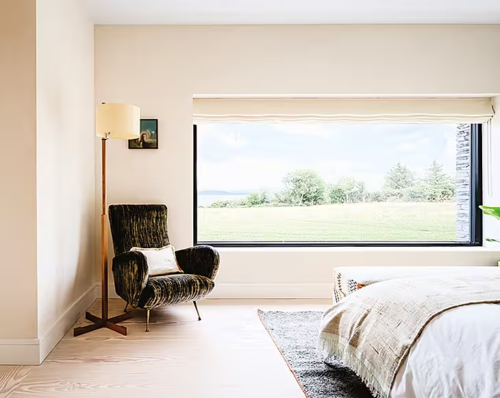
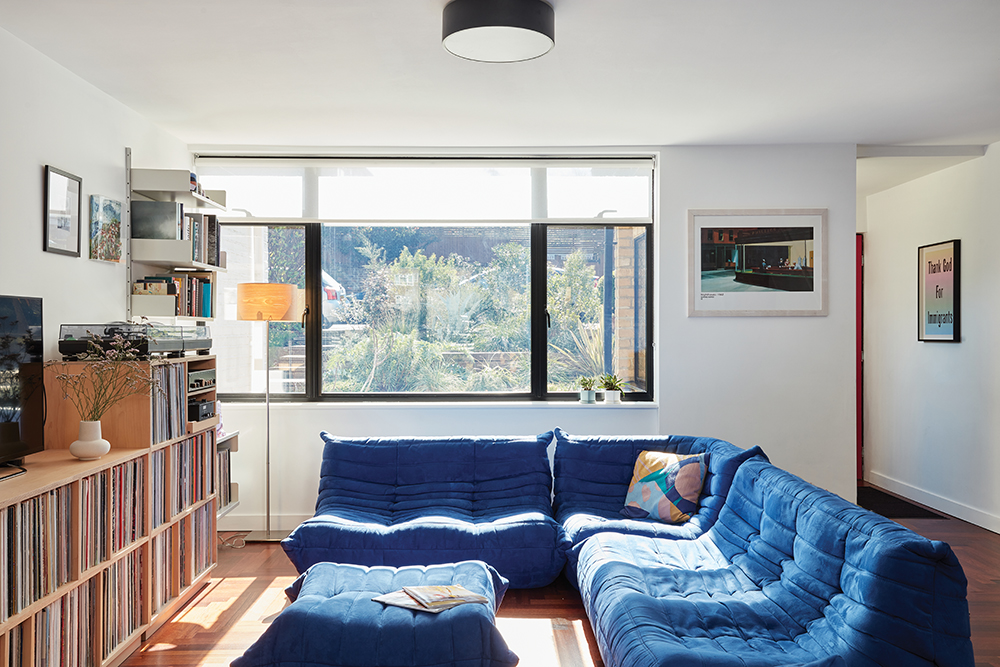
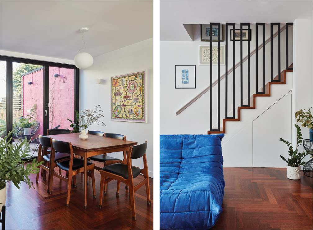
The result is a home with three generous double bedrooms which now includes a home office and a master loft bedroom with an en-suite. Downstairs the space was opened up to create an open-plan lounge and dining area free-flowing into the kitchen.
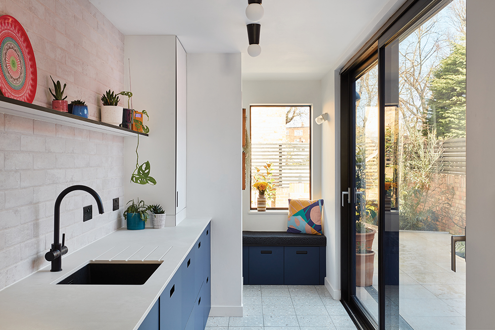
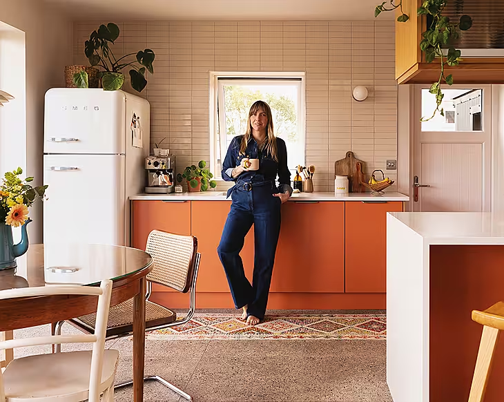
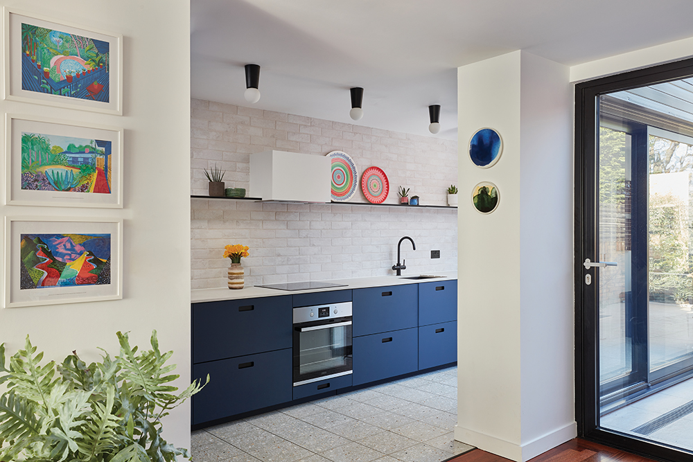
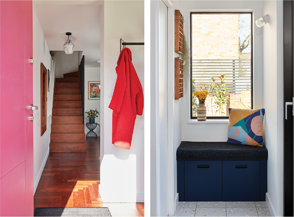
The utility room was removed and the kitchen was streamlined to be along one wall so they could add in floor-to-ceiling sliding doors on the other side. A small cloakroom was created at the end, alongside a seating area with views to the garden. “I love the large glazed door running alongside this galley kitchen. It brings in so much light and makes it feel so much bigger. The footprint from the original kitchen hasn’t changed but the vibe certainly has. We imagined this alcove as the perfect place to sit and have a cuppa,” says Bo.
The interior design
In terms of colour and materials, Bo says they very much stuck to the mid-century palette using natural tones along with woods, with some punchy pops of bright colour running through the house. “There is a lot to be said for trusting your instinct when it comes to colour and their shades,” she advises. “Sometimes you just love a hue that might go against all the ‘rules’ but that can at times create the best and most original schemes.”
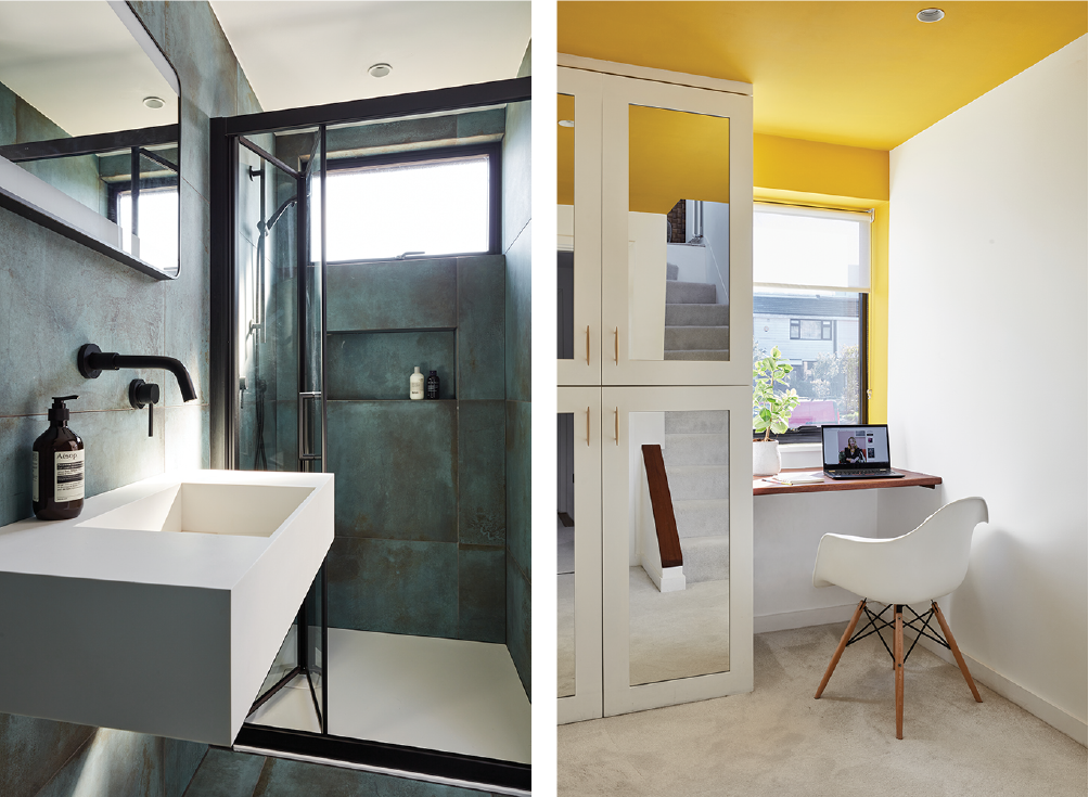
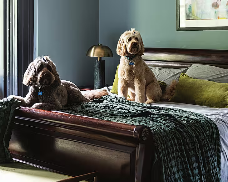
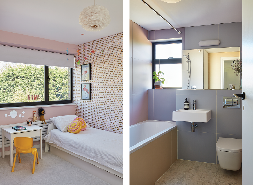
Colour is used to wonderful effect in this home. Effortlessly mixing old and new as well as monochrome and primary colour; the blue of the kitchen echoes with the Ligne Roset Togo sofas and chair in the downstairs living space. The pink front door and the pink wallpaper in the bedroom upstairs chime together, as do the green of the shower room tiles with the plants which are dotted around the house.
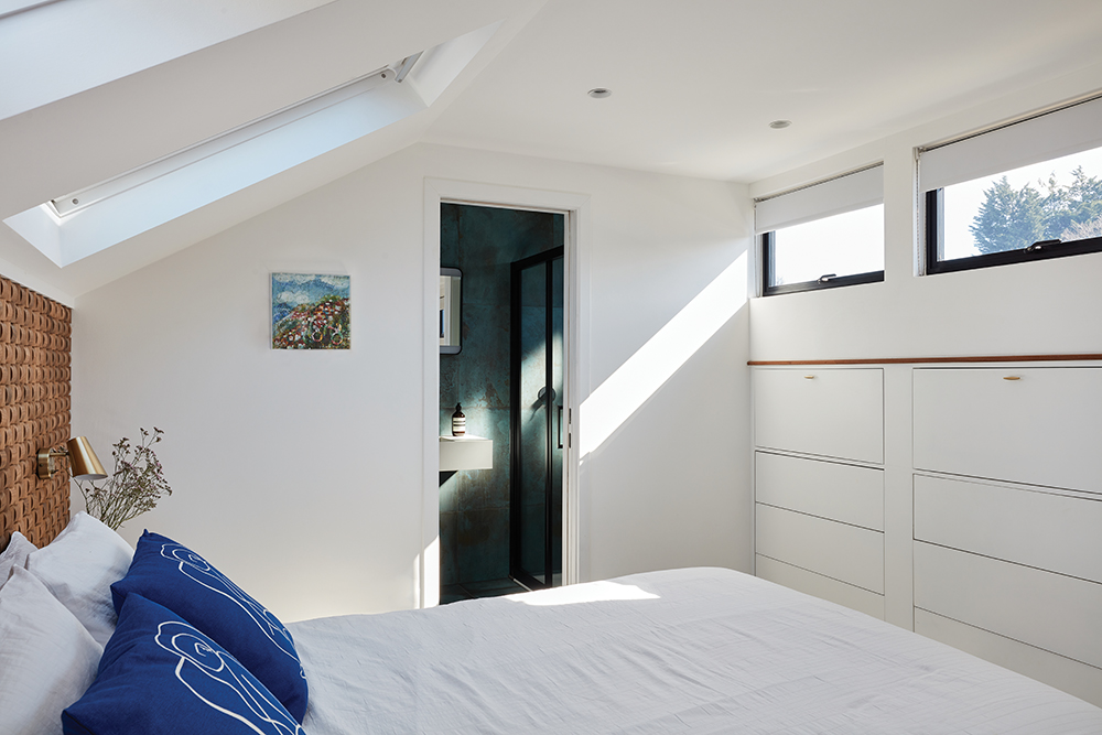
“One of my proudest moments in this house is the loft renovation,” says Bo. “Previously a pine covered storage room with the world’s steepest stairs built into a cupboard, it’s now a calm bedroom retreat, with a perfectly formed little en-suite. I love it.”
The challenges
The project, like any project, was not without its challenges though and one of the biggest that Bo encountered was the lockdowns themselves.
“The clients were renting a one-bedroom Airbnb nearby and were also expecting their second baby so the timescales were super tight,” she says. “With the first lockdown, things slowed on site but luckily not for long. The builders worked incredibly hard to get the house to a state where the clients could move back in. They got in just two days before their son was born. There was still work to be done but at least the family had their bedrooms and a working kitchen.”
The design of this house didn’t stop at the interiors either – there was an exterior facelift too, which meant replacing windows and doors and adding cladding. “I’m always keen to see a design through from the exterior so you can really set the scene for what’s inside,” says Bo.
The couple also engaged landscape designer, Dubliner Marc O’Neill, to reinstate the tiered front garden and redo the back garden. “The clients took a real leap of faith with this house but they could see it had potential,” says Bo. “We laugh now that their house has gone from being the worst house on the terrace – the proper ugly duckling – to hands down the best!”
Sourcebook
Interior designer: Bo Fentum
Kitchen: Holte
Joiner: Kraftwork
Kitchen floor tiles and surfaces: The Mosaic Factory
Kitchen ceiling lights: Light Cookie
Flooring: Parquet flooring in lounge and dining area, Maples & Birch
Garden design: Marc O’Neill
Windows and doors: Smart Systems
Exterior cladding: Qtdgroup.com
Furniture: Ligne Roset Togo sofa, dining table and chairs – all vintage. For similar try Vinterior
To find out more about Bo, visit her website, or pick up more top tips by following her on Instagram @bo.fentum.design
Don't miss Bo's top tips for renovating a mid-century house like this one. And if you're hungry for more renovation stories, check out Siobhan Lam's 10-year project, turning a house carved up into flats back into a family home.

