London’s calling for this incredible Victorian terrace house, full of colourful contrasts
Photography: Jemma Watts
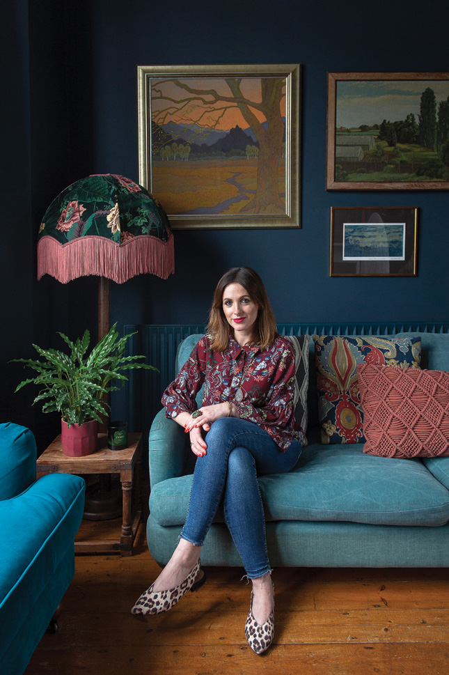
Ask Wexford-born print designer Carol Maxwell her favourite colour combination for the home and it’s no surprise when she says green and pink. Not only are these the signature shades she uses throughout the elegant four-storey Victorian terrace house in South London that she shares with fiancé Tom and their kids, Max (5) and Milo (2), they’re also the branding hues for her online cards and art business Max Made Me Do It.
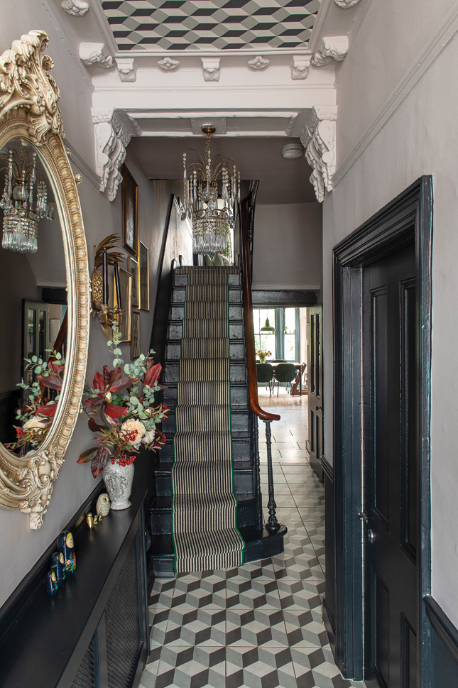
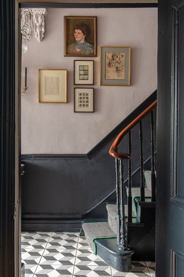 HALLWAY The wallpaper on the ceiling is from Cole and Sons and the floor tiles are from Tons of Tiles. The woodwork and stairs are painted in Railings, with Peignoir above the dado rail, both by Farrow & Ball. The striped carpet and runner is from CarpetRight, which was whipped in bright green.
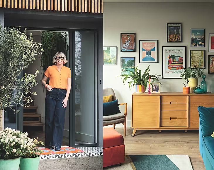
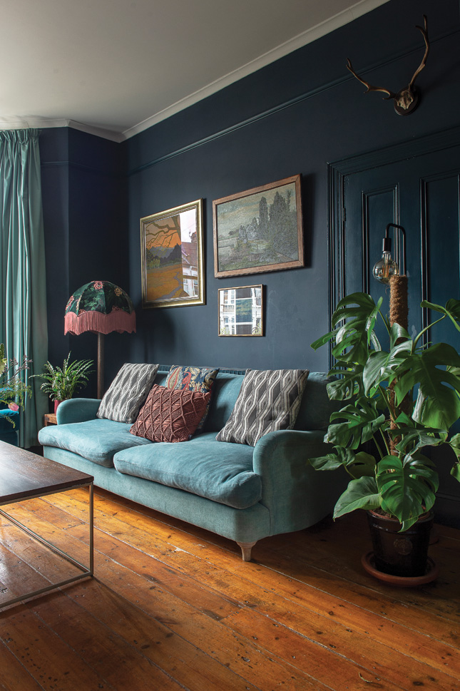
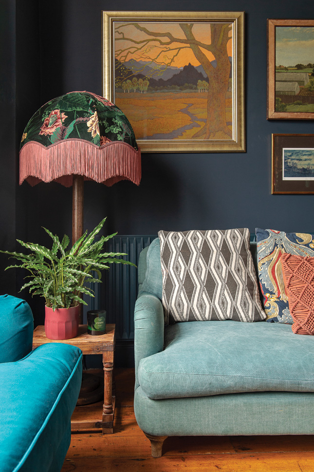 LIVING ROOM The walls are painted in Farrow and Ball's Hague Blue. The smaller velvet sofa is from Made.com and the larger one is Loaf.com. The lamp in the corner is House of Hackney with a base from a car boot sale. Original artwork abounds, lots of which has been inherited and some which were gifts.
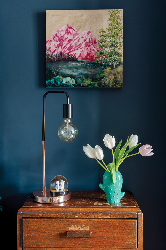
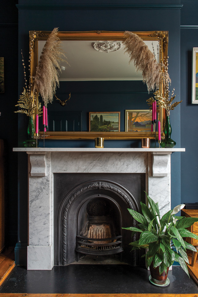
When Carol started her illustration business while on maternity leave with her son Max, she chose minty green and dusky pink as her trademark colours. Reflecting this into her two-tone studio space at home, she has subsequently painted the acid green on the ceiling Arsenic and the pale pink walls Calamine, both by Farrow & Ball.
Almost to follow suit, shades of pink and green are the dominant tones that run through every room in the Victorian terrace house, from the newly refurbished family bathroom to the recently re-painted kitchen and the loft conversion, just completed last summer.
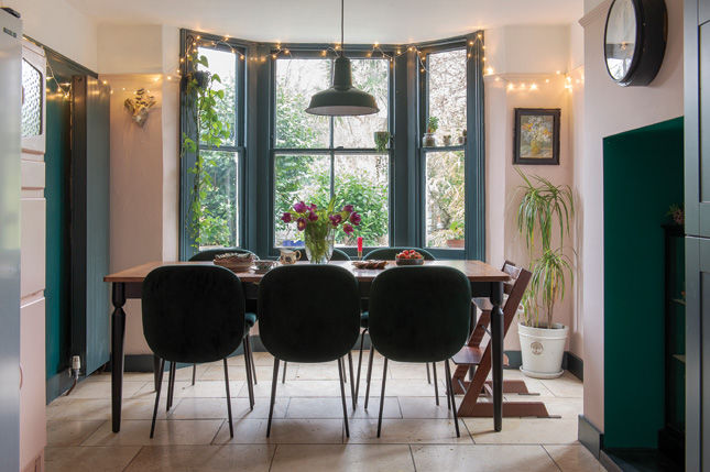
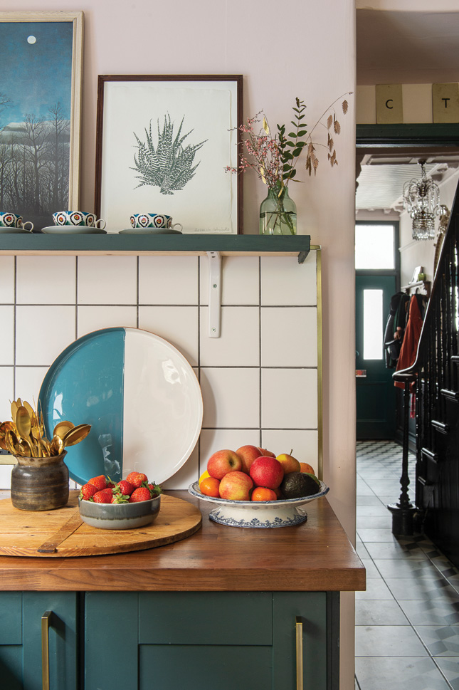
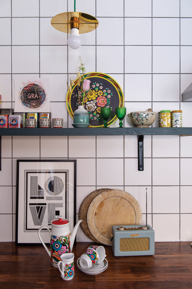
“Maybe it’s my Irish roots, with the green keeping me connected to home, but I am always drawn back to greens of every kind of variety. There are so many shades - and there’s always the right pink that I can match right in there too,” she laughs.
Original painting and artwork in the house are really important to Carol, who came to London in 2002 after graduating from NCAD with a BA in Printed Textiles. While lots of the art in the house throughout the house is Carol’s own, there are also pieces from friends, family and favourite artists, which she mixes in with junk shop and flea market finds, as well as heritage pieces that have been gifted to the couple over the years.
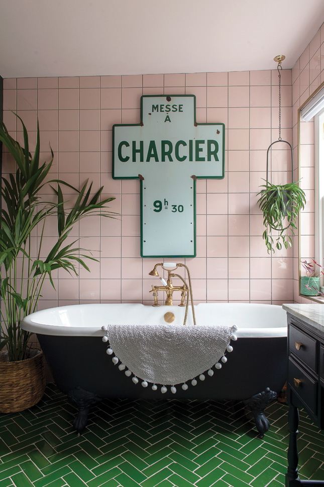
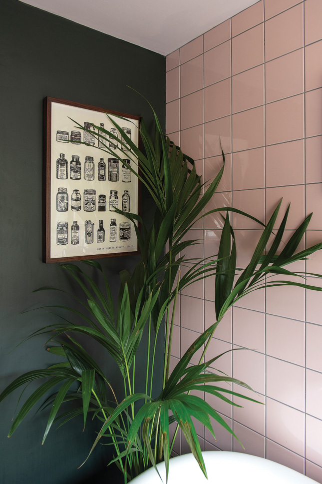
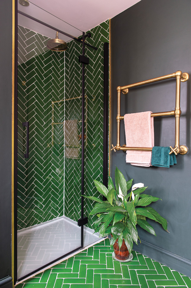
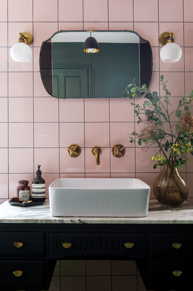
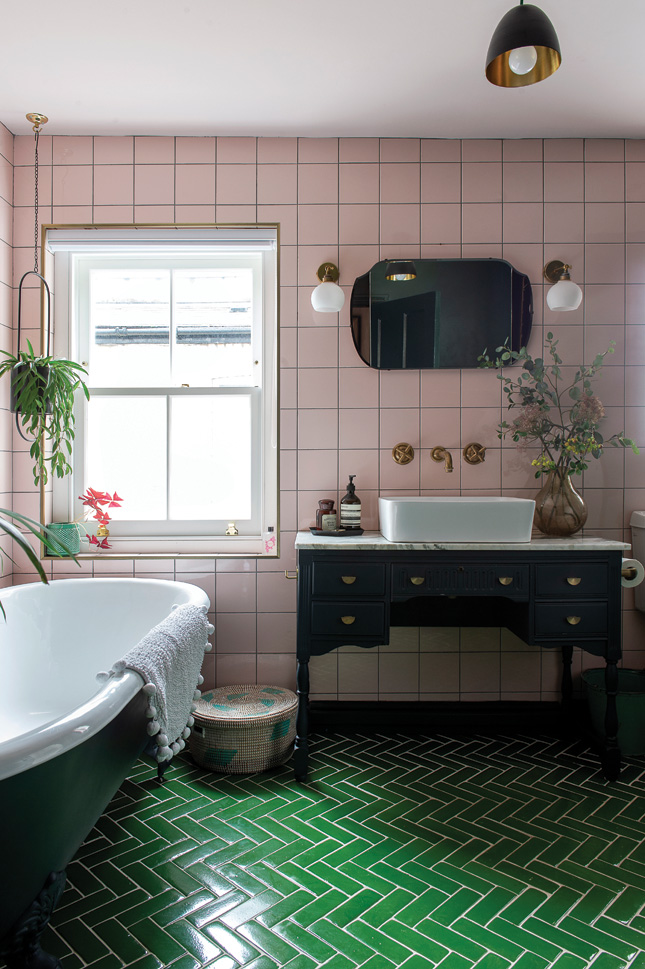 BATHROOM The square pink wall tiles are from Topps tiles and the green floor tiles are the Siham tiles by Bert & May. The sink was from the old bathroom bought on eBay and the vanity unit was an Edwardian writing desk which Carol painted. The brass taps and shower are from Bespoke Taps. The metal Charcier sign is a vintage French church sign, bought in a second hand shop
In fact, Tom’s mum used to run an antiques business in the 1980s which means they have been handed down quite a few interesting pieces, which all add to the vintage feel of the house.
Besides her impressive studio space, another stand-out room in the house is the family bathroom which Carol designed with a mixture of inexpensive and designer tiles, as well as up-cycled and vintage finds. The metal Charcier sign, bought in a second hand shop, was the starting point for the whole scheme. The sink was found on eBay and the vanity unit was an Edwardian writing desk which Carol painted, changing the handles and sourcing a marble off-cut piece for the top.
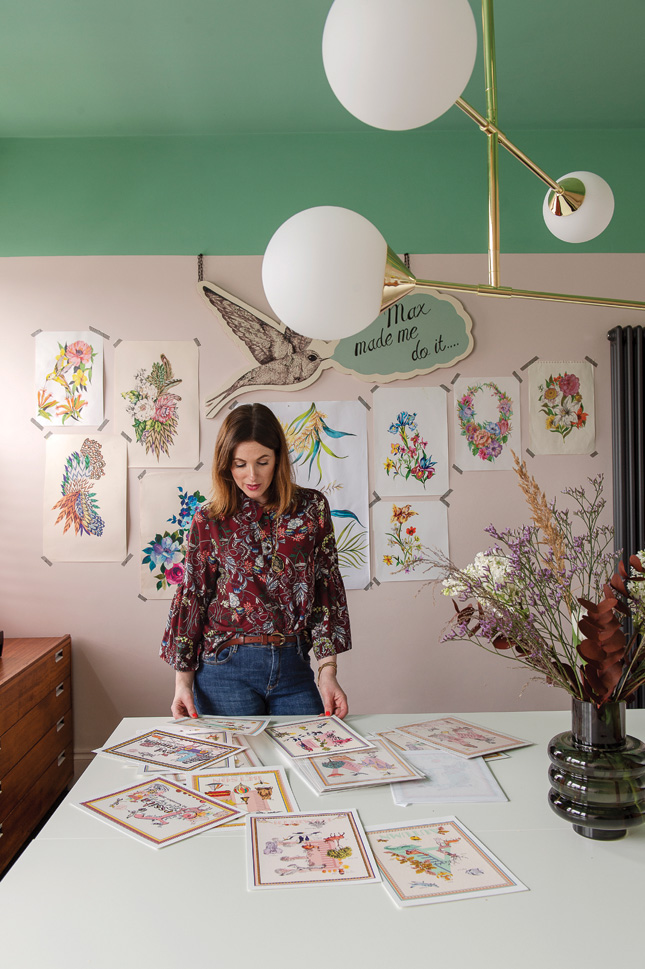 STUDIO By bringing the green down from the ceiling and on to the wall the ceiling cleverly mimics some of the other rooms in the house, giving an illusion of a Victorian picture rail. The walls are painted in ‘Arsenic’ and ‘Calamine’ by Farrow and Ball.
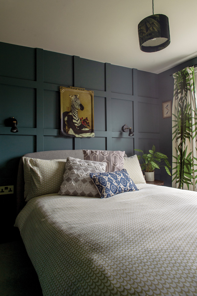
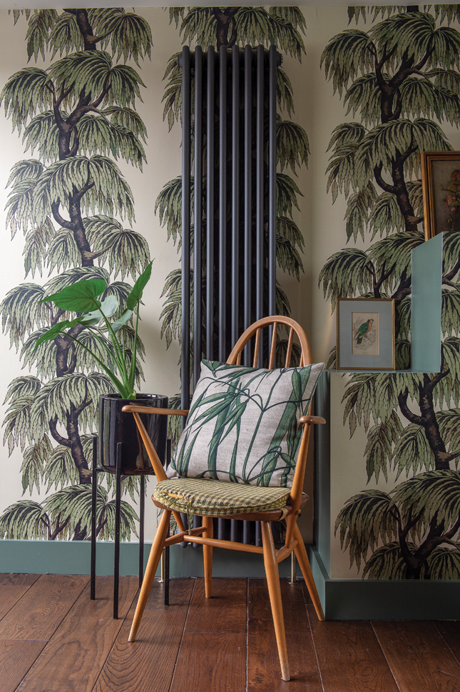
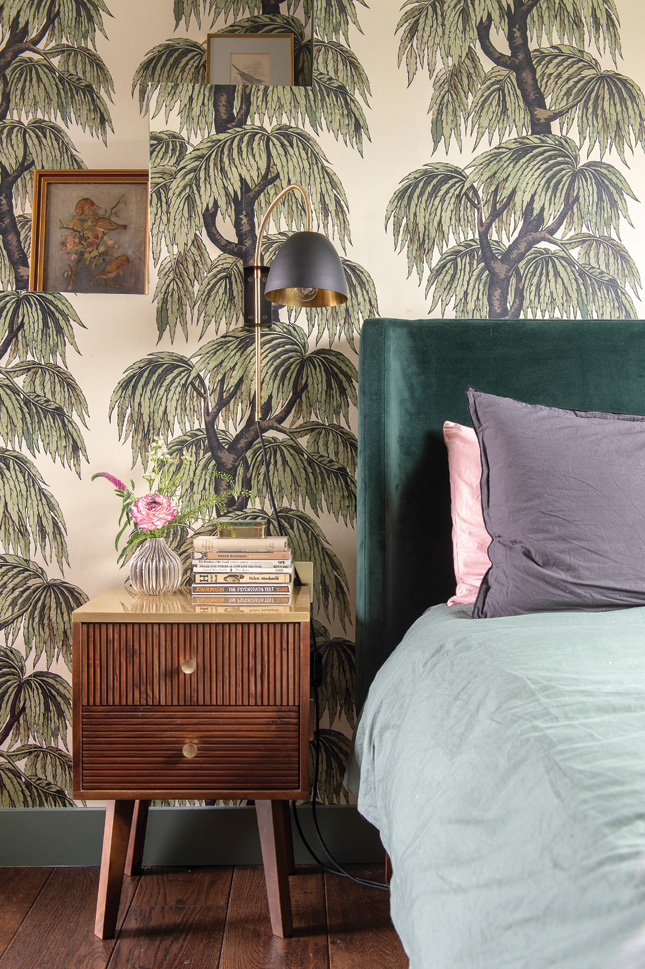
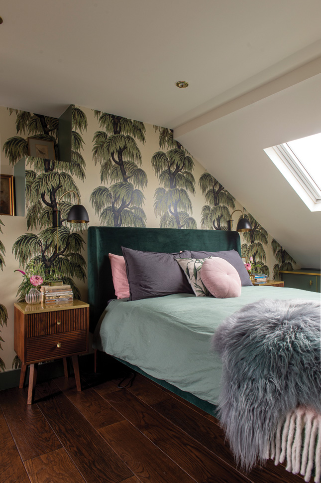 MASTER BEDROOM With its glamorous industrial loft feel and daring wallpaper, the master bedroom and en suite in the new attic conversion looks like the suite of a fancy design hotel, which was exactly the idea. The wallpaper is from House of Hackney, the bed is from Made.com and the bedside lights are from Spark and Bell
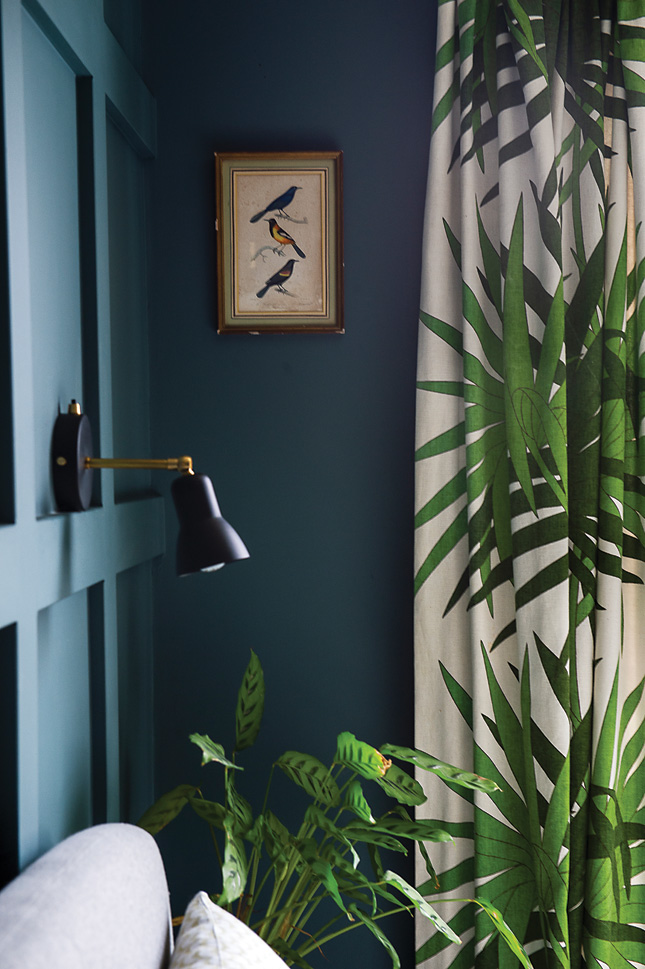
Carol’s vintage palm print curtains in the guest bedroom are another item that set off a whole design: “I bought them years ago and wanted a colour to sit well with them so I grounded the walls in dark, dark blue. I showed my builder this picture from Pinterest of the panelling and he easily created this for me out of MDF. This is essentially a new room, but the panelling brings in such character.”
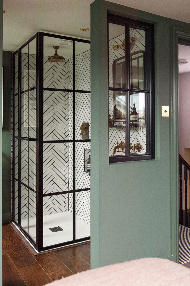
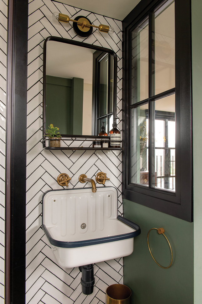
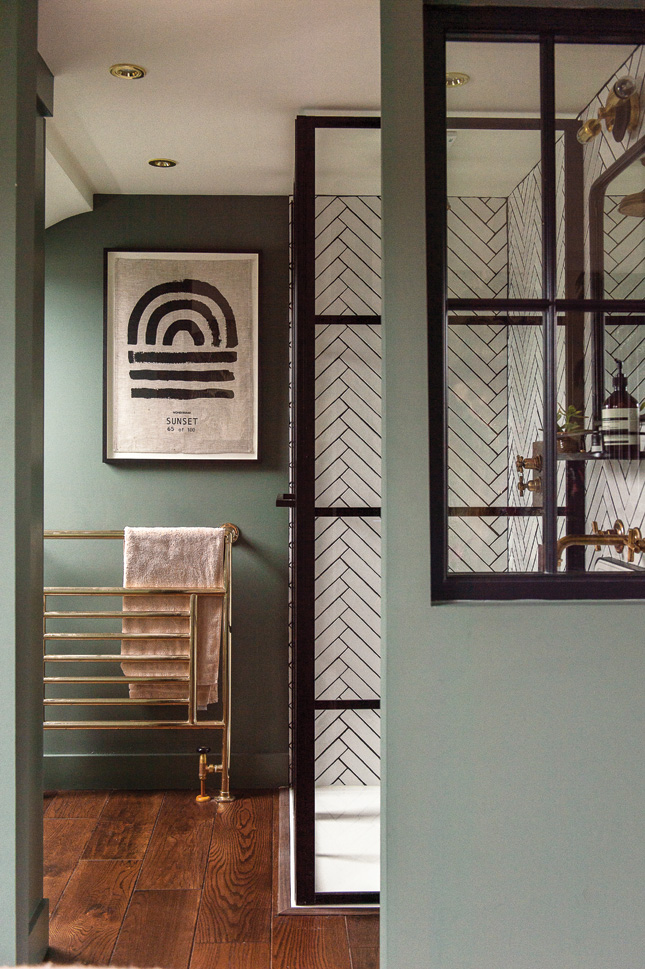
Upstairs, the couple have most recently converted the loft to create two new bedrooms, one with a Juliette bathroom and light-filled en suite, with black Crittall-like shower frames. More green and pink abounds here, with stylish details including leafy wallpaper by House of Hackney, lighting by fellow UK Irish creative Spark and Bell and a green velvet bed by Made.com. Carol’s dad is a builder back in Gorey in Wexford and he was very hands-on with help.
“Even after the loft was finished, my dad helped by re-doing the whole floor, stairs and landing up to and including the loft. He also tiled our hallway floor and last summer he came back and helped with the kitchen, I don’t know what I would do without him.”
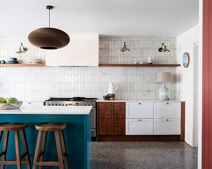
“The kitchen was a revamp on a budget, as we may still want to do a bigger side extension here in the future,” says Carol.“ So we kept the floor which I hate, painted the cabinets and changed the handles. We also replaced the worktops and sink with ones from Ikea.”
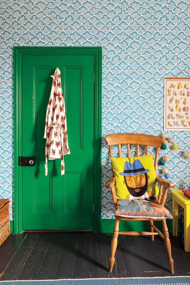
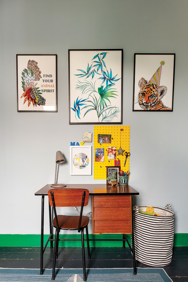
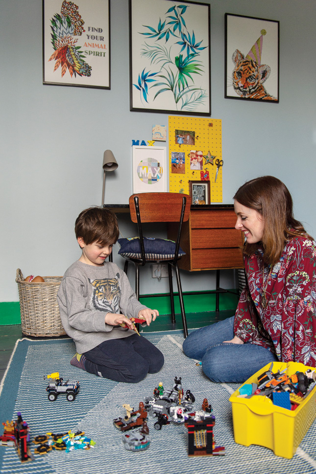
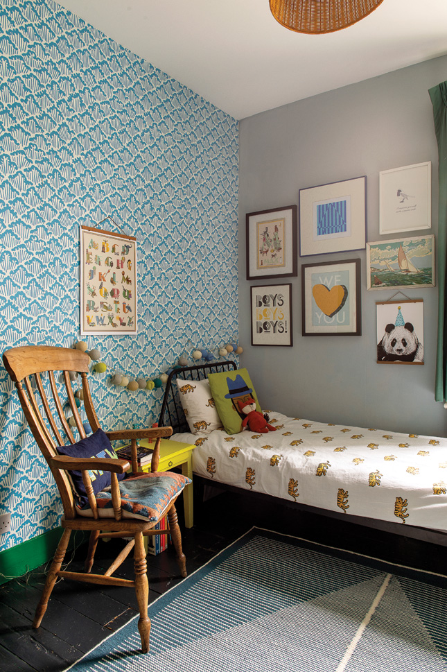 MAX'S ROOM This is the most recently decorated room which Carol has just finished in time for Max’s fifth birthday. The blue walls are Parma Grey with Aranami wallpaper both from Farrow and Ball. The desk is a vintage find. “I love to play with colour and am not afraid to go bold with it and when it comes to furniture and accessories I’m a vintage girl at heart”, says Carol.
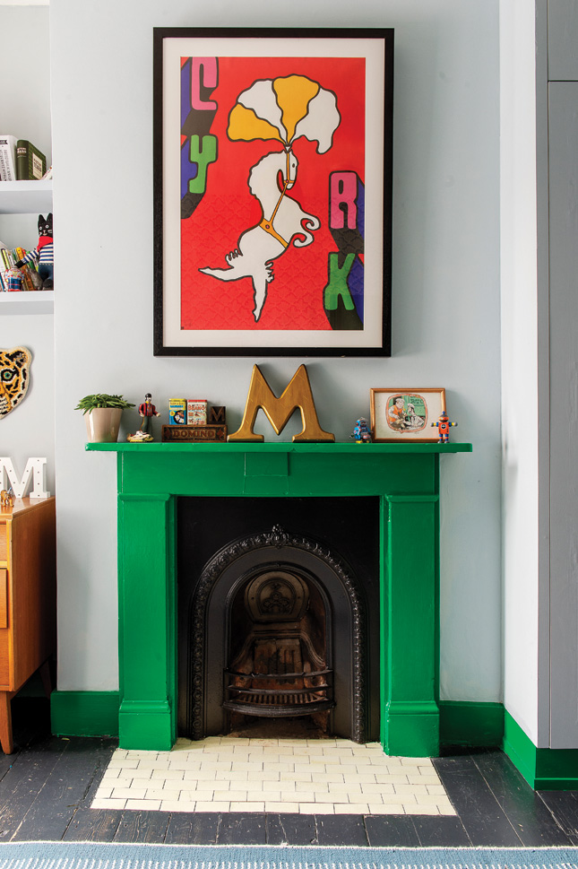
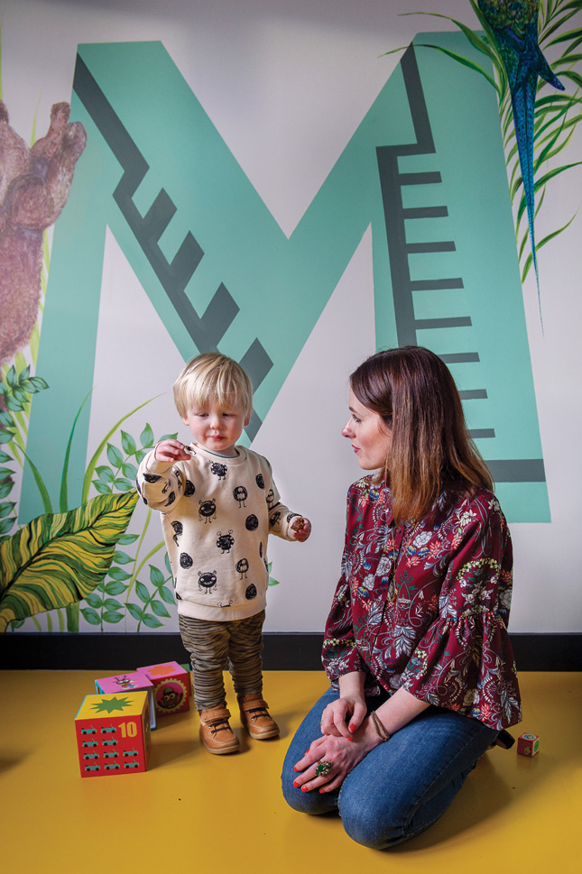 MILO'S ROOM Carol hand painted the mural in here, which is a play on her popular Max Made me do It letter print range. The yellow flooring in Milo's room is by the Colour Flooring company
So, finally does Carol have any advice to anyone planning a head-to-toe revamp, like hers? Anything she’d do differently next time around? “Yes. I’d think more long term. For example, we had the most tiny bathroom when we first moved in so we decided to turn one of the kids box rooms in to the bathroom. What we should have done is what we did this year and knocked through the three rooms to create one large bedroom and bathroom; essentially in five years we’ve done two family bathrooms, which we didn’t really need.”
A lesson hard learned, but with the beautiful interior results eventually attained, Carol and Tom should be nothing but proud of all they have achieved in this fun but sophisticated family home.


