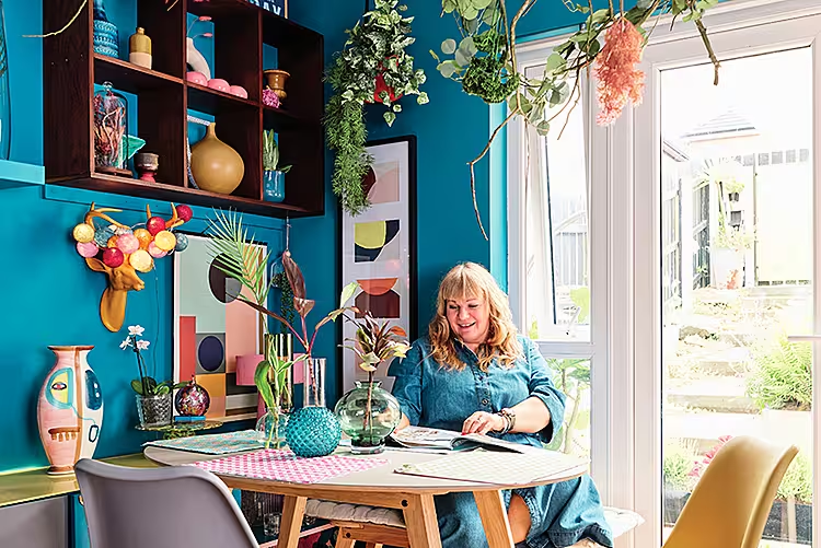
Helen and Alan have turned their Belfast new-build home into a showcase of colour and creativity
Words: Victoria Hrastic | Photography: Philip Lauterbach
When Helen McVitty-O'Hara and husband Alan O'Hara started their Belfast property search six years ago, rather than looking for character they were on the hunt for a blank canvas where they could make their mark. “We'd always wanted a townhouse and because it was a new-build, this was perfect for us to make our own,” explains Helen, an education officer. “The location was also perfect, close to Cavehill mountain and country park where we enjoy walks with our dog Oscar.”
The three-storey abode has an open-plan galley kitchen with a large living room and dining area downstairs. On the first floor are two bedrooms, one with an en-suite, and the bathroom, and the top floor has a master bedroom and snug, all ideal for when they need to work from home or want to welcome friends and family.
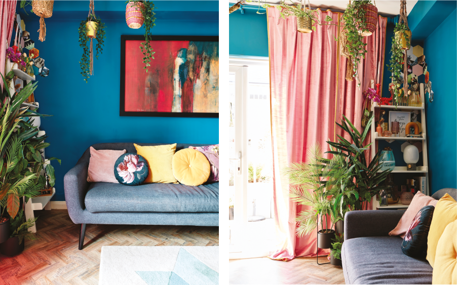
Aside from the addition of a glass partition downstairs, a practicality which means they can shut away the kitchen when they want to while still keeping the space open, they haven't done any structural work. But they have completely transformed each and every room with bold colour and statement design. “Our last home had lots of white walls which formed the perfect backdrop for accessories, but this time we knew there'd be no white and we wanted colour all the way,” says Helen. “Our home is individual, maximalist and bright – I didn't want any grey in the scheme.”
Scouring Pinterest and Instagram, reading books and magazines, and watching interiors programmes all fed Helen's inspiration – she shares her creativity on Instagram @myaudacioushome – as well as the couple's love of travel. “To bring the look together I found similar patterns, styles, forms and textures all helped,” she explains. “Being a creative, I tire easily of how interiors look, so I'm constantly making changes and seeking ways for self-expression in our home.”
Helen's room designs tend to start with a find, whether wallpaper or curio, and grow from there, with a combined love of creativity and hands-on approach meaning the décor has the couple's own bespoke twist throughout. “I've made curtains and roman blinds, created mural features and customised curtain poles and furniture,” adds Helen. “While Alan is very talented and can turn his hands to anything from painting to wallpapering, flooring and tiling, we only called the experts for either plumbing, joinery or electrics and the installation of the glass screen.” Herringbone luxury vinyl tiles (LVT) throughout the ground floor, new carpets upstairs and fresh vinyl in the bathroom and en-suite, all sourced by Alan who is a flooring contractor by trade, helping the colourful spaces flow together.
They've also learned how to make the most of features they weren't so keen on. The windowless bathroom – which will one day be a wet room – now has massive mirrors to create a feeling of spaciousness and light even though there are no windows.
Similarly, the kitchen and bathrooms had been chosen by the builder, but over time the sinks have been replaced and the kitchen updated with extra shelving and a new worktop, painting the cabinetry and incorporating patterns to reflect the living area and their style too. “The intention was to extend the units to the ceiling just like we had in our last house,” adds Helen. “It's a useful tip for making a small kitchen appear bigger as it draws the eye up, but the top of the units provides the space to adorn with plants and curios.”
“The house wasn't perfect when we moved in but with a lot of hard graft and creativity we've come to love it,” she adds. “My advice to anyone looking to buy a house is to look past the imperfections and see the possibilities. The living room is a feast for the eyes and it performs so many different functions, whether it's relaxing and socialising at the dining table, working from home, or access to the garden through the French doors – friends say there's so much to look at and it's very typical of me.”
Living room
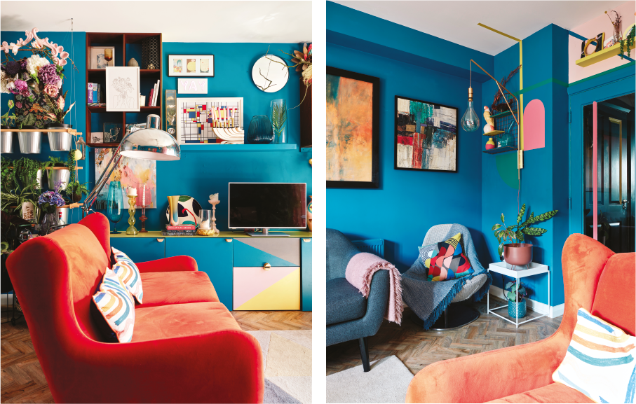
The couple originally wanted a bespoke piece for their television but couldn’t find a joiner so Helen customised Ikea units with paint in 'Moon Shadow' from Little Greene, the same colour as the walls, handles from Anthropologie, a perspex sheet on top and LED lighting at the back. A living wall of hanging plant pots, a mix of faux and real, creates natural interest on a wall which houses pipes leading to the bathrooms. The feature wall in the living was a pandemic project of Helen’s. “Creating it was cathartic, it didn't cost very much as match pots of paint were used,” she admits. “It evolved over time, paint and wallpaper in the kitchen too.”
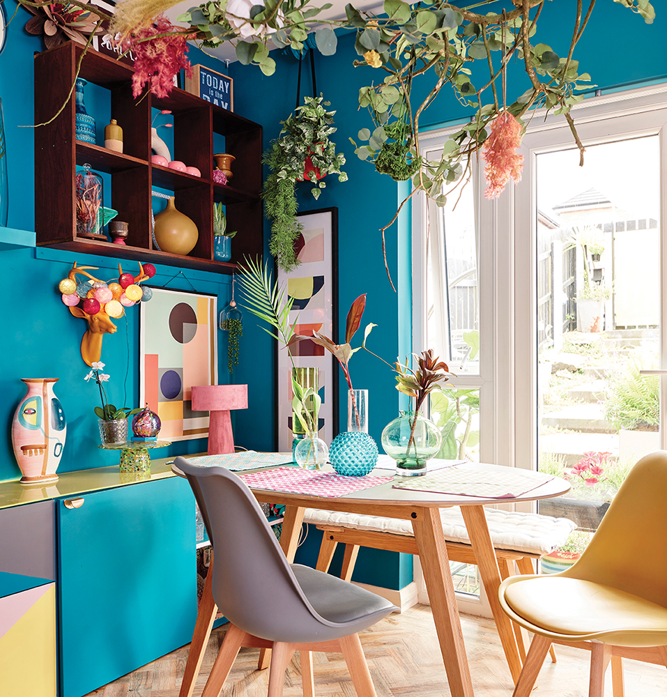
A creative combination of shelving, prints and paint showcase both the couple’s flair for design and their love of travel. “The selection of vases have been gathered over time from internet trawls and holidays,” says Helen. In the curation of the shelves and cubes, key pieces complement the space without cluttering it.
Kitchen
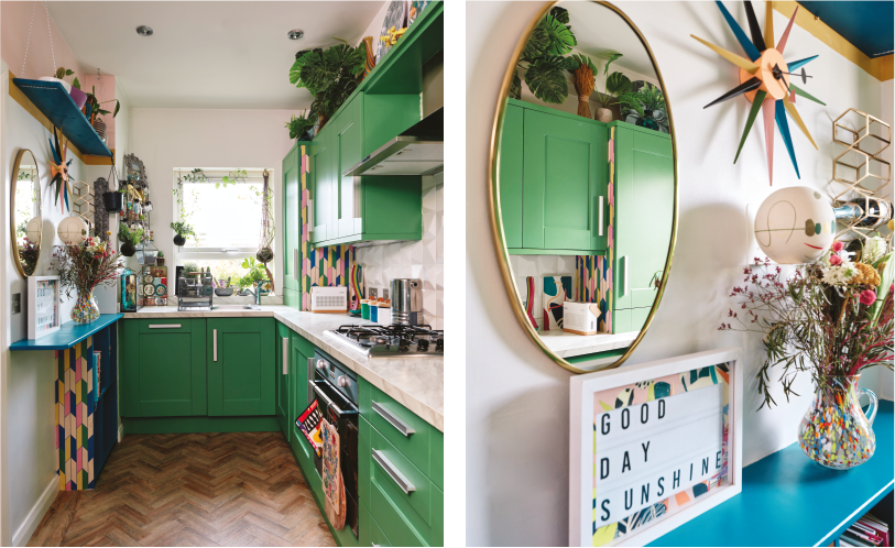
The couple repainted the cabinetry in a bold 'Neo Green' from Lick paint, adding a new worktop, sink and shelving. By continuing the key colours from the living area the two spaces complement each other. Three-d tiles were inspired by a trip to Lisbon, creating an understated statement, Helen found them at Porcellana Tile Studio in Belfast.
Cloakroom
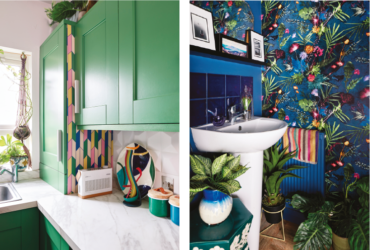
Indigo Tropical wallpaper by Gillian Arnold (from Not On The High Street) creates a vibrant statement in the downstairs loo (above right).
Study
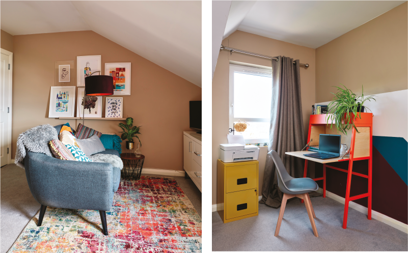
The wall mural in the multipurpose study and spare room was inspired by the pattern from a cushion – Helen had the paint colour matched at Valspar in B&Q, while the Ikea bureau means the laptop can be closed away, taking up little space and offering just a pop of colour after hours. The sofa, from Made, sits next to a picture shelf of prints with an Ikea sideboard for media storage.
Master bedroom
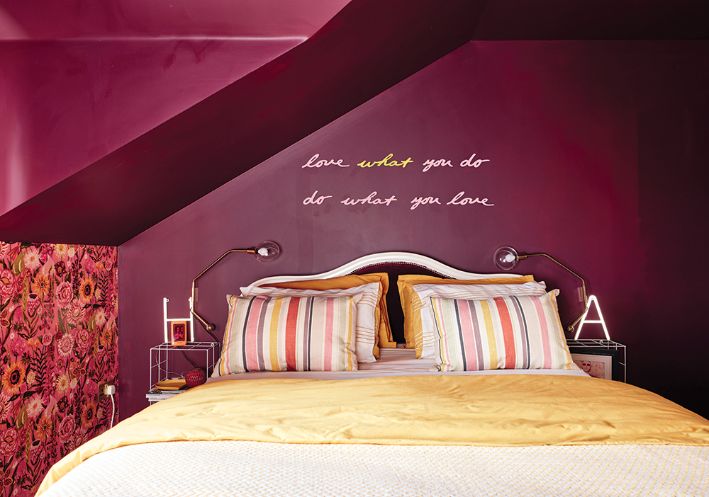
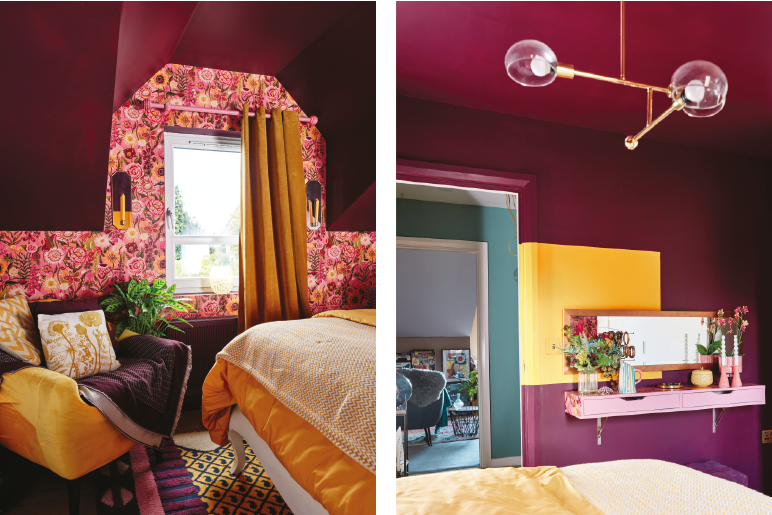
The Ikea dressing table was originally white, Helen added a wallpaper top and painted the front a pretty pink, with more accents of mustard and gold bringing a fun angle to the space. The lighting came from Made, as did the armchair which Helen updated with a new velvet cover.
Blue bedroom
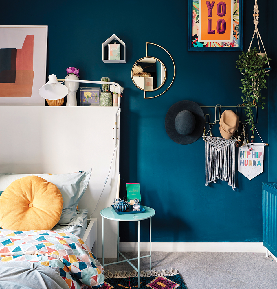
The couple’s first foray into dark paint was in a south-facing bedroom which is flooded with light. They chose a neutral grey carpet to contrast with the dark blue hue. The bed has a handmade headboard and storage area above. The table is from Søstrene Grene.
Pink bedroom
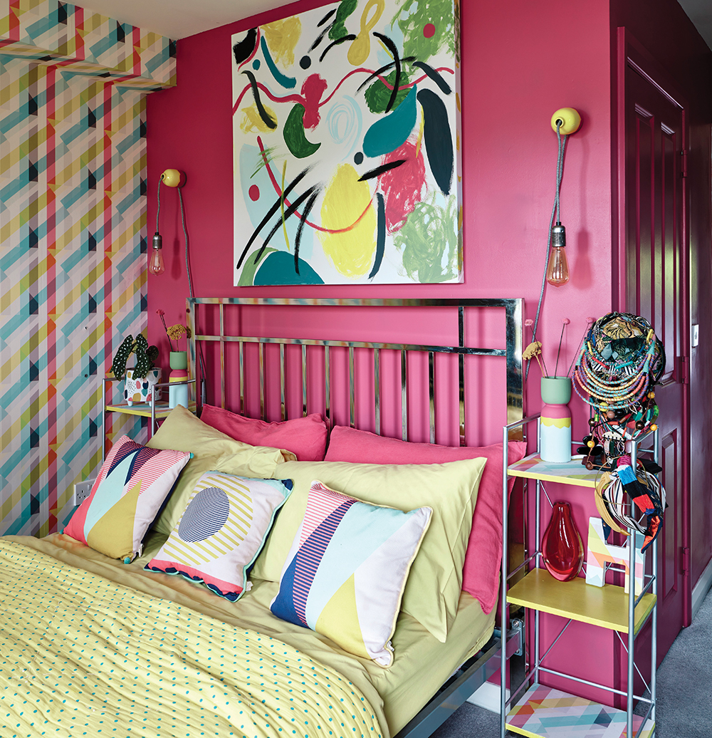
The statement graphic wallpaper was originally teamed with white, then grey walls, before Helen settled on pink, which is colour-matched to the wallpaper. “I’m finally happy with the look,” she says. “The abstract art gives it a fun element." The bedside stands (from Urban Outfitters) have been painted and wallpapered to coordinate with the canvas painted by Helen using leftover sample pots.
Helen's colour tips
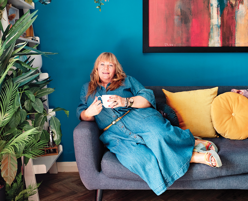
1 Choose colours you love. Don't be too influenced by fancy fads as trends come and go. I have always loved peacock blue, and it is the perfect backdrop for the look I wanted to achieve in the living room, but it is not for everyone.
2 Build it up slowly – you can't do it all at once. We worked through each colour scheme room by room, I found ideas on Pinterest and then, when budget permitted, searched out similar patterns, styles, forms and textures to create a unified look.
3 I feel your home and the colours inside should tell the story of who you are. It's a way of communicating without speaking. As designer Charles Eames said: 'The details are not the details, they make the design.' I have noticed that the colours you love to wear are often the ones you will love to be surrounded by at home.
If you love Helen's colour style and want to even more inspiration, don't miss a tour round Kathleen and David Lonergan’s maximalist Dublin home.

