When Sarah and Phil Crawley viewed their house for the first time, they were instantly enraptured. “We fell in love with the beautiful Edwardian detailing and the double-height ceilings. It was also in the right location for work and family nearby. Immediately we saw the opportunity to take what was already a classic home and bring in a more contemporary, fresh feel,” Sarah says.
Recently engaged, the couple had been living in a small flat, having moved back from Leeds to their native Nottingham. On a mature road, the house is near parks, corner shops and the city centre, as well as around the corner from Sarah’s parents, and it felt like the perfect family home. “That was five years ago, and we bought it planning to grow into it, hoping we could have a family,” she recalls.
Now, they’ve got 18-month-old Theo in tow, and it’s the ideal family home.The first thing they did was to change the magnolia walls, and they also re-carpeted the halls and re-tiled the bathrooms, but left the loft rooms and kitchen area as they knew they were eventually going to do a bigger job.
“We spent six months drawing up plans, and a further year getting permissions needed,” Sarah says. “We then spent six months doing the front extension and finishing the house.”
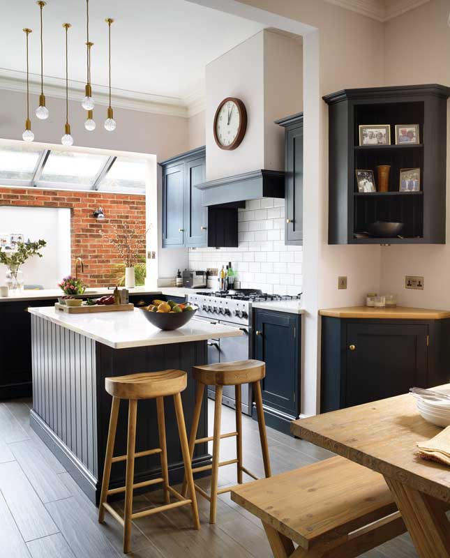 There is a calm, bright and modern vibe to the kitchen-dining space, achieved thanks to a pared-back wooden dining table and stools set against dramatic dark cabinetry and an exposed redbrick wall at the far end of the island, which has space for a small snug. The bespoke kitchen cabinets are painted in Farrow & Ball Railings. Above the island hangs Lee Broom Crystal Chandelier lighting (Leebroomeu.com). "This is my favourite room in the house as I love the really high ceiling and the space it gives, and think the Lee Broom lights really bring this height to life," Sarah says
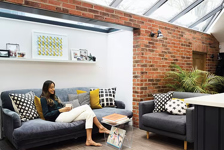
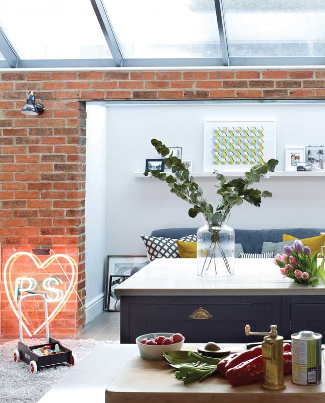 The neon sign was a wedding present of the couple’s initials and is a nod to their join love of artist Tracy Emin. “One of the readings at our wedding was a poem she wrote,” reveals Sarah. Try Dublinneon.com for bespoke neon options. Sofa.com's Bluebell or Isla couches are are a similar option, available at House of Fraser. Try Meadows and Byrne (Meadowsandbyrne.com) for cushions. For a similar geometric print, look to Irish print artisit Deirdre Breen (Deirdre-breen.com)
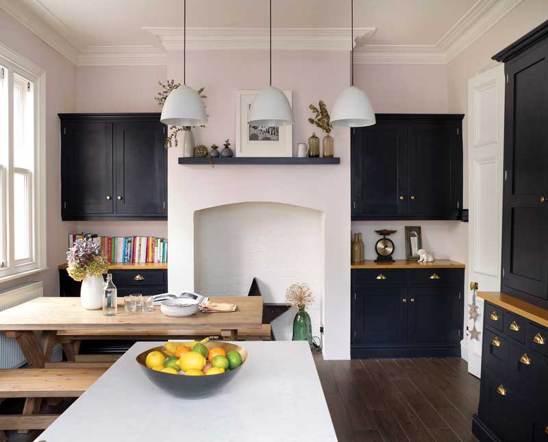 Pale walls, a trio of matching pendants (Brightlights.ie has similar) and wooden tones give this area a contemporary classic feel that's welcoming.
Once planning was achieved, phase two kicked off. The couple knocked the kitchen into a lean-to and garages at the side of the house, in order to create a new open-plan kitchen, dining and utility area.
In terms of design process and ideas, Sarah first locked in a colour palette for each room, choosing schemes that would flow throughout the house. She then built up her ideas through mood boards which brought to life the hues, textures and furniture, in order to pull it all together.
“We mostly went for quite a muted palette,” she muses. “But then there are some really strong colours throughout the scheme too, and I’m glad about that as we now have a combination of calm along with impact.” For inspiration, Sarah looked to Pinterest and magazines, and also admits that she developed a bit of an addiction to Instagram along the way.
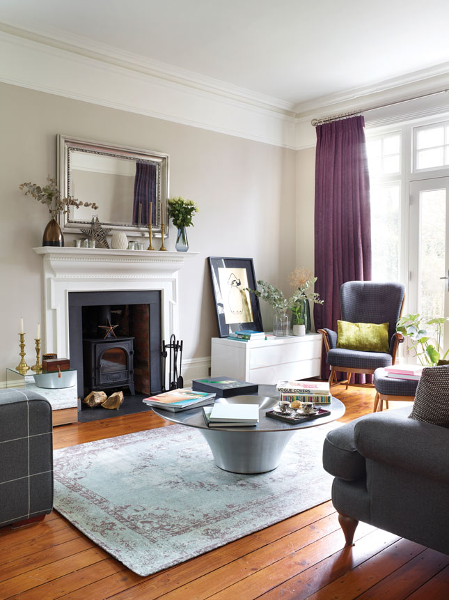 This room has a very classic feel, with its original fireplace and cornicing and the calming grey walls. “We wanted this room to have a sophisticated vibe,” says Sarah. “It gets so much light and has such a lovely view to the garden.” The wall colour is Elephant’s Breath by Farrow & Ball. The framed art print is by Zara Wood (Zarawood.com). For similar rug, try Harvey Norman (Harveynorman.ie) or Rugart (Rugart.ie), DFS (Dfs.ie) has a range of check armchairs; find a coffee table with a metal base at West Elm (Arnotts.ie)
I’d find myself lost in an interiors hashtag hole,” she laughs. “I love seeing how other people style their homes. Through doing this project I’ve definitely developed a love for interiors, and left to my own devices – and with a limitless budget – I’d start refreshing all of rooms again!”
Every project comes with its issues, so what did she take away? “I feel we should have been more realistic about how much time and budget we had for it,” muses Sarah. “I made the mistake of buying some mega-expensive things and then not having anything left over for the fun stuff. Saying that, it’s important to have the odd splurge too! For instance, I looked for months to find some cheap bedside lamps for our bedroom, which were like the Loaf ones I had seen and loved. In the end I couldn’t find anything as nice, so I bought them – and honestly I’ve never regretted it.”
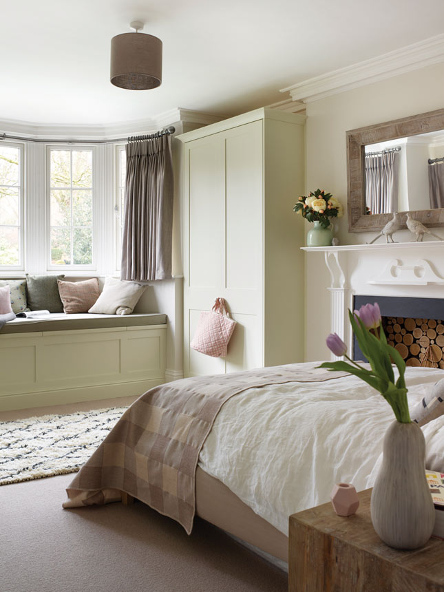 The couple calls this guest room the Cotswolds room, as it's modelled on weekends spent in cottages there, where they were inspired by natural textures, tweed fabrics and the dusky grey and yellow colour palette you'll find in this part of the world. “We had the window seat built into enjoy the view and make use of the space in a different way,” says Sarah. Find a similar Berber rug at Sostrene Grene, Monet Pale from Fleetwood's Vogue collection (Fleetwood.ie) is a similar shade to the woodwork colour
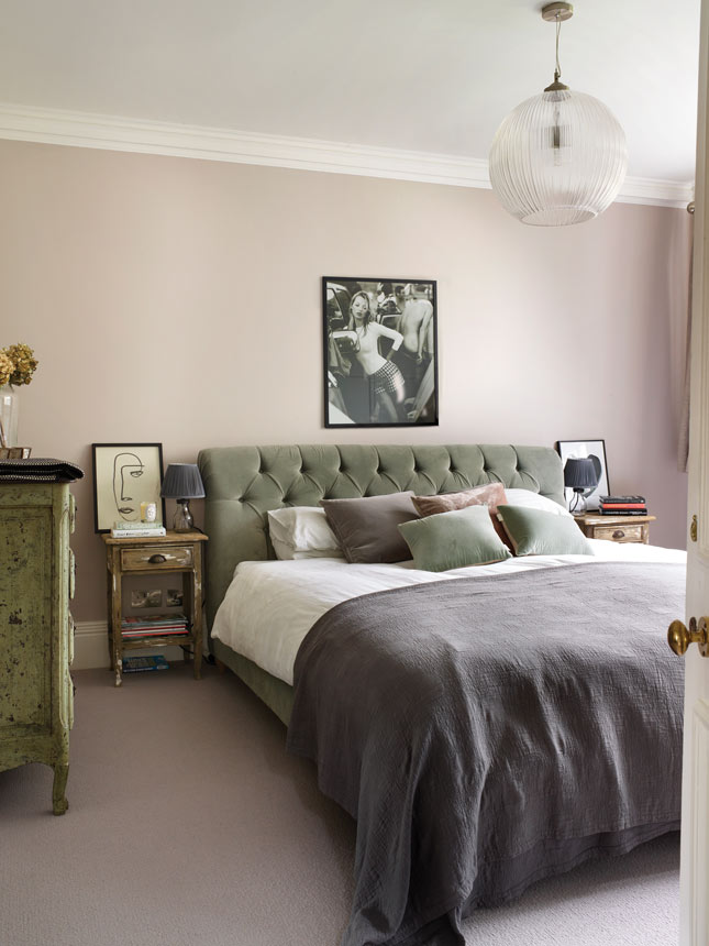 The master bedroom is painted in Farrow & Ball’s Pigeon. “The bedside tables were my best buy,” says Sarah. “They were €60 for the pair from a local antiques fair – I love that they are original and unique pieces.” The bed and bedside lights are Loaf.com with the light above the bed by Made.com. The throw is from Soho Home (Sohohome.com) and cushions are from Cox and Cox (Coxandcox.co.uk) and Habitat (Habitat.eu). The artwork over the bed is Kate Moss by Mario Testino, and beside the bed ‘Serious Dreamer’ from Loulou Avenue
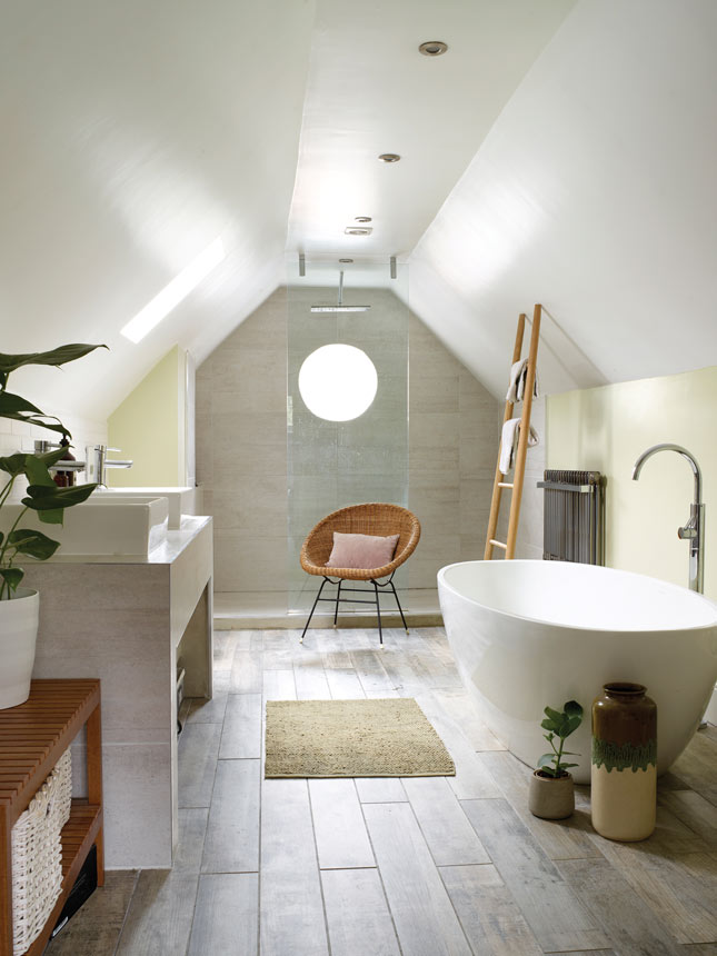 Originally two small rooms ,the couple had them knocked into one. “One weekend before we moved in I came down to see the work and Phil said 'I’ve got something to show you',” recalls Sarah. “He’d got the guys to knock the two rooms through and create this spacious, light and bright bathroom. I loved it and even though it’s way bigger than we need and an indulgent use of space, it’s like my sanctuary and so relaxing.” The flooring here is from Fired Earth (Firedearth.com), with bath from Victoria and Albert Baths. Try Tubs and Tiles for similar (Tubstiles.ie). Units are by Villeroy and Boch (Idealbathrooms.ie)
So, what’s next for this home-loving couple? The dream is to buy a piece of land and build from scratch – or is it? “Actually,” Sarah says, “I know it is completely different, but a minimal barn conversion would be the ultimate project for us!”
DON'T MISS THE DETAILS
At the end of the kitchen-diner is a clever boot room addition to the family uses to store coats and clutter. In the downstairs cloakroom, tongue and groove panelling and Victorian-style floor tiling are contrasted with fun Flamingo wallpaper by Cole & Son (Cole-and-son.com). In the Cotswold room, muted tones and original features combine for a restful, relaxing vibe that's really inviting. The old and new combine seamlessly on the exterior of the couple's Edwardian house.
See below for a look at some of the other aspects of Sarah's beautiful home.
PHOTOGRAPHY: Rachael Smith


