Mark O’Neill’s small Dublin city apartment shows you don't need tonnes of space if you're maximising what you have
Photography Philip Lauterbach | Styling Lesiele Juliet, assisted by Sophie McKenna
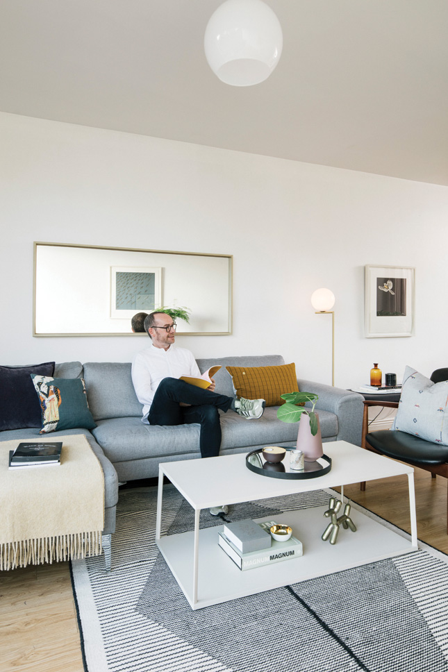
When we arrive at Mark O’Neill’s designer-decked two-bedroom Dublin city apartment, he apologises for the mark on the enormous plate glass windows book-ending his living area. “A bird flew into them,” he tells the House and Home team, and we wince – but this glass expanse is one of several reasons Mark’s 60 sq m home feels so large and airy.
In old money, that’s a compact 645 sq ft. However, it doesn’t feel it. It was the bright, well laid out dual-aspect accommodation, rear-facing balcony, proximity to a nearby river and trees that sold the flat to him in the first place. That, and the fact he had family living in the area, so it was a spot he already knew and liked.
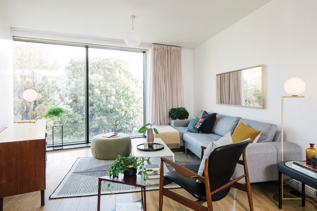 LIVING AREA Adding a large sectional couch from Made.com was a starting point for the room and he didn’t clutter the space with any other large furniture items. Find a similar throw at Foxford Woollen Mills, and a rug at Made.com. Opposite the couch sits a vintage sideboard found on Adverts.ie, inside which Mark has cleverly placed his TV. When not in use, it can be shut away. On top, the lamp is from Flos and the plant holder was a TK Maxx find.
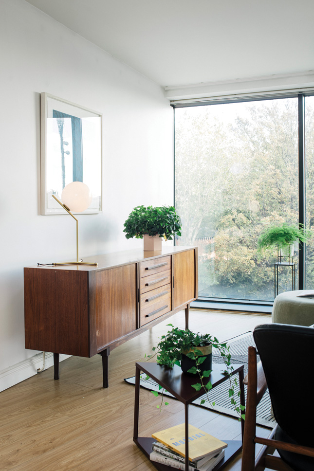
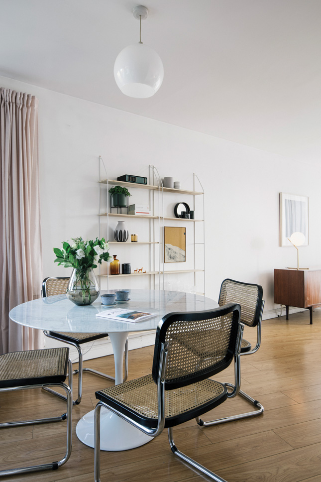
Mark, who works in brand concept and development, moved into the apartment in January 2018, and his first order of business was to paint the whole space white. “I’ve always had an interest in interiors,” he says. “I’ve enjoyed making a place feel like a home, even when renting. My previous apartment was in a converted church, so I had more antique pieces that really suited that environment. But with this apartment, which is a lot more modern, I’ve used more contemporary items.”
Pared-back though Mark’s style may be, he’s an inveterate collector, with a skilfully-edited selection of objects and art on display throughout his Dublin city apartment, with some small heirlooms handed down from his grandparents. “I lived away for five years so have some pieces from that time, which are always a nice reminder,” he says. Artworks, liberally sprinkled throughout the flat, come from a variety of sources. “I buy from The Printmakers Gallery, SO Fine Art Editions and have bought a few pieces from Instagram, it’s a great resource,” he says.
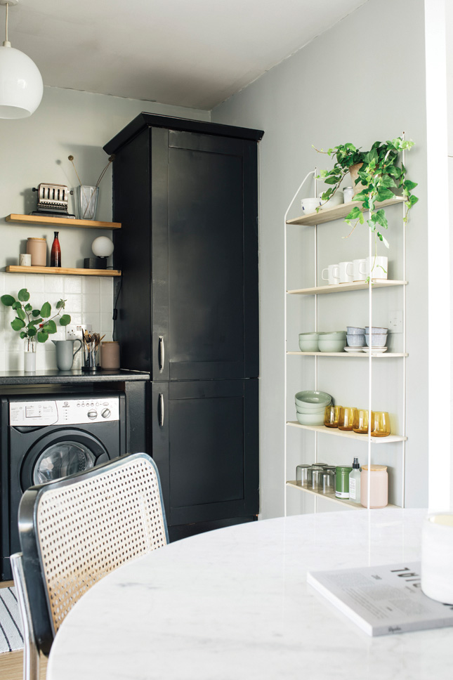
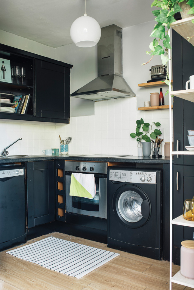 KITCHEN A makeover in the form of a paint job worked wonders to unify this small space. He painted the cabinets in Rust-Oleum Universal All-Surface Paint in Black Matt, and painted the walls in Benjamin Moore’s Metropolitan. String shelves from Sostrene Grene.
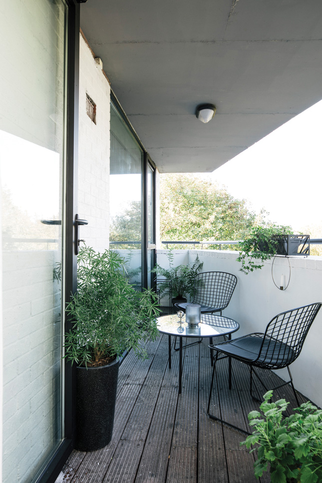
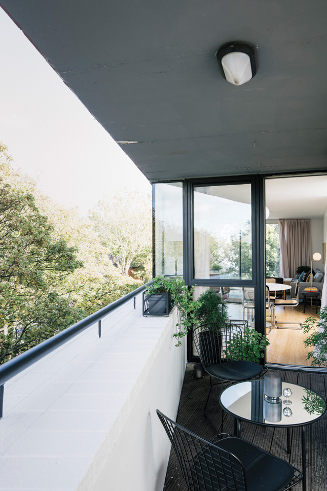
It’s clear he can tell a Muuto from a Menu. “I’m a big fan of Scandinavian style and mid-century, so it’s a mix,” he muses. “I like clean, simple lines, nothing too fussy; no bold colours or patterns.” Mark’s go-to brands – and labels you’ll find in his interiors – include Hay, Hem, Normann Copenhagen, Arper, Menu, Bo Concept, Paustian, Million, Kristina Dam, Punt, AndTradition, Gubi, Ferm, Flos, Muuto and Woud.
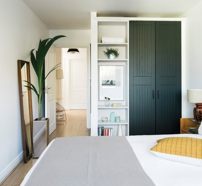
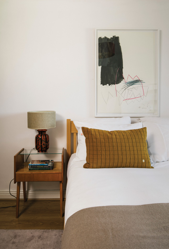
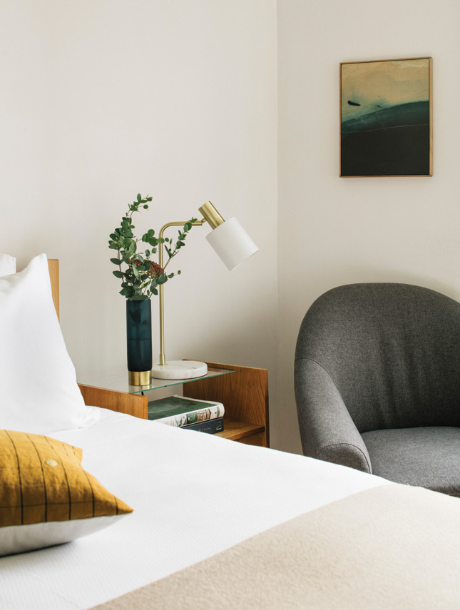
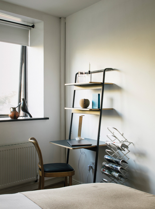
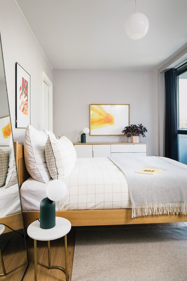 BEDROOM This is a supremely relaxing space that’s full of considered pieces, natural materials and a lot of light. The bed and sideboard are from Made.com, the throw is from TK Maxx. Underneath the bed sits a rug from Homebase. Mark sourced the navy velvet curtains and large mirror by the bed at Ikea. His bedside table is Helen James for Dunnes Stores. The occasional chair and magazine rack were both picked up at the Dublin Flea Market.
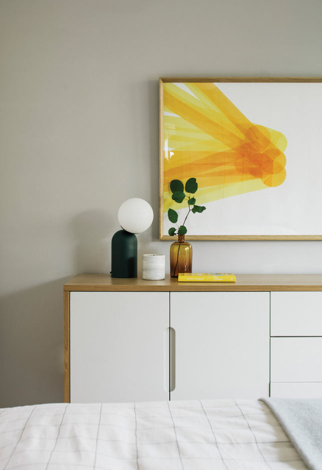
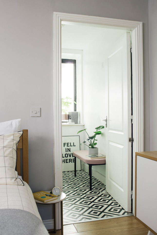
But as any good interior decorator knows, the high-low is the way to go. Sostrene Grene features throughout Mark’s home and, “I buy a lot of things from Made.com – good design and reasonable prices. The Vintage Hub is another place that I love to browse. TK Maxx, Industry and Article are always good for accessories. Nest.co.uk has a great selection of pieces at pay day pieces.”
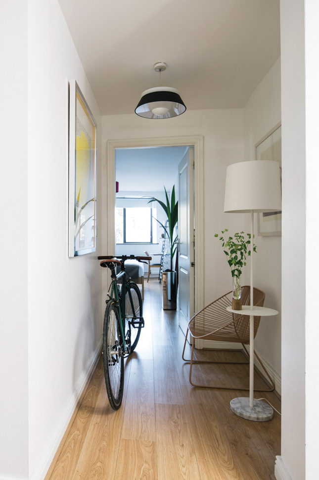
Mark’s latest creative foray is social, recently setting up his own Instagram, @mark_t, to document his home décor journey. “I like the creativity involved and it can be a great community for sharing ideas, inspiration and seeing how others see the world,” he says.
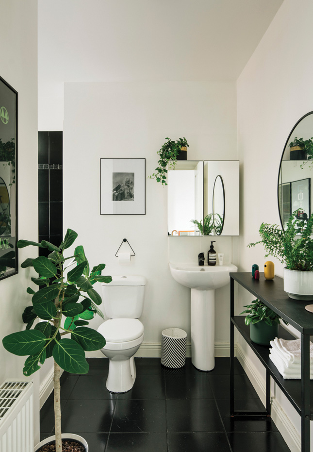 MAIN BATHROOM Mark painted the floor and wall tiles in his main bathroom, using Rust-Oleum Universal All-Surface Paint in Black Matt. His console came from LaRedoute.com, the mirror was from Sostrene Grene, the striped bin is from Ferm Living, while the artworks are original 1950s screen prints, sourced on eBay.com.
For a window on what he’s up to next, find him there – and we’ve got some insight too: “First on the list is new floors. I spruced up the kitchen and bathrooms with paint so they’ll suffice for the moment, but will eventually have to be done.” We can’t wait to see the rest of this flat plan.
Mark’s small space tips, from doing up his Dublin city apartment
- I always try go for ‘visually light’ furniture, nothing too cumbersome or heavy.
- If I don’t love it or need it, I just get rid of it.
- I keep things tidy and free of clutter – that makes a big difference.
- Shelving can be a great way to maximise space – again nothing too heavy in design.
- Multi-functional furniture such as a bed with storage can be a great way to hide things away.


