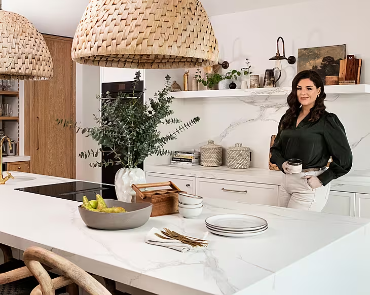
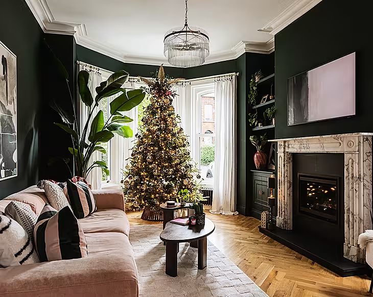
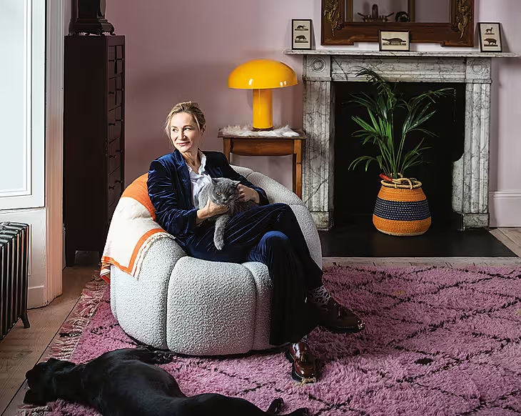
As a conservation officer, homeowner Sandra, used her innate knowledge of materials and textures to achieve a stylish airy interior, while respecting the original era of her dormer bungalow.
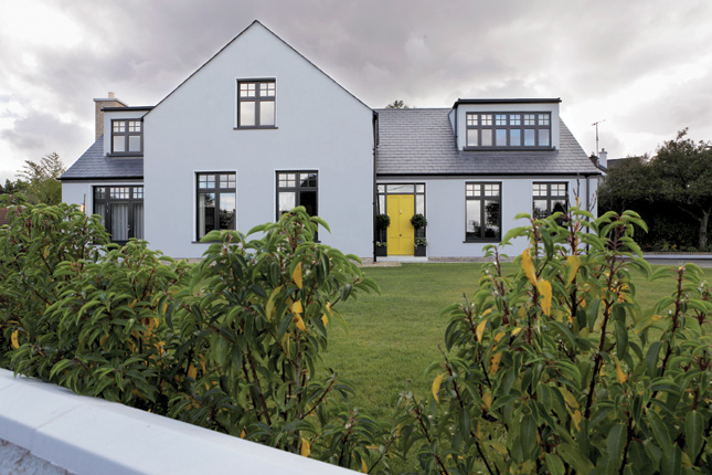
After a year of house hunting in Dublin, a dated 1950s dormer bungalow in Blackrock, Co Dublin, held Sandra and Paul Sharpe’s attention.
Set on an elevated corner site, with privileged sea and city views, the house needed a complete rethink to work for the couple’s growing family. The first thing to go was a narrow corridor down the centre of
the ground floor – a common theme in older dormer bungalows. They hired DMVF Architects, a firm that specialises in high-end home remodelling, to complete the project. “The house needed a lot of work, so we thought, ‘why not remodel it from the ground up?’,” says Sandra.
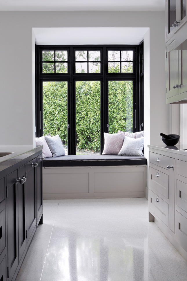
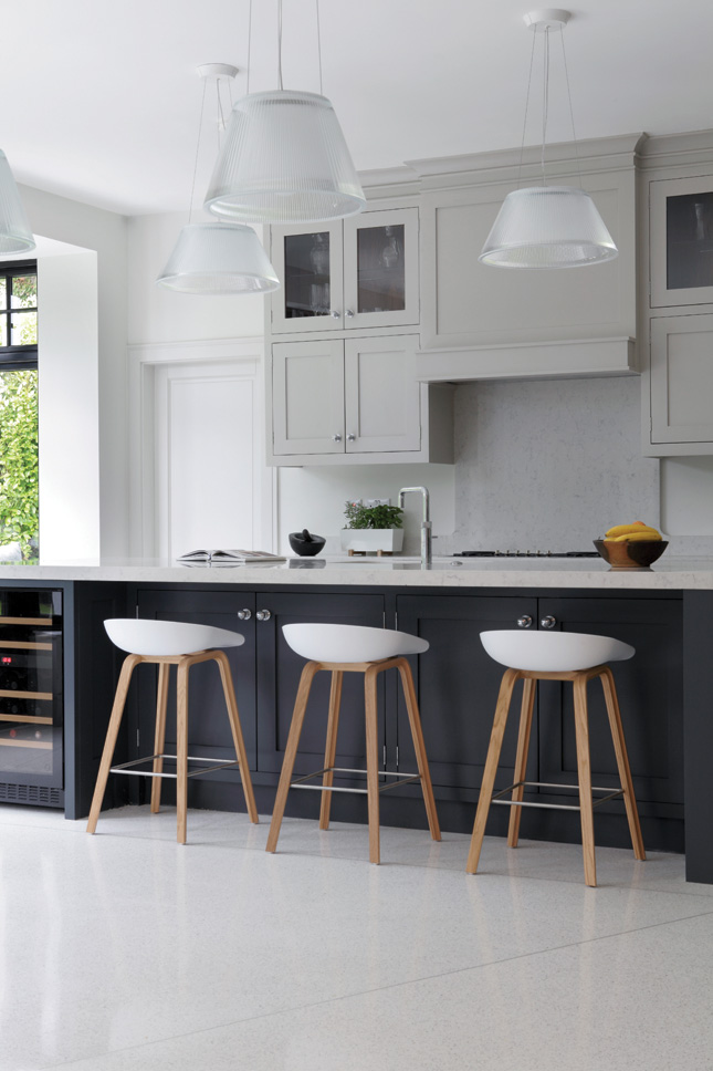
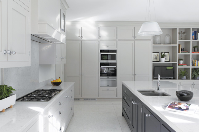
“I previously worked as a conservation officer for a London council. I dealt with materials on a daily basis and had a very strong idea of what I wanted. I knew I wanted this kind of brick, that render, these windows etc... I knew the materials, inside out, thanks to my job, so that was very useful.
“For interiors inspiration, I did a lot of research with magazines. We also called on a friend of ours, Laragh Bohn from Trinity Interior Design, in London, for our soft furnishings”.
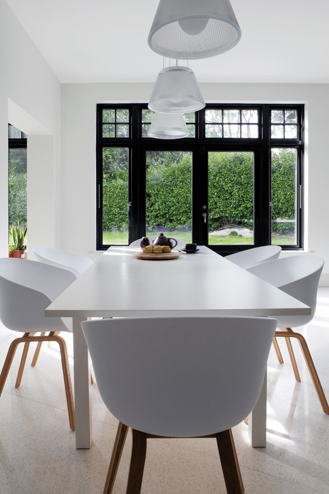
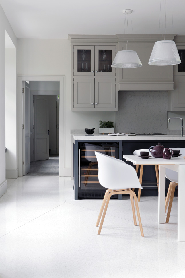
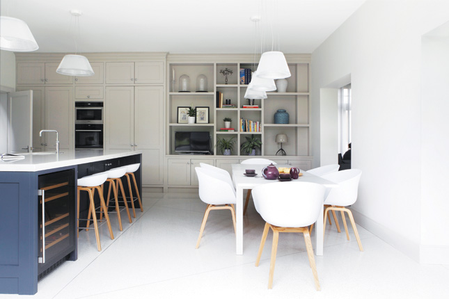
Sandra and Paul wanted an energy-efficient, stylish home. “Not strictly open-plan, but with bright airy rooms,”says Sandra. “Above all, we want a family home that we can change easily, while our children grow up.” Remodelling this house created a number of challenges for DMVF Architects. “The house had been loved,” says architect Colm Doyle, “but it was as if it had been built for a totally different site. Perhaps the plans had been bought from a book. The house didn’t respond to the site. There were no windows facing the sea, so you had to look out the window, sideways, to see it. Now, however, there are a lot of sea views,” he says.
“Sandra and Paul were fantastic to work with. Everything was about the family and the house. Sandra was super when choosing materials. You can really see her understanding of textures throughout the house,” Colm says.
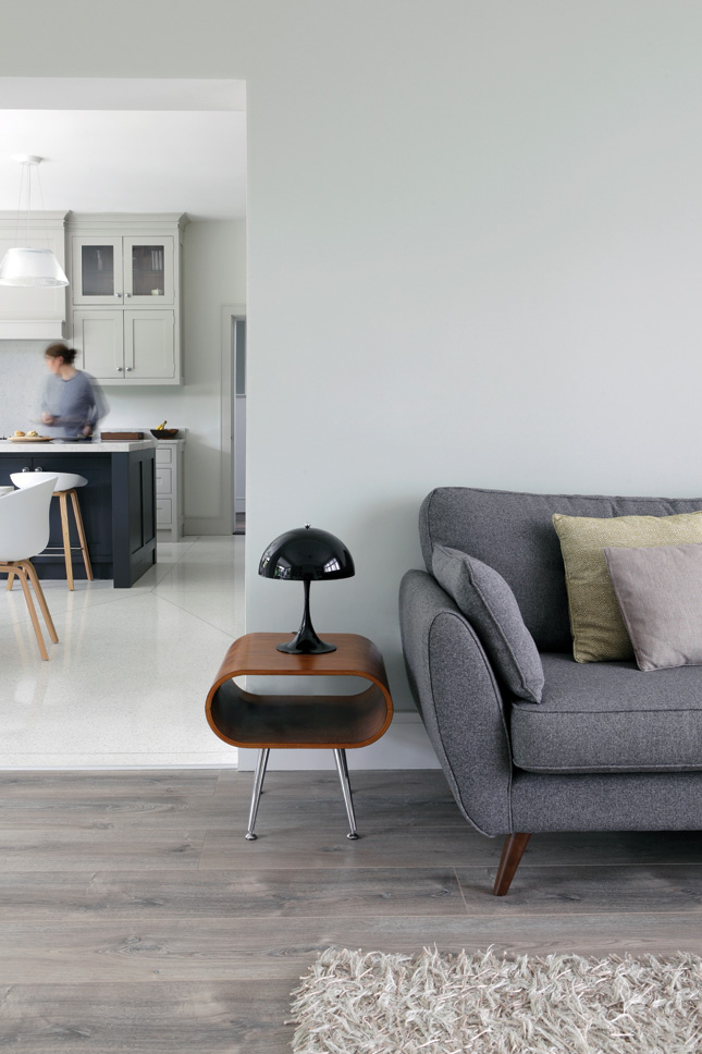
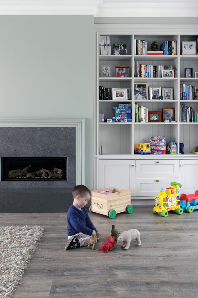
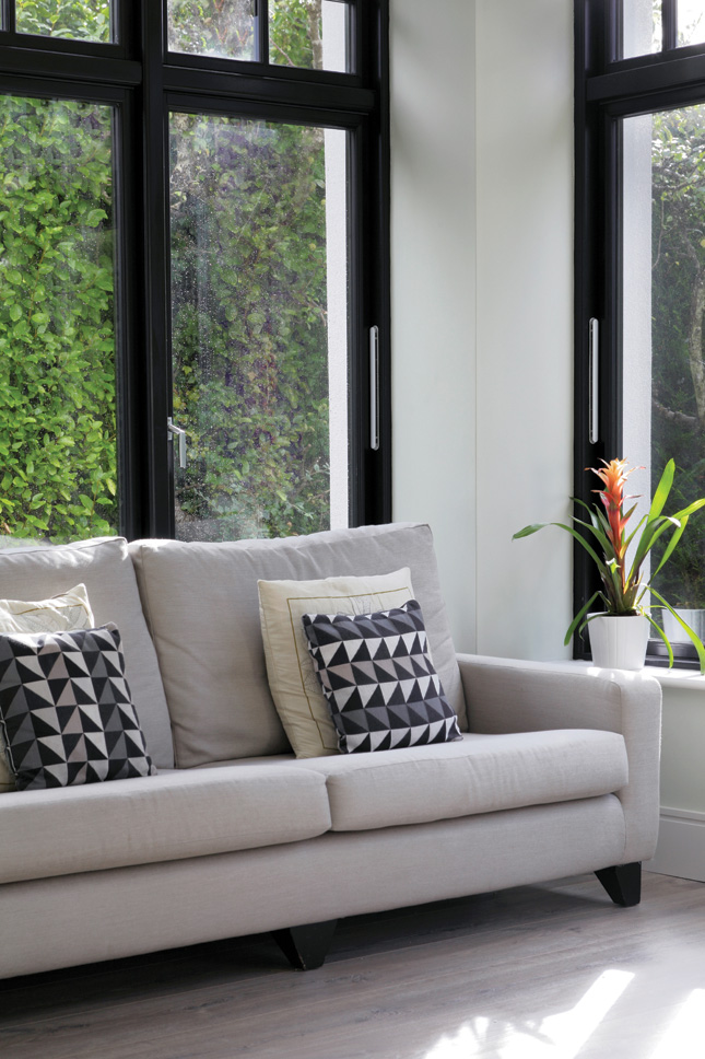
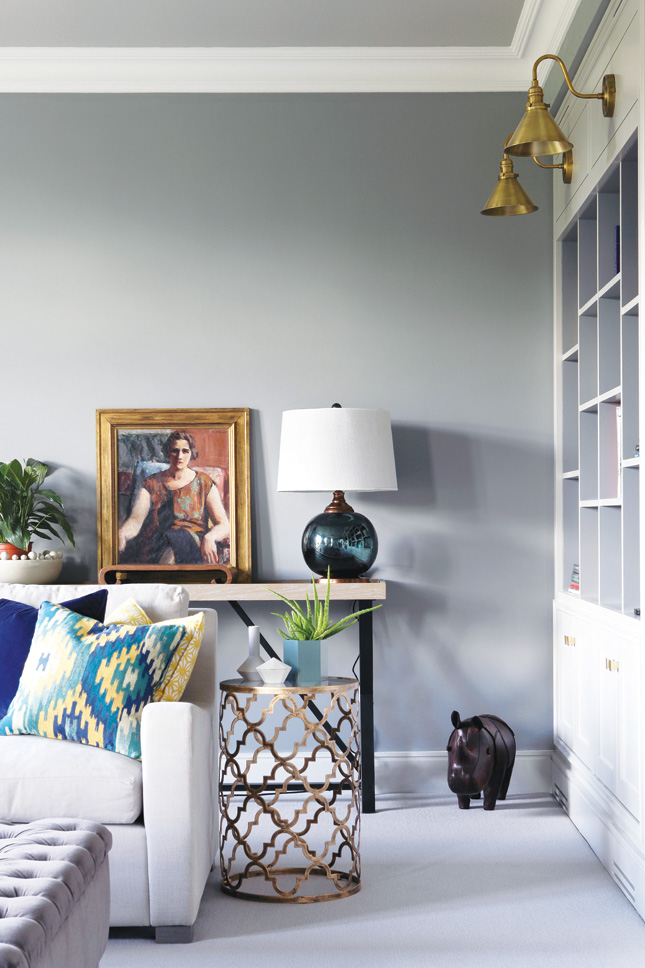
The clean lines of the new design contrast wonderfully with a number of traditional features, inspired by Sandra’s work and her desire to include some of the features of a mid-twentieth century home.
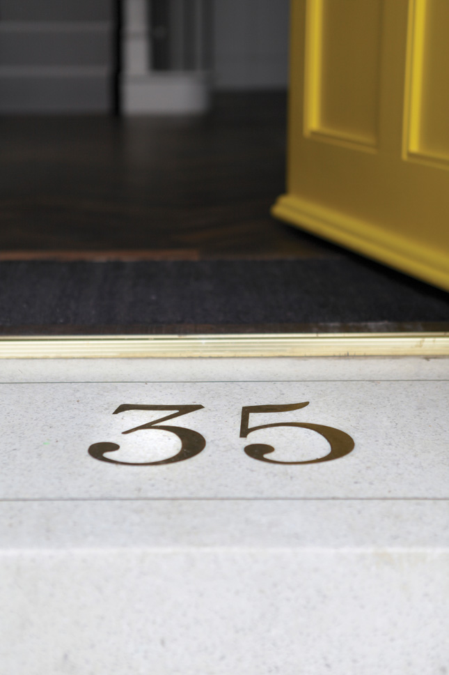
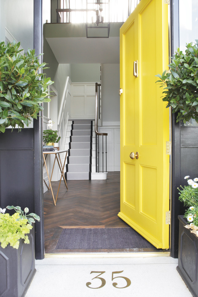
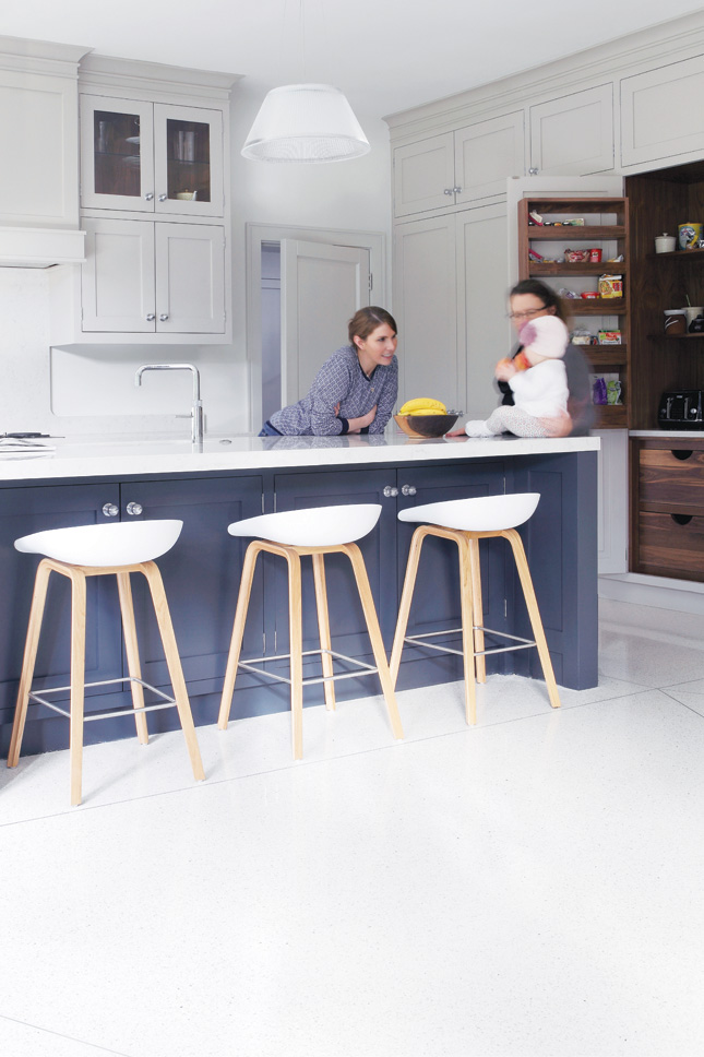
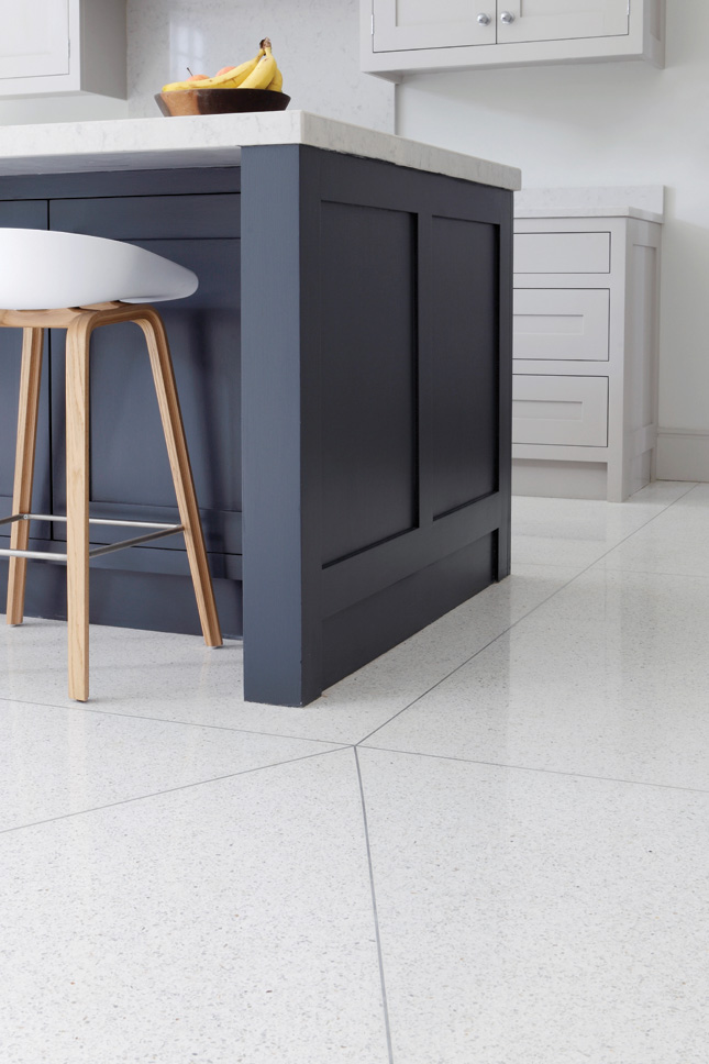
“I wanted the kind of front door your parents would have had,” she says. “A front door with a knob and a single lock. The panelling in the front hall is ‘40s/’50s style, and we used terrazzo on the kitchen floor and on the front door step. Terrazzo was hugely popular during that era and is having a resurgence now. I saw it on shop fronts and I really wanted it for the house.”
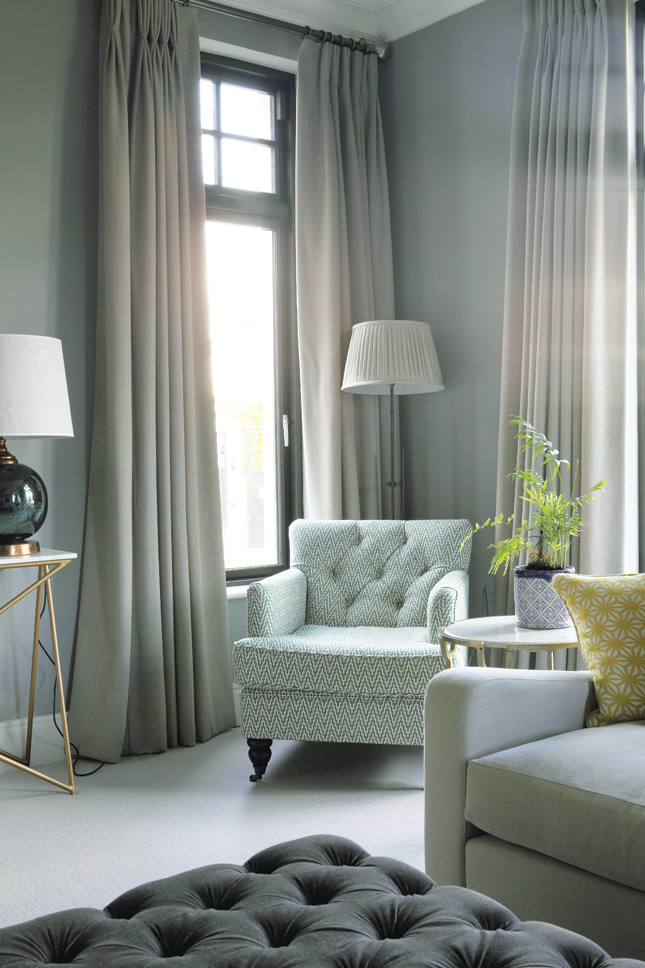
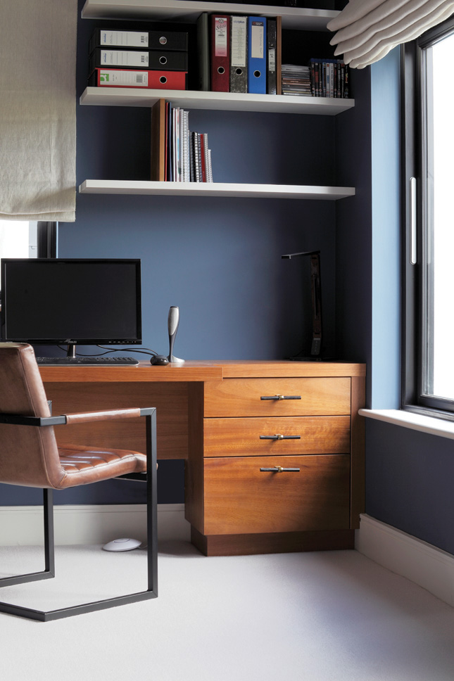
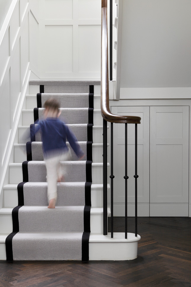
Herringbone floors and black radiators, in the bathrooms, are reminiscent of a past era but one of the most eye-catching design features in the house is the terrazzo kitchen floor. “You have to put in expansion brackets to stop the terrazzo from cracking,” advises Sandra. “Laura O’Gorman from DMVF had the idea of creating a diagonal pattern in the floor, so we have a design feature that’s functional and stylish. The kitchen island was positioned purely to suit the pattern.
“One of my biggest worries involved the double height staircase and mezzanine. I thought noise would carry, in the evenings, while the children were sleeping. Colm Doyle convinced us otherwise and he was right – it’s a really lovely feature and we’re delighted with it.”
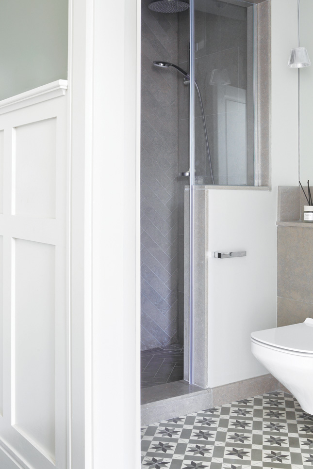
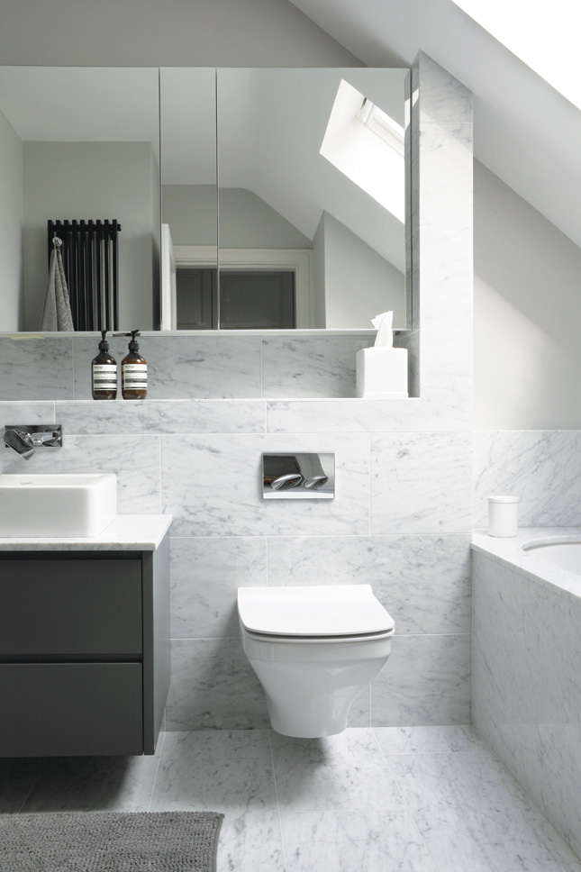
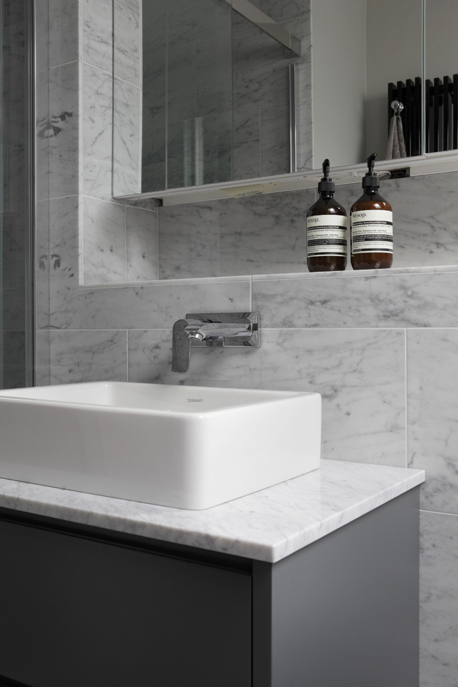
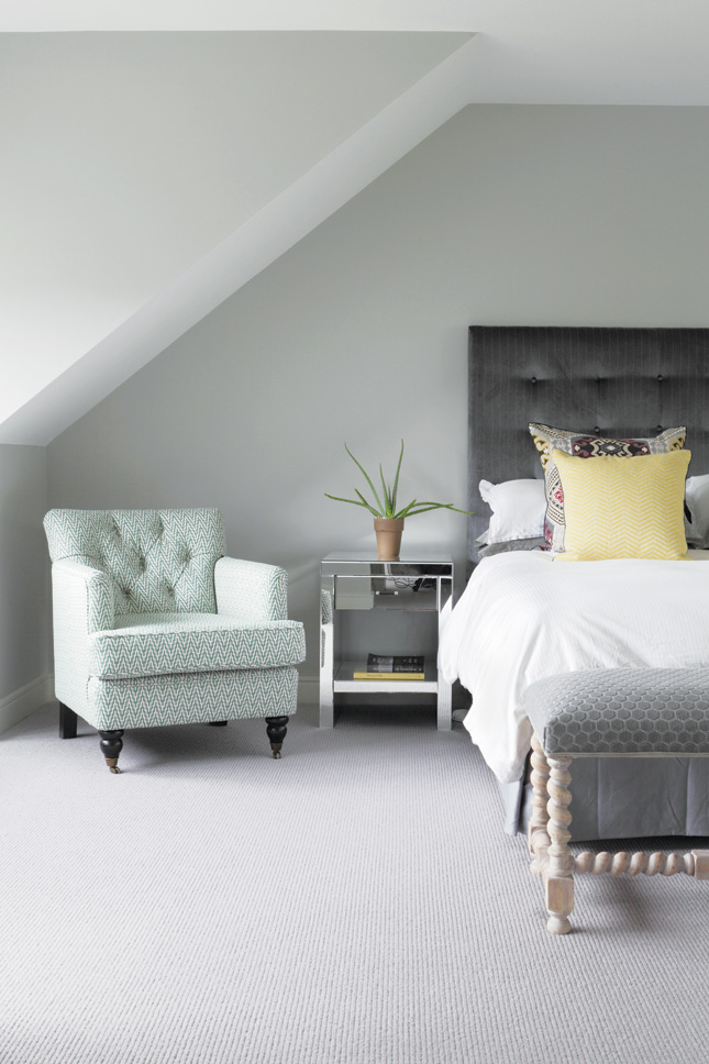
With three young children under the age of six, Sandra and Paul’s use of white and pale hues is a brave step. “So far, so good – the children haven’t destroyed the place. They understand that crayons are for colouring books and, apart from the odd grubby hand print, they’re very good – although they do use the kitchen island for gymnastics”.
“Paul chose the yellow front door, which makes me smile every time I see it, because it’s so welcoming,” says Sandra The house is now two and a half times its original size, yet the exterior looks the same as it did before. When you step through that welcoming yellow front door, you find a re-imagined home, inside, which works perfectly for a modern Irish family, and will continue to, for years to come.
Words: Catherine Murphy
Photography: Ruth Maria Murphy


